4 responsive web design tools to add to your workflow
Chances are your needs from a design tool have drastically changed in just two years. Dan Rose puts four new apps that promise to aid responsive design to the test.
Perhaps it's taken you each and every day since Ethan Marcotte dropped the responsive web design (RWD) bomb. Maybe it happened instantly. Most likely, it was somewhere in between. Inevitably, you realised it. Responsive web design (RWD) is hard. Part of the difficulty is that it's tricky to communicate visually. How do you show a client or a developer your intention for a single element at multiple breakpoints, outside of actually building it?
Certainly HTML and CSS are great for implementing RWD and, for some, designing solely with code is a viable option. Others struggle when design is abstracted through the layer of code. However, an environment for vetting out creativity through direct manipulation is necessary.
Until recently, such an environment was typically an image editor like Photoshop. Though it provided a means to express our creativity, it also handcuffed us to static deliverables. You could use an image editor to make multiple comps, but that workflow is potentially tedious, and if we're being honest, our breakpoints should be dictated by content stressing rather than convenience (only changing an element when all the others change). Our previous set of tools simply can't accommodate the complexities of relaying responsive design, visually.
Web design demands that our tools have fluid canvases, integrate web fonts and speak in the language of CSS. We have a few apps that accommodate all of that to choose from. So, how have some talented folks addressed our need for a responsive design tool?
Let's take a closer look at four apps promising to aid responsive design that have managed to separate themselves from the rest.
Webflow
- Platform: Browser
- Price: $16 a month for personal (10 projects). $35 a month for professional (no project limit)
For Sergie and Vlad Magdalin, the need for a better web design tool came out of some brotherly frustration. Project work had been going swimmingly, with Sergie handling design and Vlad handling development. However, repetition and time exhaustion started to drive them nuts. Instead of allowing their workflow shortcomings to persist, they decided to do something about it.
"Initially, like nearly every design agency on the planet, we explored creating our own custom content management system," explains Vlad Magdalin.
Get the Creative Bloq Newsletter
Daily design news, reviews, how-tos and more, as picked by the editors.
"Eventually, that effort led us to think about a purely visual web design approach, which got both of us really excited, and we started working on a prototype," he adds.
That prototype was the first version of Webflow, which is now a complete web app.
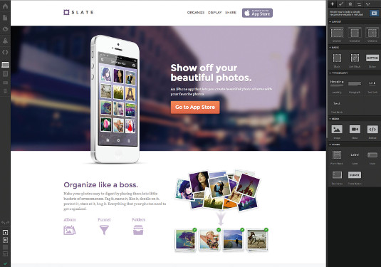
"From the very early days of this project, we wanted Webflow as an application to be as close to the medium as possible. Being a web application allows us to more accurately state that "what you see is what you get," because it's the same exact code and view that will be shipped to production. For example, there's a lot more to web design than just graphic design (interaction with elements, form submission, resizing behaviour, zoom/accessibility behaviour), so it really helps to be working as close to the final product as possible. Being an in-browser application helps us achieve that," says Vlad.
Where Webflow really excels is in its versatility. Certainly there's the layout tools and if you only use it for interface design, you'll be quite satisfied by the app's intuitive controls. However, there's another layer to Webflow that may appeal to some: optimised and accelerated hosting with site backup and versioning. Theoretically, you could start building a prototype, refine it and have production code ready to be hosted, all within Webflow.
However, Webflow isn't without its constraints, and that's a good thing. For example, as liberating as it is to draw a box and drag it wherever you'd like, sometimes it's to the detriment of web standards. "We deliberately enforce the constraints of the CSS box model (margin, padding), because that enables a lot of downstream benefits (such as automatically responsive layouts and fluid designs)." You may sacrifice complete autonomy, but it affords you a design that becomes responsive by default.
"It's the beginning of a new web design platform," declares Vlad. "We'll soon unveil other features that will help web designers work much more efficiently and avoid doing a lot of repetitive work."
So who should use Webflow? Seems like if you're looking for a turnkey app, from prototyping to deployment, this could be the tool for you. That doesn't exclude those looking to use it for one specific task, but Webflow is certainly more than capable of being your workhorse.
Froont

- Platform: Browser
- Price: Free for public projects
Sometimes the best ideas come from previous ones. As was the case for San Francisco designer Sandijs Ruluks who, just a few years back, launched a simple, WYSIWYG content management system, Berta.me. The original intention was to just use it for his own site, but, after sharing it with friends, the user base grew to the point where he could charge for hosting. There was still one problem: the inability to design for small screens.
Ruluks proceeded to introduce a breakpoint ruler, grid controls and a handful of other responsive-focused features. Out of this, FROONT was born. It's a seemingly logical sequence of events, yet it validates the importance of iteration and the benefits of addressing your users' problems.
"Our focus is on things that are painful or impossible to make with the current set of tools. For example, we aren't planning to add ability to draw custom shapes, as Photoshop and Sketch are good enough for that. Instead, we focus on best practices in responsive web design, web fonts and interactivity. We aren't going to the direction of a CMS and we are totally against full design automation; that's not where the innovation lives," says Ruluks.
Probably the most notable difference between FROONT and the other web design tools has to do with your wallet. FROONT is absolutely free to publish public sites, and gives you HTML and CSS, should you want to use that elsewhere. Ruluks promises that FROONT "will be free as long as projects are public." (Private projects will be available on paid plans.)
Why's that important? Perhaps paying for a next-gen design tool is a worthy investment for someone using it from prototype-to-frontend development, but what about a designer just looking to experiment? An argument can always be made for the worth of a tool, but it's refreshing to have options when there's so many workflows out there.
Testing made easy
One of the benefits to using a browser-based design tool is the accessibility of the browser itself. To preview your work from a native app on a mobile device, some intermediary app needs to exist. Being able to visit a URL on your phone to preview your FROONT project makes the process extremely simple. "Everything you make is accessible via any internet-ready device simply by typing in the URL, so that designers can test their designs in a 'real life' environment," adds Ruluks.
Sharing is just as easy. FROONT doesn't require any uploading or extra steps outside of the app. Simply supply the project URL and discuss with your client.
"Having projects in the cloud makes it easier to collaborate and iterate," Ruluks points out.
Responsible breakpoints
Every app that wants to play in the next-gen sandbox needs to tackle how we visualise breakpoints. FROONT's approach is fairly intuitive: you're given the 'famous four' of 320, 480, 768, and 1024px along the top of the app. You can edit any of those by simply 'scrubbing' to another value.
It's perhaps not as autonomous as Reflow, but still allows you to shape your breakpoints to your content, as opposed to specific devices. Any way you look at it, the ability to adjust breakpoints lends itself to being content-centric.
Reflow
- Platform: Native app
- Price: Included with Adobe Creative Cloud Subscription
When discussing design tools, Adobe is naturally part of the conversation. It's earned that right with its contributions of Photoshop, Illustrator, Fireworks (RIP 2013) and the like. But the keen eye has been focused on its Edge tools, a lineup of apps geared towards addressing the difficulties web creators encounter. Reflow is the responsive design tool within that said lineup.
The premise is straightforward: "Reflow focuses on helping designers communicate their vision and responsive intent. Designers today don't have the luxury of throwing static comps over the wall and hoping for the best," explains Jacob Surber, Reflow senior product manager.
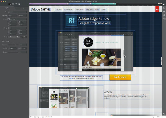
With Photoshop, there was a responsive communication problem. How do you show design intent with static comps of absolutely sized and fixed positioned elements? With Reflow, the canvas is fluid and the elements are relative, allowing you to better communicate how elements adapt at different screen sizes to both clients and developers.
The visualisation of the breakpoint ruler is impressive. Zones are created along the ruler, sitting above the app to indicate where media queries occur. Each is assigned a different colour. This proves useful when navigating around Reflow. While other apps may dial back the approach to visualising breakpoints, Reflow's 'at-a-glance' functionality puts breakpoints centre stage. Feel free to add as many breakpoints as you deem necessary. A conscious decision by the Reflow team allows the content you create to be the catalyst for media queries rather than popular device widths, which are subject to change any time a new Apple device launches. "If you're going to design your responsive site for more than iPhone, iPad and desktop (which you should be), Reflow lets you resize the design surface, see where your content breaks down, then add a media query," explains Surber. "Instead of devices dictating breakpoints, your content leads the way, ensuring designs look great no matter what screen they're viewed on."
Photoshop integration
When's a good time in your workflow to use Reflow? For some, right from the beginning makes sense. Others still prefer to start exploring design in Photoshop, whose static exports can be a dead end in terms of responsive. Fortunately, there's the option to import your Photoshop document in to Reflow. Get started in the former, and fine tune atop a fluid grid in the latter. As Surber details, "Once the assets, text and static layouts are extracted from your PSD, Reflow converts them to per cent based HTML and CSS then relatively positions all of the items. From here, you can add structure and hierarchy."
A nudge of code
One of the most important questions next-gen design tool teams need to ask themselves is: will we promise production-ready HTML and CSS? We designer and developer types tend to be finicky about the purity of exported code. Reflow presents a nice compromise: CSS snippets are available for those who wish to use them (through a pop-up panel), but it's not a key cog of the interface or intended workflow. HTML is exported in the assets folder alongside your Reflow project, but again, it's only there should you choose to use it.
Reflow isn't intended to be a publishing tool. It's a design tool that helps bridge the gap between design and responsive development. If you're looking for a way to get cleaner, more optimal code (it tends to be heavily reliant on <div> s and <p> s) out of the app, try Reflow Cleaner by Terrence Ryan.
Developed in the open
From the beginning, the Reflow team has taken the approach of "developing in the open" , which is quite admirable. Customer feedback has influenced a great deal of the current features, and the discussion occurs everywhere from Twitter to forums, to a pre-release program. As a result, Reflow is unconfined to the 30-day download limit associated with a free Creative Cloud account. Perhaps that will change down the road, but it's a great way to experiment without commitment.
Macaw
- Platform: Native app
- Price: TBA
Traditionally, having a design app produce your code is like having a toddler file your taxes. You may get it to work, but it'll be a mess of unintuitive spans, IDs, and non-breaking spaces. Macaw not only seeks to change that, but suggests that the CSS it produces could be more succinct than what you'd write.
Longtime Photoshop proponent Tom Giannattasio realised a need for something better suited for web design. "It wasn't until 2012 that I devoted myself to building something," says Giannattasio. "I started with simple experiments and eventually left my job at MIT to do it full time. I eventually convinced my partner (Adam Christ) to come on full time."
The team of two have since drawn the curiosity of the web design community with their "pet" project, Macaw. Some screenshots here, a sneak peek video there (see the resources links opposite) and a wildly successful Kickstarter project that was fully funded within the first 24 hours, the Macaw guys clearly have the attention of an industry.
Being code-savvy
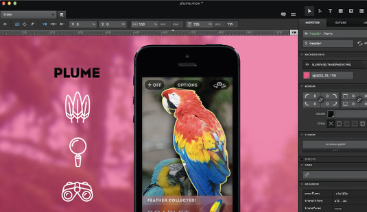
Besides having the requisite user interface with CSS units and responsive breakpoints on a fluid canvas, Macaw claims to be "the code-savvy design tool". Production-quality code isn't just a feature of the app, it's arguably what sets it apart from the others.
How does it manage to produce clean HTML and CSS? In a word: "Alchemy". That's Macaw's under-the-hood code engine that produces code to rival a top-flight developer. "On the HTML side, it gives the designer full control over the semantics of the document by simply naming each element using a simple syntax," Giannattasio explains. It's as simple as naming a layer to produce the correlation.
Most impressive is how Alchemy handles CSS. When asked about the magic behind the scenes, Giannattasio replies, "The tags and classes set for the HTML are then used to consolidate the CSS in the most succinct and practical way possible – taking into account concepts like specificity, applicability, cascading, advanced selectors and media queries." That's no easy task, given the innumerable ways we could approach CSS. However lame the pun, Macaw truly leverages its bird's-eye view: "Because it has oversight of an entire project, it often writes styles more succinctly than I would think to."
Something for you and me
When designing your code, it's natural that there's benefit for interface designers as well as frontend developers in using Macaw. Designers should find the HTML and CSS assignment of elements and classes intuitive, while developers will appreciate the clarity of the code that's output. Both effectively 'touch' the code, and a convergence occurs.
"Being a native app provides an overall better experience. Many people expect the next-gen design tools to live within in the browser; we believe the next-gen design tool will be powered by a browser. It's a subtle but important distinction. Typical consumer-facing browsers are incredible tools, but hinder the user experience of a professional tool because they're designed for browsing. We want to provide an optimal design experience and avoid fighting things like keyboard shortcuts that can't be (easily) overridden."
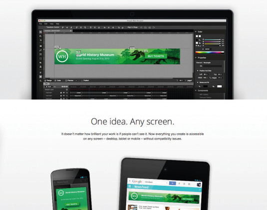
One of the best things that RWD has taught us is that prescriptions for the only way to do something are prone to fail. Likewise, any of the tools mentioned could be the one you've been waiting for, or the one you'll never use. It depends on a number of things: team structure, project scope, budget and a whole lot more. These tools are fantastic steps forward from the traditional ones we had, but none can truly be effective if they're viewed as 'the one way to do RWD'. There's simply more to it than that.
How interesting it could be if you use one tool for a small site and another for a larger project? Or one tool for communicating design intent and another for publishing? The good thing about each of these next-gen tools is versatility. Each is capable of being a workhorse if you take the time to utilise features like pages, custom breakpoints and code export. Likewise, each is capable of making small tasks easy. Just remember that the 'right' tool is often the one that allows you to complete the 'right' task, proficiently and efficiently.
On image editors
Part of the hype surrounding these tools is their potential to be the 'Photoshop killer'. While it's tempting to place such a distinction on any of these, image editors aren't going anywhere in our design workflows. CSS certainly gives us the means to implement style, and all the tools mentioned here provide a means of direct manipulation on a canvas. However, none are environments suited for creating raster or vector assets, nor do they intend to be. As Giannattasio declares, "We're not trying to replace Photoshop ... Macaw works best alongside Photoshop and Illustrator to help designers get their assets into an interactive medium."
By repurposing your image editor as a high-fidelity sketchpad of sorts, you may set yourself up for success before, or even while, using a next-gen design tool. Reflow's Photoshop integration is an example of a workflow that takes what you 'sketch' in an image editor and prepares it for interactivity.
The idea isn't necessarily to cut down on the amount of tools, but use them for better, more efficient purposes.
Support and reap the benefits
As a community, it's important that we support and contribute to the development of our tools. The silo mentality that's perceived by users and placed upon software teams doesn't exist with the products highlighted in this article. Each app has a small team of talented people genuinely reaching out for input from designers and developers. It's easy to complain about what a tool is missing, or how it should intuitively know your particular workflow, but it's our duty to communicate with the folks behind these apps and let them know how they can be improved.
Webflow, Reflow, FROONT and Macaw each have the potential to impact your responsive design workflow. Even beyond these four talented teams are designers and developers racing to offer tools to address a once barren landscape. Two years in and these tools speak of how bright the future is for addressing this whole 'responsive' thing. Experiment and see what works for you.
Resources
Reflow
Introduction tutorial
Reflow Cleaner
Adobe TV Reflow Channel
Webflow
FROONT
Macaw
Sneak peek video
Interaction design video
More RWD tools
Google Web Designer
Easel
Divshot
Words: Dan Rose
Dan Rose is the creator of Photoshop Etiquette. He's an interface designer at WSOL, conference speaker and pioneer of Syracuse Sync
This article originally appeared in net magazine issue 249.
Liked this? Read these!
- Our favourite web fonts - and they don't cost a penny
- How to build an app: try these great tutorials
- Brilliant examples of landing page design

Thank you for reading 5 articles this month* Join now for unlimited access
Enjoy your first month for just £1 / $1 / €1
*Read 5 free articles per month without a subscription

Join now for unlimited access
Try first month for just £1 / $1 / €1

The Creative Bloq team is made up of a group of art and design enthusiasts, and has changed and evolved since Creative Bloq began back in 2012. The current website team consists of eight full-time members of staff: Editor Georgia Coggan, Deputy Editor Rosie Hilder, Ecommerce Editor Beren Neale, Senior News Editor Daniel Piper, Editor, Digital Art and 3D Ian Dean, Tech Reviews Editor Erlingur Einarsson, Ecommerce Writer Beth Nicholls and Staff Writer Natalie Fear, as well as a roster of freelancers from around the world. The ImagineFX magazine team also pitch in, ensuring that content from leading digital art publication ImagineFX is represented on Creative Bloq.
