The 10 principles of inclusive web design
Sandi Wassmer of Copious explains the 10 principles of inclusive web design and how to apply them to the real world of website building
The full version of this article appears in issue 216 of .net magazine, the world's best-selling magazine for web designers and developers - on sale now. Buy it here!
What is inclusive web design? It’s about considering the needs of the widest variety of people possible throughout the design process, from conceptualisation to planning, build and completion.
Inclusive design is well established in architecture and industrial design and the principles that apply to these disciplines are equally relevant on the web. It’s people that your website engages with, not technologies, so a user-centred approach is fundamental. There are 10 basic principles of inclusive design – follow these and you won’t go far wrong.
1. Be equitable
Being equitable is a central tenet of inclusive design, but it’s important to note that equitable is not the same as equal. It’s not about having your website look the same on every device; it’s about providing different user experiences, but with equally valuable outcomes. This can be achieved by involving real users in research and testing as early in the process as possible.
Having an inclusivity champion on every project is ideal, but if you have limited resources, you can share the responsibility within your team and ask friends and family to help, as well as disability charities, to put you in contact with real users.
2. Be flexible
Be flexible in your thinking and in your approach – there is no ‘one size fits all’. Your users have a multitude of needs and behaviours, so your team needs to be concerned with the finer details of serving your audience. The aim of being flexible is to provide options for your users by building for different outcomes.
3. Be simple and intuitive
This is where you exercise restraint. It’s not simply a case of ‘less is more’; it’s a case of ‘less is more when more isn’t appropriate’. It’s about the benefits that your website will provide users and how these will improve the overall user experience. You need to ensure that with every feature you’re adding value and not just complexity. People don’t want to have to work out how to use your website. Technology is meant to make their lives easier.
Get the Creative Bloq Newsletter
Daily design news, reviews, how-tos and more, as picked by the editors.
4. Be perceptible
What’s deemed perceptible by one person may be incomprehensible to another. The best way to get your head around this principle is to assume nothing: imagine that your website is the first one your users have visited. Think back to when you were at school and how frustrating things were for some kids when there was only a single way of teaching them. Perceptibility is relative: some people memorise, some contextualise, some visualise and some need to rinse and repeat. Being perceptible is about considering the varied ways of communicating information and building your site accordingly.
5. Be informative
Being informative is about maintaining an ongoing communication with users by providing the right information and feedback, in the appropriate manner and at the right time. From the moment users enter your website, you must start a dialogue with them that continues throughout their journey. The aim of being informative is to give users control and choice over the way they navigate, interact with and achieve their goals on your website.
6. Be preventative
Most websites include some form of interaction, whether it’s simple tasks such as clicking a link or completing a contact form, or more complex processes, such as buying a product or registering with a website. Handling these processes well is crucial. Ironically, this is an area that’s frequently either executed poorly or not considered. When people start interacting with your site, you need to equip them with the right information up front, in order to prevent them making errors and feeling silly.
The main purpose of being preventative is to minimise errors, but the wider objective is to engender trust. When people feel supported, are treated respectfully and are not made to feel stupid when interacting with your website, the trust built up reflects on your brand.
7. Be tolerant
Although being preventative mitigates errors, everyone makes mistakes, and when they do, you must be tolerant. The aim of being tolerant is to help users build confidence in their ability to interact online with your website and brand. By being gentle and supporting users in correcting errors, the confidence built – which began with the trust engendered by being preventative – is long lasting. This reinforces reliability and influences whether or not users will visit your website more than once.
8. Be effortless
For your website to be effortless, it’s the site and not the user that needs to do the hard work. In addition, the visitor should not be privy to the hard work that’s gone into it. To your users, your site needs to be a light, breezy, hassle-free experience. If you place demands on your visitors or are too restrictive, they will soon tire and go elsewhere. You need to put as little mental strain on people as possible. The aim of being effortless is to have happy users who can access and interact with your website efficiently and effectively.
9. Be accommodating
In a physical environment being accommodating relates to things such as headroom or door width. Online, it’s about how well you use space on the page in order to make people want to engage with your website.
If there’s too much space and not enough content, users may think the page hasn’t downloaded completely or there’s something wrong with it, which can cause them to recoil. On the other hand, if your site is jam-packed with content and looks crowded, some users may find it daunting, not know where to begin, and leave.
The purpose of being accommodating is to make people comfortable so they can navigate and interact with your website feeling relaxed and with room to manoeuvre.
10. Be consistent
Being consistent is about providing a familiar environment with memorable navigation, features and functionality. It means understanding the standards, guidelines and best practices that govern our industry, but it also means understanding conventions and why some things just are the way they are.
Of course, if a feature can be improved upon that’s great, but if it’s a convention users will expect when they visit your site, don’t disappoint them. It’s important to know the rules and when to adhere to them, but it’s also about knowing when to break the rules.
Real-world challenges
These are the principles of inclusive design. Now let’s take a look at how to put them into practice in the real world. We’ll do this with reference to two websites we built, Vision Hotels (www.visionhotels.co.uk) and Action for Blind People (www. actionforblindpeople.org.uk).
The key challenges on both projects were very similar. Both sites share a core audience of visually impaired users of all ages, with a large proportion over the age of 50, and both also serve the needs of a wide range of professional stakeholders.
The technical limitations in serving the core audience posed significant constraints, with IE6 penetration at 20 per cent and most people using assistive or adaptive technologies. The challenge was to create beautiful, modern websites with intuitive user experiences, while overcoming the considerable technical constraints.
Lack of adoption of web standards among assistive technology vendors, particularly screen readers, has resulted in interoperability issues. This, combined with the need to deliver equally valuable experiences for all users – while considering all of the vagaries from IE6 to modern browsers – meant we had to create the best user experiences with HTML and CSS, restricting the use of JavaScript to an enhancement only.
In the same way that we now design with standards and consider interoperability for the many different devices people use, it’s important to understand the needs and behaviours of the people behind the devices, browsers and other technologies that deliver content to end-users.
That’s why we began each project with a panel of user experts. We recruit people from within the sites’ target audience, but demographics alone don’t tell the whole story: we dig deeper and ensure access needs are part of the mix.
Researching your audience
To be both equitable and flexible, we needed to know quite a few things about our users. What were their technical abilities? What language did they speak? Did they have any impairments that might restrict their ability to access or use the internet?
What was their ethnicity or cultural background and how would we be able to accommodate cultural diversity? What was the age range and how could we satisfy the needs of different age groups? What were their geographic locations? What type of internet connection did they have? What devices did they use and how were they configured? Did they use any assistive or adaptive hardware or software? What browsers did they use and what were their browser settings?
Some of this data was readily available through analytics data, which provided the context, but it wasn’t until we talked to and observed our user experts that we had the information we needed. Engagement with our user experts on both projects began with market research, completing surveys and participating in focus groups. They then got involved in prototype testing and worked with us throughout on testing features, functionality, accessibility and usability.
Planning for inclusion
Once we got to grips with what our users needed, we began planning. We scoped out features and functionality, giving consideration to how we would deploy them in ways that provided users with choice.
Once our features and functionality were scoped, we wrote use cases. A few of our funky ideas fell by the wayside and the rest made it through to prototyping. We then got our users
in to test the hell out of them, and we canned a few more.
This may sound like a lot of work, but the time we invest in asking, thinking, observing, scoping, planning, prototyping and testing always yields great returns – we never have a snag list a mile long at the end of the build. We may finesse things here and there, but that’s about it, since most major issues are unearthed as we build and test.
What about technologies? We began both projects with web standards, providing a meaningful foundation where all content and functionality works in HTML first. We then applied effective styling to reaffirm meaning and enhance the user experience for visual users. Next, we added scripting to make behaviour more dynamic and intuitive, while also ensuring that it was unobtrusive and not device-dependent.
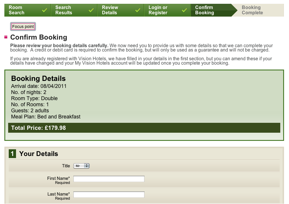
For example, on Vision Hotels, when considering the flow between the stages of the booking process, we wanted to enhance the experience for keyboard-only and screen reader users so that they didn’t have to tab through the navigation at each stage. We couldn’t give focus to the first form field because screen readers wouldn’t be able to read the form label.
We thought about giving focus to the H1, because it’s common for screen reader users to use it to orient themselves on page, but the H1 was not linking to anything. So we created Focus Point, which is an anchor that sits before the H1 and allows screen reader and keyboard-only users who have JavaScript enabled to circumvent the main navigation and tab into the form easily. Users who have JavaScript turned off can use the Skip links or the main navigation.
Meaningful experiences
In order to ensure meaningful experiences for all site visitors, we had to think about the many ways people access content. On Vision Hotels, for example, the photo galleries had to be visually appealing while also taking into consideration access needs and alternatives for non-text content. So we created a thumbnail gallery that linked to a slideshow, using JavaScript as a progressive enhancement. The result is a gallery that’s keyboard-navigable and screen reader-friendly, using both the title attribute and alt text.
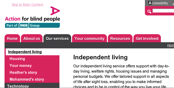
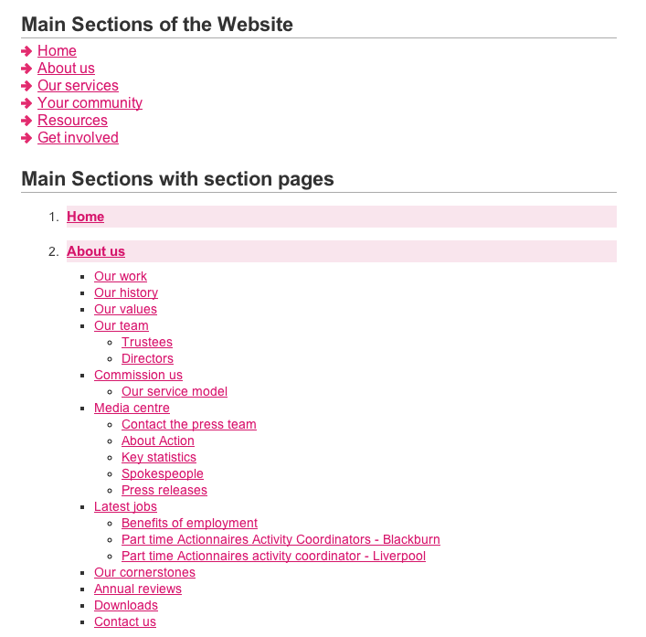
Providing different ways for people to navigate and access content is key. Some people like to use a website’s main navigation, others like to use sitemaps and some ignore navigation and go straight to the search box. On Action for Blind People, we wanted to make good use of the sitemap as a genuine alternative to the main navigation and not just a rehash of it.
During testing, we discovered that many people liked to use sitemaps, because they found them less cluttered. We grouped the main site sections for quick reference and also grouped the main sections, with section pages down two levels, in an ordered list. In addition, we grouped site-wide content for easy access.
When user interaction effects a change, you must let users know in advance, so they can decide if that’s what they want and more so, that it’s what they expect.
We learned a few things about link purpose on both projects. At first, we set out to conform to the WCAG 2.0 AA by providing individual words or phrases as links, as long as they made sense within context. However, we quickly found out during testing that this was useless for some screen reader users, who grouped links by listing them out of context, so we changed our approach and now conform to AAA, ensuring that link text is sufficient on its own.
On Vision Hotels, providing an intuitive, accessible and seamless online booking experience was a labour of love. We didn’t want to reinvent the wheel, so we looked initially to customise an existing online booking engine. However, they all used device-dependent obtrusive scripting so we had to build one from scratch.
We crafted the booking form very carefully. Instructions, labelling, form field interaction, indication of required fields, indication of all stages and current stage in the booking process, error messaging, error handling and success messaging had to be clearly understandable by all, and it had to work in a way that prevents users making errors as much as possible.
Trial and error
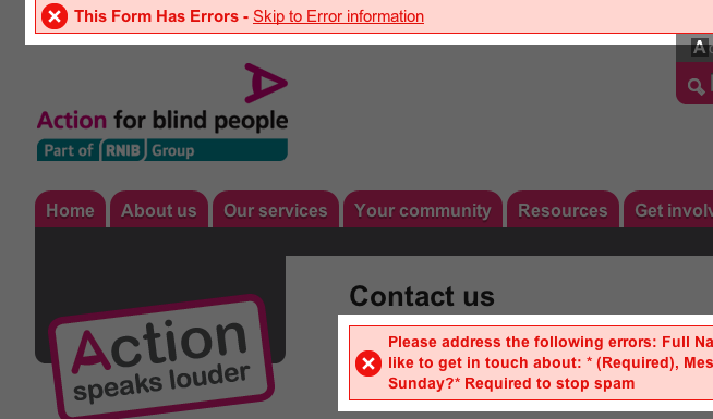
On Action for Blind People, we watched how users navigated pages when an error was returned on form submission. Because providing focus in form fields was unsuitable for screen reader users in this instance, giving focus to the top of the page alone caused screen reader- and keyboard-only users angst. So we added an additional Skip to Errors link at the top of the page, which improved the user experience significantly.
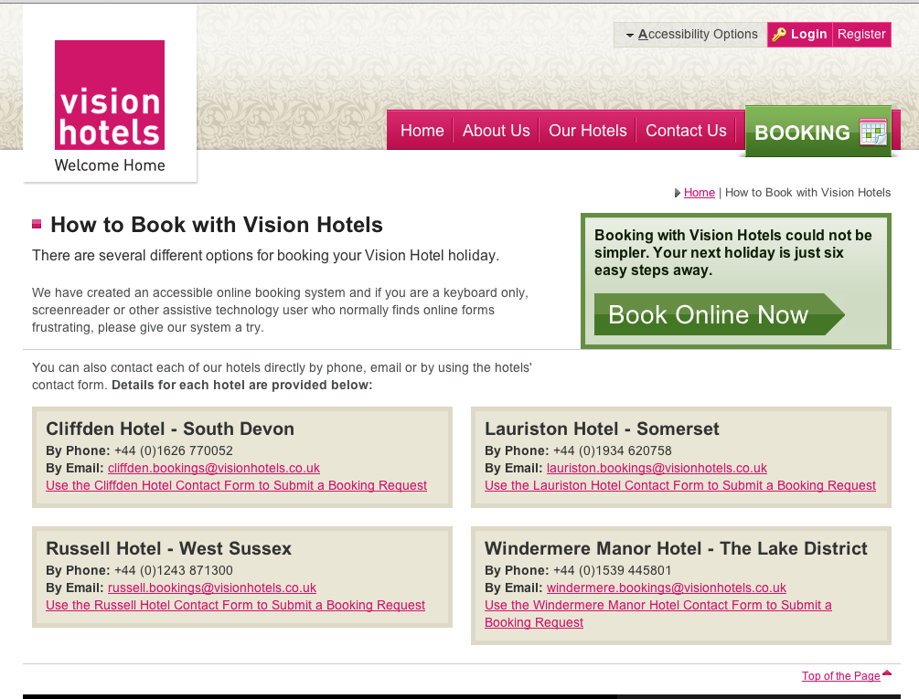
On Vision Hotels, we learned that visually impaired people tended to book by phone or email. Although the focus groups were told that the site would be fully accessible, there were concerns about the need for a choice of booking methods – users reported poor online experiences with sites that claimed accessibility conformance but didn’t deliver. It was clear that trust would have to be earned. In this instance, serving the needs of the core audience prevailed over usability best practices and we created an interim booking page to provide the necessary choice.
In general, two main factors help to make sure that both websites are accessible and memorable. The first is ensuring that common elements are consistent, clear and concise, and don’t make the user have to think. The second is sticking to conventions. The internet has been around long enough to have some – placing your logo in the top-left corner and making sure it’s clickable is an obvious one. Employing a header, footer and main body content as part of the structure is also now a convention. Giving people what they want and expect makes them more happy.
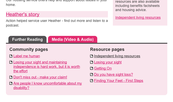
Making content dynamic in a world dominated by sexy JavaScript is not an easy task. On Action for Blind People it was all about content strategy. We structured the content around three cornerstones – services, resources and community – and created a system for ambient referrals that guides gently and signposts users to related content in the other cornerstone areas. The usual approach to large charity websites, where fundraising is the aim and the ambience is austere, could not provide the deeper levels of engagement and participation that Action sought from its community. Our approach not only facilitated the desired community activity, but it allowed Action to have a single voice to communicate with both community and stakeholders alike.
Fitting it all together
The internet is like a big puzzle, and the different pieces should fit together perfectly – but unfortunately they don’t. By following the principles of inclusive design, you’ll be giving your piece of the puzzle the best opportunity. With different devices, configurations, browsers, personal settings and assistive technologies, and no agreement on how to achieve interoperability, web builders must do their best to accommodate the diverse ways people access the internet. Building with this in mind will ensure your visitors have a quality experience.
Inclusive design enables us to create great, meaningful, on-brand internet experiences for the widest audience possible. However, inclusive design is also a new way of thinking, and its overarching aims may not mirror those of your organisation or clients. Change takes time, so you may not be able to do everything at once. If you just start thinking about accessibility and plan your projects with users in mind, you’ll be on the right path. There will be trade-offs and tough decisions, but this is where inclusive design really comes to the fore. It challenges us to hone our craft and fosters real creativity and innovation.

Thank you for reading 5 articles this month* Join now for unlimited access
Enjoy your first month for just £1 / $1 / €1
*Read 5 free articles per month without a subscription

Join now for unlimited access
Try first month for just £1 / $1 / €1

The Creative Bloq team is made up of a group of art and design enthusiasts, and has changed and evolved since Creative Bloq began back in 2012. The current website team consists of eight full-time members of staff: Editor Georgia Coggan, Deputy Editor Rosie Hilder, Ecommerce Editor Beren Neale, Senior News Editor Daniel Piper, Editor, Digital Art and 3D Ian Dean, Tech Reviews Editor Erlingur Einarsson, Ecommerce Writer Beth Nicholls and Staff Writer Natalie Fear, as well as a roster of freelancers from around the world. The ImagineFX magazine team also pitch in, ensuring that content from leading digital art publication ImagineFX is represented on Creative Bloq.
