The 10 principles of inclusive content
How do you make sure your content is accessible? VerseOne Technologies’ Penny Everett explains all
This article first appeared in issue 223 of .net magazine – the world's best-selling magazine for web designers and developers.
I have yet to come across a content author who isn’t absolutely mortified when they learn that they have unwittingly excluded a particular group of users. So this article is to help anyone who wants to do their best to make sure their web pages are inclusive.
Making your content inclusive to all is largely a matter of common sense, but there will often be things you won’t have thought of and some industry best practices you may not have been made aware of. But by following the 10 principles I’ll outline here, you should go a long way towards creating content that is usable and accessible for all.
To be inclusive, web content should be:
- Empathetic: Don’t upload any content without thinking of the impact on impaired users.
- Meaningful: Write link text that makes sense when read out of context.
- Descriptive: Describe sounds to a deaf person and images to a blind person as if they were next to you.
- Explanatory: Explain what users need to do when input is required.
- Economic: Upload suitably-sized images using web resolution (72dpi).
- Illustrative: Add relevant images, with descriptive alternative text, to illustrate a point.
- Informative: Write in bite-sized chunks using ‘plain English’ aimed at the reading level of the target audience.
- Different: Present content with sufficient difference in contrast between foreground and background for both sound and images.
- Orderly: Make sure that any items such as placeholders, or interactive objects, can be navigated when only using the keyboard and the page navigation is in a sensible order.
- Code aware: Use correct web formatting for things such as headings, data tables, numbering and bullets.
Now let’s look at these in more detail…
1. Be empathetic
Empathy in this context means you always consider the impact on those who are:
- Blind or have low vision.
- Born deaf or are hearing impaired.
- Dyslexic, who do not speak English as a first language or otherwise have difficulty in understanding the written word.
- Prone to seizures and may be affected by flashing or repeated patterns.
- Keyboard-only users, or motor impaired.
For example, think twice before setting a link to open in a new window as it disorientates blind people because they can’t easily return to the previous page. Always warn users of the outcome before they perform any action on your site.
Don’t use fully justified text or words in all capitals as dyslexics don’t cope easily with these formats. For this reason italicised text should also be used sparingly.
Make sure that there is plenty of space on the screen between, and within, areas of the page that require the user to activate an element such as a link or a button. Motor-impaired users find it very difficult to select a small area of the screen.
2. Be meaningful
Blind users often use their screen reading software to read all the links on a page in a continual list. This means that links such as ‘More …’ or ‘Click here …’ and so on won’t make sense out of context.
A blind user scrolling down the page will typically hear their screen reader say ‘Link, learn more’, ‘Link, learn more’, ‘Link, learn more’, and so on – and be none the wiser. If, instead, the content author includes the subject title in the link, the user will then understand the topic out of context. For instance, they might hear something like:
‘Link, learn more about residents who are Over the moon’
‘Link, learn more about new beginning at annual conference’
When it comes to images that act as links, always state the destination in the alternative text and not the description of the image. You should also ensure that the same text links go to the same destination, to avoid confusing users. This also applies to image links – make sure the same image goes to the same destination throughout.
3. Be descriptive
Don’t exclude blind users when it comes to objects such as infographics. Add relevant descriptions within the alternative text as if a blind person is sitting next to you. If you can’t explain the object in less than 26 characters in the alternative text, add an additional separate full description. This should be placed either on the same page within the content, or in a separate linked PDF file or web page. The one exception to this is images of art. ‘Beauty is in the eye of the beholder’. Your interpretation may be quite different from that of the artist, or anyone else for that matter. Adding your own opinion isn’t necessarily giving a blind user an equivalent experience!
Not everyone realises that screen reading software announces the alternative text for an image to the blind user with the word ‘image’. There is therefore no need to include words such as: ‘picture’, ‘photo’ or image in the description.
Provide verbatim transcript of audio and video. Include in the transcript (in brackets) a description of relevant images to a blind person and relevant sounds to a deaf person so that they have an equivalent experience to everyone else.
Content authors should only add additional information in the form of title text (aka tooltips) if the link or iage isn’t self-explanatory. These tooltips are for sighted users when they mouse over, there’s no point in repeating the text again in the tooltip when they can see it on screen any way. Also, never repeat word-for-word the alternative text of an image in the title text. Some screen reader users will hear both the alternative text and the title text and will find it very annoying to hear the same words twice, to say the least.
Get the Creative Bloq Newsletter
Daily design news, reviews, how-tos and more, as picked by the editors.
4. Be explanatory
Give users helpful hints and cues whenever they need to input data such as complete a form. Give examples wherever possible.
Avoid colour dependence such as ‘Click on the green button to go’. In this case consider using a representative symbol or a text label for the button. Another common area of colour dependency is form filling. For example, ‘questions in red are mandatory’. It would be far better to state ‘questions marked with a red asterisk * are mandatory’. The asterisk then acts as a symbol for identifying content without solely using colour. This avoids the issue of colour deficient people not being able to follow colour dependent instructions.
5. Be economic
Make images, files and downloads as small as possible in order to minimise both upload and download times for users with slower connections.
For instance, PDF files that are uploaded to the web are frequently much bigger than they need to be (eg, ‘Annual Report.pdf (4.5MB)’), owing to the entire contents having been saved as a graphic or, more commonly, the images within the document having a high graphic resolution.
Often the reason for this is because the document was originally designed for top-notch print quality and not for web resolution. Graphics should be converted to a lower resolution for the web in order to reduce the file size. A word of caution – never make files bigger than their original size as they may become pixellated.
6. Be illustrative
Help dyslexics and the cognitively impaired, by adding relevant images to content to help them process the information.
Don’t include anything that dyslexics or other cognitively impaired users might find distracting, such as moving images. Also make sure there is sufficient contrast between foreground and background even on photos.
7. Be informative
Use nested headings and sub-headings frequently to identify topics and present the text in smaller, easily digestible, chunks. Many users, including older users and dyslexics, find difficulty in concentrating and this will help them to retain the information.

Run a survey to calculate the average number of years of education a percentage of the target audience has received and use an online tool such as the Gunning Fog Index to ensure the reading level of the content matches that of your audience. The reading level for the general public should be set to no more than the equivalent of undergoing nine years of education. This equates to the reading age of a 14-year old. Offer an alternative easy to read supplement to the content for the cognitively impaired, particularly for essential information such as Health and Safety leaflets.
Microsoft Word offers readability statistics after running the spell checker (providing you have ticked the relevant checkbox under ‘Proofing’). This is the Flesch-Kinkaid test and is also based on the number of years of education. In addition, it displays how many passive sentences you have used, but bear in mind that both these tests use an algorithm to make their calculations and do not apply human logic.
It’s also very important that content authors avoid using jargon that the target audience may not understand. If you need to use a ‘jargon buster’ you really need to rewrite your content!
Endeavour to keep sentences to no more than 15-20 words. Restrict words of three syllables, or more, to those that your target audience would readily understand and are familiar with.
If you have to use acronyms and abbreviations that aren’t generally known, always state their full meaning the first time they occur on any page.
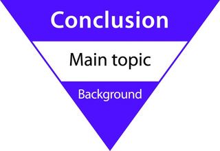
Use the inverted pyramid method for content, whereby the conclusion appears first. This method will inform your audience right at the beginning before they start to tire, or lose interest.
The inverted pyramid involves making sure that:
- The main heading on the page describes the entire topic.
- The first sentence summarises the topic.
- The first paragraph covers the main points you are trying to get across.
That way your message will be received by most of your users.
Remember to keep all of the important information within the first screen before the user has a need to scroll.
8. Be different
Ensure sufficient contrast between foreground and background. This applies to both sounds for the deaf and images for dyslexics and the cognitively impaired, as well as people who have low vision, or those who are colour blind.
Contrast in sound may require complex sound editing software or the assistance of a sound engineer. Whereas the contrast in images can be adjusted using simple image editing software.
Bear in mind that blind screen reader users need to hear their reading voice at all times to know where they are on a page. Any other sound which starts up unannounced will make it very difficult for them as it will conflict with their screen reader. For this reason always allow the user to switch on sound.
9. Be orderly
Emulate keyboard only users yourself by solely using the keyboard to navigate your page. This will establish whether the content is readily available to these users, which includes the blind, and that there is no keyboard trap stopping the user from moving on.
Listen to your page using a screen reader such as the free open-source NVDA (NonVisual Desktop Access) screen reader for Windows. This will give you a true insight as to what the blind user will hear and the order they will hear it in. Amazingly this software was written by two blind developers. Don’t forget to donate towards its development if you find it useful.
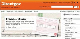
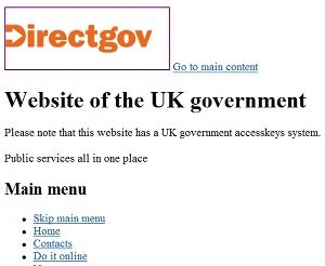
View the contents of your page without a stylesheet. This will visually establish whether blind screen reader users will have a navigation route that makes sense. This functionality is available under options in browsers. For example:
- Internet Explorer.
- Mozilla Firefox 5.0.
- Alternatively you could use a text only viewer such as Lynx Viewer to view your content as some disabled users will view it, or listen to it.
10. Be code aware
Screen reading software is for the blind and visually impaired, and despite its name doesn’t actually read the screen. Instead it accesses the coding that the browser interprets in order to display the various elements on the user’s screen. This coding is known as hypertext markup language (HTML) and it is absolutely essential that the correct HTML formatting is applied to items such as headings and numbered/bulleted lists. If this isn’t done the blind user won’t be told what element they are listening to.
For instance, screen reader users often listen to all the headings in a list within a single web page to find out what topics are being covered and, more importantly, whether they want to continue ‘reading’ the page. Therefore, it’s really important that headings are descriptive. It’s equally important that they’re not just made to look like headings for sighted users. This is because if a heading isn’t coded properly, screen reading software will bypass it completely when reading out a list of headings to the blind user.
Always refrain from emphasising a paragraph of text using a heading style. This is something content authors are tempted to do if they like the ‘look’ of the heading style. The blind screen reader user would then have to listen to the whole paragraph when all they are trying to do is quickly list the headings on a page.
Unfortunately many websites are at a transitional stage between HTML4 and HTML5. This means that content authors will need to be aware of the implications of this change when their website eventually updates.
If all else fails
Finally, if content really can’t be made fully accessible then this should be documented and published on the website. Ideally a time scale should be stated when the organisation plans to make the relevant object accessible. Additionally contact details should always be given making it clear that disabled users can request help should they need it.
In conclusion, making your content inclusive to everyone is often a lot simpler than you might think. By following the principles I’ve outlined here, you can make sure you have all the basics covered. And apart from the warm glow you’ll feel, visits to your site and conversion rates will increase as well!
If you would like to know more about an eLearning course entitled ‘Writing Content for the Web’ please contact the author.
Discover the secrets of the perfect website layout at our sister site, Creative Bloq

Thank you for reading 5 articles this month* Join now for unlimited access
Enjoy your first month for just £1 / $1 / €1
*Read 5 free articles per month without a subscription

Join now for unlimited access
Try first month for just £1 / $1 / €1
The Creative Bloq team is made up of a group of design fans, and has changed and evolved since Creative Bloq began back in 2012. The current website team consists of eight full-time members of staff: Editor Georgia Coggan, Deputy Editor Rosie Hilder, Ecommerce Editor Beren Neale, Senior News Editor Daniel Piper, Editor, Digital Art and 3D Ian Dean, Tech Reviews Editor Erlingur Einarsson, Ecommerce Writer Beth Nicholls and Staff Writer Natalie Fear, as well as a roster of freelancers from around the world. The ImagineFX magazine team also pitch in, ensuring that content from leading digital art publication ImagineFX is represented on Creative Bloq.
