10 common UX mistakes startups make ... and how to avoid them!
A positive user experience can transform your business. Here Laurence McCahill, co-founder of Spook Studio, comes up with 10 essential tips to put you on the right track for a better customer experience
‘How can I improve the user experience of my website/app?’ A frequently asked question and one that doesn’t have a standard response. Thankfully there are some steps you can follow to ensure that a customer’s experience of your product is a positive one. Here I’ll be highlighting some common mistakes we regularly come across that can easily be avoided.
So, why should we care about user experience?
Well it’s been proven that a positive user experience can transform your business by improving the quality of your products and, as a result, the satisfaction of your customers. If you have a great product that people love, then your marketing team’s job will be easier; customer support enquiries will be reduced to a minimum; and the positive PR it generates will give your company a great foundation for future growth.
Similarly, a negative experience can have a damaging effect. As we all know, bad news can spread like wildfire. Unhappy customers can be a poison that can really harm your brand. Ryanair anyone?
I love this quote below from startup guru Dharmesh Shah:
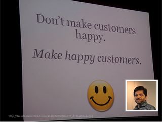
It’s more difficult to make unhappy customers happy than to create happy customers in the first place. The point he’s trying to make is that it’s not just about investing in the product or a world-class customer service team to support it. It should be an end-to-end process, a mindset, a culture.
UX as part of the wider customer experience
Smart companies are now placing customer value at the heart of their organisation by developing a company-wide experience strategy – one that crosses UX, branding and marketing, with the goal of creating a uniform experience for customers across all ‘touch points’ of their company.
Many companies in the past have made the mistake of thinking it was OK if their website wasn’t particularly easy to use because their offline offering made up for it. Unfortunately it’s no longer acceptable to treat your customers in this way and deliver them a sloppy product. Every touch point with your customer is marketing. It’s a competitive world out there and other, more innovative players are looking for opportunities that arise where people are receiving a second-rate experience.
Get the Creative Bloq Newsletter
Daily design news, reviews, how-tos and more, as picked by the editors.
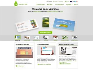
Uniform customer experiences are so rare that when they do happen, they surprise and delight. Companies that come to mind include Ocado, Apple, Innocent Drinks; as well as more recent startups moo.com (the online printers) and Graze.com (healthy snacks by post) – organisations that are passionate about the products they sell and really value their customers. And believe me, it shows.
It’s important to bear in mind though that user experience designers can only do so much. We can’t design away a shoddy product or a poor team. Which leads me neatly into the first common mistake that startups make ...
1. Great experience, wrong product
The right product is simple, compelling, and aligned with the business model. Often, though, you’ll come across websites or apps that look nice and appear on the surface to have a good experience, but as you delve deeper and use them more there’s no obvious benefit to the user. Either the problem you’re trying to solve isn’t actually a big enough problem for many people, or the solution being proposed doesn’t hit the right note to gain significant traction. First make sure that you’re building the right product for your audience before perfecting the experience. And try and explore product-market fit before you do too much design and development. As the saying goes ‘fake it before you make it’.
2. Doing it too late (and half-heartedly)
The return on investment for any UX spend is generally greater the earlier it’s spent on a project, so ideally try and bring it on board from the very start. You really want someone on your team from the outset that has your customer’s interests at heart, with the aim of guiding the direction of the product based on close contact with your early adopters. This should help to minimise the risk of building the wrong product or having to re-design aspects of the system that have already been developed. Embracing UX early means you can make key design decisions while there’s less at stake. Create and iterate low-fi prototypes of the system before you build it to get customer feedback early and often.
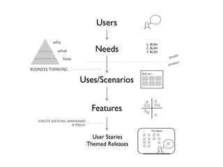
Play around with Lean UX techniques to stimulate collaboration, ideas and momentum. Start with user needs and stories, ensuring any features that are built relate to these. Lean UX takes the more traditional UX design approach but reduces it down to startup speed. Every startup, no matter how small, now has the ability to embrace UX from day one (without it costing the earth).
3. No clear value proposition
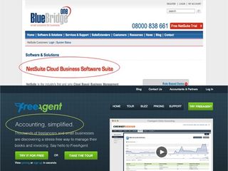
With any relationship it’s important to start the conversation right. If you don’t capture your audience’s attention within the first few seconds you’ve lost them. Creating a clear value proposition is hard, but if you get it right there’ll be a clarity and focus to your message that will help to set you apart from the competition.
When crafting your value proposition really think about the value a user will glean if they are to use your product. The main objective of a value proposition is to turn an unaware visitor into an interested prospect so have this in mind when creating yours. Try to keep it to as few words as possible. ‘Short and deadly’ should be your aim.
4. Lack of focus
If there’s one thing that startups are often guilty of, it’s trying to do too much, too soon. Having a clear focus means it’s easier to communicate what your product is and who’s it for. By trying to appeal to everyone and adding features left, right and centre, you actually dilute your message and could end up with a complex, bloated product.
Take lead from recent success stories such as Dropbox (sharing large files) and Instagram (sharing photos) by doing one thing really well. It’s not as easy as it sounds. Often there can be pressures from customers, investors or other team members, but learning to say no is something you’ll need to get to grips with if you want an intuitive product. Get the core right and you’ll make your life a lot easier.

5. Not enough observation in the wild
Usability testing is something that we all should do more of but never quite get round to it. When was the last time you tested your product with users? Surveys, focus groups and customer interviews are all useful in their own right but not a substitute for one-to-one observation. You’ll gain valuable insight that you may never have otherwise uncovered.
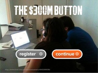
One widely quoted example of where user testing has made a big difference is the ‘$300m button’. A large online retailer discovered that its customers were dropping out from the checkout process of their ecommerce site before paying, so brought in top usability expert Jared Spool to conduct some usability tests. Through observation he discovered that users really took objection to having to create an account before they purchased a product. A common gripe being ‘I’m not here to be in a relationship’.
By changing a button from ‘login’ to ‘continue’, thereby removing the need to create an account prior to checkout, the retailer saw sales jump 45% overnight, resulting in a $300m jump in annual turnover. Not a bad return on investment.
Don’t assume that your product is easy to use and intuitive just because you think it is. You’re probably too familiar with it to be able to make that judgement. It’s time to start testing.
6. Forms from hell
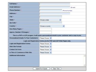
Forms need to be usable in order to help users achieve their goal and often a poorly designed form can be a key reason for users leaving your site.
Almost every website now has a form that requires some input from the user, whether that is an enquiry form, mailing list subscription, ecommerce transaction or sign-up process. It’s vital that you put real thought into each and every one of these interactions, as otherwise users may get frustrated and jump ship to a competitor.
Thankfully since Luke Wroblewski’s groundbreaking book Web Form Design: Filling in the Blanks was released in 2008, website owners and designers have taken form design more seriously.
Often making some small changes to the design of your forms can pay dividends and help to boost conversions.
For instance, don’t just have one long form with 20 fields in it, break it up where possible into logical groups or steps. Also think about whether you really need all the information you’re asking for. Think about the user and what they would be comfortable providing. After all, the more fields you add, the less likely it is they will complete the form. Often the marketing department will ask for as much information as possible, but bear in mind this comes at the risk of a smaller completion rate.
7. Letting developers write copy
Ever felt stupid when trying to perform a task on a website? Ever felt like you’re being shouted at by some unfriendly, red error message on a form? Too often the small bits of copy on a website are neglected and left to developers to write. It seems amazing that such important interactions with a customer can be left to people not known for their people skills (okay, a massive generalisation, but you get my point).
Take control of your microcopy, defined by designer Joshua Porter as: "small yet powerful copy. It’s fast, light, and deadly. It’s a short sentence, a phrase, a few words. A single word. It’s the small copy that has the biggest impact. Don’t judge it on its size … judge it on its effectiveness.”
You can really create a connection with your audience by putting some thought into the smallest details. Carefully craft your copy across the customer journey (from Google search to website and email) to ensure a consistent tone of voice and extend your customer service to each and every touch point. Often adding some informality (and even humour when appropriate) can turn prospects into customers.

8. No story, no personality
Don’t be afraid to humanise your product. Too much of our industry is focused on the functional and usable side of web development, but where possible we should try and inject some personality into our online experiences.
Whether you're building a web app or using your website as a shopfront for your organisation, it's important that you develop a design persona. Whether it's fun, outgoing, serious or strict, by adopting human values and traits you're more likely to create a lasting impression.
9. Technology as a barrier
Too often websites feel like you’re talking to a computer with little thought into the user experience. Don’t let technology become a barrier. Make the technology work for you and where it’s not flexible enough to deliver a first class experience to the user, consider other options. Just because ‘computer says no’, it doesn’t mean you need to accept it. Work with your developers to make it work. Extraneous password requirements, difficult to read ‘CAPTCHAS’ or unfriendly error pages – all very annoying for the user and utterly avoidable.
10. Launching to soon (or too late)
Too many startups spend months (or years in some cases) in ‘stealth mode’, hidden away from prying eyes, only to never release as uncertainty and competition spoil the show. Equally there are others that launch a crappy early version of their product in true lean startup style. However if it’s not ‘minimum awesome’, don’t release it. Make sure there’s a base level of design and usability across all features otherwise you might not get the outcome you’re hoping for.
Getting the balance right between launching early and creating the perfect product is no mean feat, but one that could pay dividends.
In summary
Startups need to embrace UX whatever their budget, and no longer consider it a luxury or something that can sprinkled on like magic dust later on.
Follow these 10 tips and you’ll be on the right track:
- Build the right product before the perfect one
- Involve UX early in the process
- Have a clear value proposition
- Focus, focus, focus
- Test and refine with real users
- Make forms fun
- Microcopy is your friend
- Develop a personality
- Make technology human
- Ship it (and start learning)

Thank you for reading 5 articles this month* Join now for unlimited access
Enjoy your first month for just £1 / $1 / €1
*Read 5 free articles per month without a subscription

Join now for unlimited access
Try first month for just £1 / $1 / €1
The Creative Bloq team is made up of a group of design fans, and has changed and evolved since Creative Bloq began back in 2012. The current website team consists of eight full-time members of staff: Editor Georgia Coggan, Deputy Editor Rosie Hilder, Ecommerce Editor Beren Neale, Senior News Editor Daniel Piper, Editor, Digital Art and 3D Ian Dean, Tech Reviews Editor Erlingur Einarsson and Ecommerce Writer Beth Nicholls and Staff Writer Natalie Fear, as well as a roster of freelancers from around the world. The 3D World and ImagineFX magazine teams also pitch in, ensuring that content from 3D World and ImagineFX is represented on Creative Bloq.


