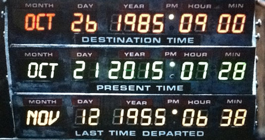
So it's finally arrived. Today, October 21 2015, is the date Marty McFly time-travelled to from 1985, in the much-loved Back to the Future trilogy.
With renewed attention on the series, re-released on DVD in time for the anniversary, we caught up with John Bell, visual effects art director on parts II and III, to find out how he gave the Hill Valley of the future its distinctive look and feel.
In the process, he told us a few things that raised our eyebrows...
01. The first hoverboards were enormous
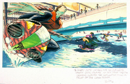
"When I started working on the film we experimented with a lot of different sizes for the hoverboard," Bell explains. "And I sketched out one that was really big, like a wake board or snow board in scale.
"The idea was that skateboarders in the 1980s were personalising their decks with stickers and paint. I thought that these giant boards would offer big canvases – so kids could put wings and random objects on them, as well as personalising them with graphics and stickers.
"So they got really big. But they were too cumbersome. The sequence in the film is relatively short, maybe two and a half mins, and it overpowered the scene; it was too much.
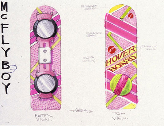
"Once they became whittled down. they kind of became more magical in that you didn't know how they worked but you knew they did work. You couldn't understand the technology but I analogise with a smartphone today. It's so simplistic but there's all this powerful technology inside of it, which makes it that much more magical.
"I think that's why the hoverboards still capture people's imagination. It's something you can't explain but you just think: 'I want to ride that thing and keep riding it'."
02. The future was inspired by the past
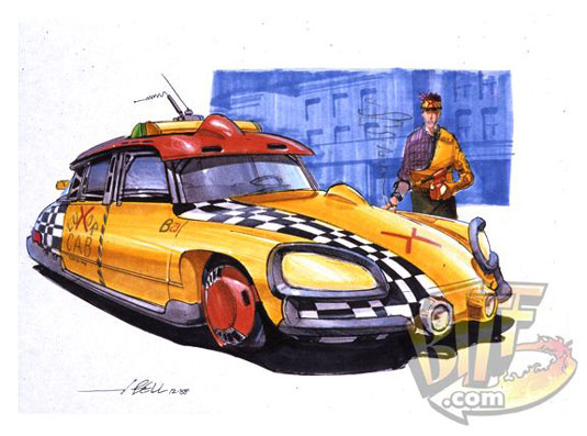
It may sound counterintuitive. But to imagine what the Hill Valley of three decades hence would look like, Bell decided to draw on the past.
"I read that, like me, when Syd Mead started working on Blade Runner he also had to project 20, 30 years into the future," Bell explains. "And so what he did as an exercise was to go 20, 30 years backwards. I thought that was a great idea. Because then you can build a believable evolution of how things would go from one generation to the next.
"I was in love with 50s pop culture, its colour and optimism. So I went back 30 years and looked at fashion, looked at automobiles, looked at city streets - how would they evolve? How would it go from 1955 to 1985 to 2015? And from there I was really able to start to generate stuff that I felt pretty good about."
03. British magazine culture was a big influence
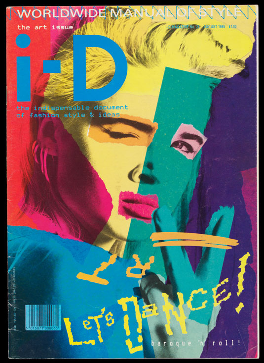
Another surprising influence on the art direction of Back to the Future II was the fashionable British magazines of the 1980s designed by the likes of Ian 'Swifty' Swift.
"I've always been in love with graphics," says Bell, "and a lot of the inspiration for the graphics not only of the 80s cafe but also the hoverboards was how much I loved the English i-D magazine, with the person winking on the cover."
"Back in the 80s, I loved that magazine because the graphic sensibility was so far beyond what was being done here in the States that it really captured my imagination, it really inspired me. So I used that as a source of inspiration for coming up with ideas for the 80s cafe. Another influence was the comic book Akira, which had just come out and which had a design sensibility that I really liked.
04. The Jaws 19 projection wasn't meant to be low-poly
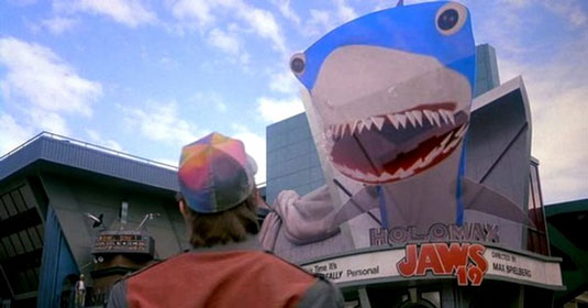
Viewed with present-day eyes, the low-poly 3D projection of a shark in Back to the Future 2 looks pretty clunky. But what many don't realise even in the 1980s, this digital effect was – purposely – primitive.
It all came about as the result of a happy accident, reveals Bell. "Someone from ILM's digital department at the time was starting to construct the sequence, and they called Ken and I into the graphic department. And they said: 'Okay, big disclaimer, what you're going to see is just rough right now, and I want you to take a look at it, just give me your thoughts of where we can go with it'.
"So they pulled up the file and showed us this crazy shark that came out. The polygons were flickering and the eyeballs looked like they were going to fall out and it looked really manic. And visual effects supervisor Ken Ralston and I burst out laughing.
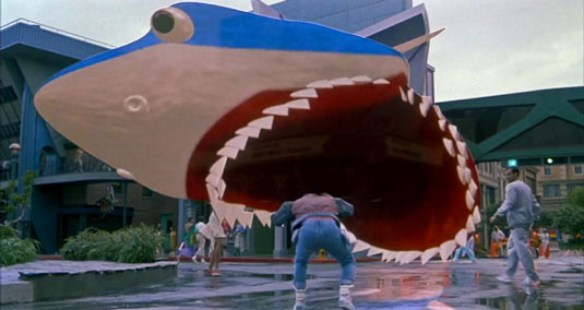
"And they said: 'No no no, you've got to understand, it's just rough right now, we're just starting with it'. But Ken said no, put it on film and ship it down to [director] Bob Zemeckis, it's going to be perfect for this part of the story. And that's how it got into the film.
"So it wasn't supposed to look like that. It was supposed to be a finished shark. But it came out to be this crazy polygonal, flickering monstrosity [laughs]. It was great, it was definitely a happy accident."
05. What the film might look like if it was made today
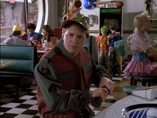
One of the biggest challenges Bell faced was the 1980s cafe; he needed to imagine how people would look back on the decade 30 years later. We reckon he got it pretty much spot-on, so we wondered what Bell thinks a nostalgia cafe 30 years from now would look like?
He responds with gusto. "It'd be a great challenge for sure to project now 30 years into the future, what it's going to be like in 2045 and what we're going to remember in Cafe 2015," he says.
Musing on the task for a moment, though, he concludes it's a tough call. "There's not a strong graphic sense and a strong design sense at this point of time," he says. "Everything's kind of sleek and minimal right now. There isn't a lot of outward expressionism. It's all kind of contained under these glass and digital screens. So perhaps that's the direction I'd go in."
The Back to the Future 30th anniversary trilogy is available to buy on DVD now.
Liked this? Read these!

Thank you for reading 5 articles this month* Join now for unlimited access
Enjoy your first month for just £1 / $1 / €1
*Read 5 free articles per month without a subscription

Join now for unlimited access
Try first month for just £1 / $1 / €1
Get the Creative Bloq Newsletter
Daily design news, reviews, how-tos and more, as picked by the editors.

Tom May is an award-winning journalist and editor specialising in design, photography and technology. Author of the Amazon #1 bestseller Great TED Talks: Creativity, published by Pavilion Books, Tom was previously editor of Professional Photography magazine, associate editor at Creative Bloq, and deputy editor at net magazine. Today, he is a regular contributor to Creative Bloq and its sister sites Digital Camera World, T3.com and Tech Radar. He also writes for Creative Boom and works on content marketing projects.
