Reinventing movie posters – the work of Olly Moss
His unofficial movie posters attract both praise and controversy. We profile the renowned artist who's blurring the lines between professional and fan art.
The art of the movie posters has always been an integral part of filmmaking. Condensing the themes, plot, characters and overall design into one solid image has enabled movie posters to become classic icons in their own right. The work of artists such as Richard Amsel, John Alvin, Saul Bass and Tony Seingiener have all paved the way for modern movie poster designers, with their posters for the likes of Jaws, Flash Gordon and Vertigo all making their way into iconic pop culture imagery.
But what makes a movie poster iconic? There’s been a mix of success stories, with the use of photography, typography and colour all coming into play. Whether it’s an infamous portrait of a Hollywood superstar or a collection of illustrations, one thing is certain – they all spring to mind once the movie’s title is uttered. Often burned onto the public consciousness, the release of a new movie poster is often as anticipated as the film itself.
Over the past few years, designers have latched onto the public’s love for movie posters and controversially started creating their own, totally unofficial movie poster designs. Whilst some claim that such designs are actually better than the real deal, there’s no denying that the artists are using the movie without consent. However, the movie studios have as yet resisting any moves towards enforcing their copyright - possibly operating on the notion that 'all publicity is good publicity' - and have even collaborated with fan artists, Olly Moss being a prime example of this trend.
The work of Olly Moss
Whichever side of the fence you stand upon regarding the legal issues, this kind of work can often bring with it incredible opportunities for the designer in question. One such success story is that of Olly Moss – a quiet, 25-year-old, cards to his chest kind of guy, he has become a cult hero in the world of poster design.
Starting out crafting the kind of designs that often cause uproar within the creative industry, his unofficial offerings soon got him noticed by the right kind of people. However, Moss didn’t start his already impressive career the way some might assume.
Graduating from the University of Birmingham in 2008 with a degree in English literature, he didn’t have any traditional design training before experimenting with illustration.Starting his career creating T-shirt designs for Threadless, Moss quickly amassed a following of fans that cherished his minimal approach - an approach that was transferred to his movie poster reimagining.
Exhibition
Moss was then approached by Gallery 1988 founder Jensen Karp to create a series of illustrations to be displayed and sold at the Los Angeles space. The content of the exhibition was kept secret for months, proving that Moss had already escalated to pop icon stature. Fans even lined the streets 24 hours before opening in hope that they would be able to get their hands on a Moss original.
Get the Creative Bloq Newsletter
Daily design news, reviews, how-tos and more, as picked by the editors.
The exhibition was a stark and refreshing reminder that pop culture art is still very much ‘art’ in its own right. ‘Paper Cuts’ featured 300 laser cut, black Victorian silhouettes of iconic characters from movies, television, music and games, making for an innovative approach to the idea of celebrity and pop culture.
Controversy
Due to the nature of his work, some have accused Moss of creating such well-known portraits and posters purely for profit. However, Moss has been quick to challenge this, stating that his love for these films and characters simply fuels the work – inspiring and influencing him whenever his pen touches paper. Both designer and fan have a huge passion for such themes, which could explain Moss’ growing popularity over the years.
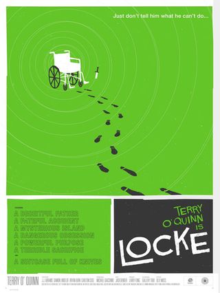
Poster-wise, it was Moss’ Saul Bass inspired creation for Locke’s Secret that got the ball rolling. Simple, striking and full of Moss’ now infamous minimalism, he went on to create a Star Wars series that attracted a mass of attention.
Attention to detail
It’s easy to see why – his creations aim to produce posters that deviate from what we - as fans of each franchise - are used to. The attention to detail is staggering, as Moss focuses on the more refined aspects of the movie in question. It’s no surprise then, that most of his posters sell out within seconds of going on sale, with many a movie buff and design lover eager to bag a product from the pop culture icon.
Moss began selling his posters through Mondo – the infamous gallery and web store that produces limited edition screen printed posters for their favourite movies from a wide range of artists.
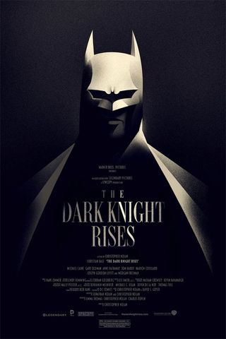
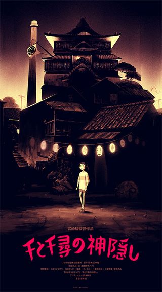
Moss’ designs for the likes of The Dark Knight Rises and Spirited Away proved to be some of their most popular, with many citing their superiority to the film’s original designs. His dabble in comic book heroes led to work with Marvel, who approached Moss to create a cast-led poster for Thor.
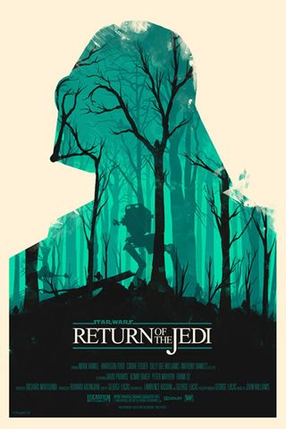
As popular as his posters are, Moss has come under fire for his extremely limited print runs that have caused many a disappointed fan and ridiculously inflated prices on sites such as eBay. However, Moss has said that he is in no way in control of such decisions, with the distributors taking full reign. More popular films will often get a larger print run but that’s purely down to the mass appeal that the design will conjure up.
Size is an issue
Creating his posters in an unconventional 16x24, Moss has also come under scrutiny for not producing the preferred 18x24 size. However, his favoured measurements are actually equal to that of a more traditional, theatrical sheet which perfectly ties in with Moss’ movie inspirations.
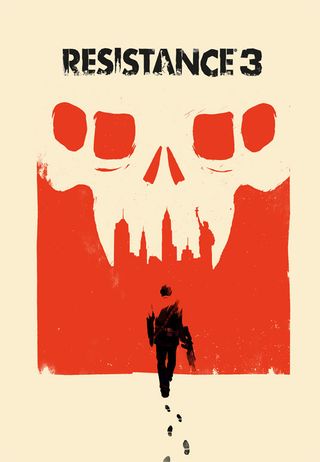
Not only has Moss created posters, exhibitions and T-shirts, he has also gone on to create a cover for Sony’s Resistance 3 game. Blending his impressive use of negative space with his ability to brand, the design was a huge hit with game and design lovers alike.
Despite whispers of taking influence from other artists a little too far, there’s no denying Olly Moss’ influence upon the movie poster industry. His use of minimalism, negative space and attention to detail has created an influx of copy-cats but Moss claims that this only ignites his strive for originality. Producing unique designs for almost any genre, there’s no denying that Olly Moss is certainly the poster child of pop culture art.
Words: Sammy Maine
Delivered in conjunction with ZED!
This content was produced in collaboration with HP & Intel as part of ZED - a Pop-Up Studio for the Creative Community held in Soho, London. For more information about ZED and any future events see here.

Thank you for reading 5 articles this month* Join now for unlimited access
Enjoy your first month for just £1 / $1 / €1
*Read 5 free articles per month without a subscription

Join now for unlimited access
Try first month for just £1 / $1 / €1
The Creative Bloq team is made up of a group of design fans, and has changed and evolved since Creative Bloq began back in 2012. The current website team consists of eight full-time members of staff: Editor Georgia Coggan, Deputy Editor Rosie Hilder, Ecommerce Editor Beren Neale, Senior News Editor Daniel Piper, Editor, Digital Art and 3D Ian Dean, Tech Reviews Editor Erlingur Einarsson and Ecommerce Writer Beth Nicholls and Staff Writer Natalie Fear, as well as a roster of freelancers from around the world. The 3D World and ImagineFX magazine teams also pitch in, ensuring that content from 3D World and ImagineFX is represented on Creative Bloq.
