A practical guide to tactical mobile prototyping
Rachel Hinman's book The Mobile Frontier went on sale a couple of weeks ago. We present an exclusive excerpt that looks deeper at one method of mobile prototyping: tactical prototyping
This is an edited excerpt from Chapter 6 of The Mobile Frontier: A Guide For Designing Mobile Experiences, published by Rosenfeld Media.
Regardless of the 'why' for your particular prototype, selecting the right prototyping method for your mobile UX project is a lot like selecting a good book. There are countless options to choose from, so how do you pick the right one? Similar to asking yourself, “What type of book am I in the mood for?", the first step in identifying the right prototyping method involves asking, “What type of design exploration am I about to embark on?”. Unlike selecting the right reading material from countless book genres, mobile prototyping methods tend to fall into two basic genres: 'tactical' (which we will look at in the below excerpt) and 'experiential' prototyping.
While I’ve categorised mobile prototyping into the two genres – tactical and experiential – there’s nothing to stop you from 'crossing the streams'. For example, it’s perfectly fine to use an experiential prototyping method, such as storyboarding, in a more tactical-type project and vice-versa. However, identifying the nature of the project you are taking on is the first point in your mobile UX decision-making process. It will help you identify the design prototyping methods that are best suited for your project and will likely prove most valuable to you as you embark on designing for the mobile medium.
Tactical prototyping
The three tactical prototyping methods I find myself turning to repeatedly and which have proved to be the most valuable are:
- Sketching
- Paper Prototyping
- Interactive On-Device Prototyping
Sketching
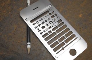
There are few things more direct and efficient than running a pen across paper, and that’s what makes sketching such a powerful design skill and prototyping method. Whether it’s on a whiteboard, recipe cards, or using custom platform UI stencils and sketchpads, sketching is by far my favorite form of prototyping because it’s direct, generative, inexpensive, and
allows you to explore ideas with a low level of commitment. Because of its generative properties, sketching is the perfect activity during the divergent phases of any design project. I use sketching to work through rough ideas for screen flows and layouts, and I find that it’s an activity best suited for communicating screen-based experiences.
Mobile templates
Can’t draw? Not a problem. Most mobile software platforms have stencils that can be purchased online. These stencils are lifesavers if you are self-conscious about your sketching abilities. For a relatively low financial investment, they come in handy for anyone interested in putting mobile ideas on paper quickly.
Sketching and ruthless editing
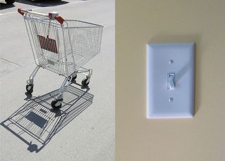
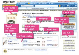
Sketching out your ideas early and often is a key step in creating intuitive interfaces that 'speak their power'. An intuitive interface, for any medium, has long been the hallmark of a good user experience. However, the inherent cognitive constraints of mobile design make it even more important to create intuitive interfaces. Great mobile interfaces are like a light switch or a shopping cart. They speak their power.
Get the Creative Bloq Newsletter
Daily design news, reviews, how-tos and more, as picked by the editors.
UIs that speak their power have affordances that invite exploration; their very design provides user with interaction cues. Compare the differences between a Web page designed for a PC experience and a similar experience tailored for a mobile device. The large screen real estate of a PC experience enables more room for annotating expectations. In mobile, options have to be readily apparent. The design elements must instantly communicate to the user how to engage with them.
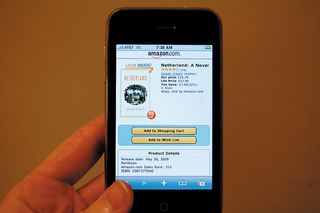
In order to create interfaces that speak their power, designers new to mobile must grow ruthless editing skills. Ruthless editing is about getting rid of extraneous text, visual treatments, and goofy transitions. It’s about combining all the design elements – screen design, interactions, transitions, flows, visual treatments, haptics, and sound – in order to guide people through information quickly and intuitively. Just like a topiary artist pruning an overgrown tree into the shape of an elephant, ruthless editing is about taming the chaos and being able to make the cuts necessary in order for a vision to take form. Ruthless editing is about making good decisions. It’s about learning to say no.
Visualising data on a small screen
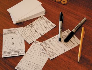
Learning how to visualise data efficiently on a small mobile screen is an important mobile skill to master. Sketching on index cards early in your design process is a practice that will enable you to experiment with different ideas while simultaneously giving you realistic size constraints.
Paper prototyping
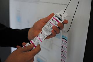
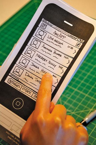
A paper prototype is basically a paper model of your screen-based product or service. Similar to sketching, paper prototyping requires a modest time and small financial investment while providing you with the means to work generatively and iteratively on your designs. Paper prototyping is a great technique for working through the details of screen flows and sequencing, as well as validating decisions about screen layout, button placements, and rough ideas for touch and gesture.
The thing I like best about paper prototypes is that they are a tangible way of testing out your interaction ideas with users and gathering feedback at an early stage in the design process. For designers new to mobile, paper prototyping is an ideal way to take your design assumptions for a test run early and often – and prevent the end of your project from feeling like a death march. A paper prototype can provide the opportunity for a quick iteration of a single concept or the ability to simultaneously work through several design directions.
Paper prototyping basics
Paper prototypes are a great way to work through your design ideas early in your design process. The steps outlined below will help you create paper prototypes with ease.
1. Determine the key interactions: Chances are that it’s not necessary to create a paper prototype of a complete mobile application or website. Instead, you’ll probably want to prototype key interactions. The first step of the paper prototyping process is to identify the key interactions you want to prototype and the central questions you want the prototype to answer.
2. Sketch screen layouts: Next, determine the types of screen layouts that will best convey information to your users. Whether you use index cards, specialised paper templates or higher-fidelity comps created on a computer, this step is about determining how to convey information and intuitively pivot people through a series of screens in order to get them to the information they need.
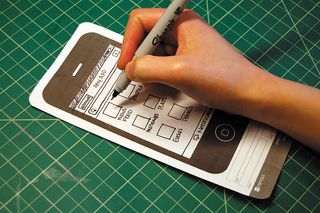
3. Determine the screen flow/sequencing: Map out individual screen layouts and the flow of those screens. It’s the process of identifying what goes where and what the users will see as they navigate through the system you’re creating. This process will help you identify primary and secondary navigation elements and how to most efficiently map out the underlying system of the key interactions.
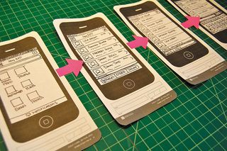
4. Prepare interactive elements: Paper prototypes enable you to fake some level of interactivity. Feel free to include and create elements such as text entry, keyboards, alerts, highlighting, and pickers in your prototype. It will help you get a more accurate sense of the user experience.
5. Take your prototype for a test run: Once you’ve created all the elements, take your prototype for a test run with colleagues or friends. Identify what’s working and what needs further refinement or modifications.
Paper prototyping and touchscreens
In recent times, modern smartphones have moved away from interactions instigated by physical buttons like four-way keys and dial pads in favor of touchscreens and gesture-based interactions. This is a trend that will probably not change anytime soon. Making the move from GUI, mouse-based interactions to touchscreen/gesture- based interactions can pose an unexpected and significant challenge for designers new to mobile. Paper prototyping is a great method for working through the key differences between NUI and GUI paradigms.
Interactive on-device prototyping
To this day, I still get a little giddy when I see an early on-device prototype of my mobile design work. There’s something about seeing all the elements – the screen layout, the interaction flows, the gestures – come together that’s … well, it’s exciting and a little magical. Part of that magic comes from the fact that unless you have some serious mobile programming skills, actually getting your design work on a device and experiencing it has historically been a challenge. While getting an on-device prototype up and running has its hurdles, there are significant benefits. Aside from that totally awesome feeling of seeing your work on a device, on-device prototypes enable you and others to critically evaluate your design decisions. As mobile UX becomes more prevalent, viewing your early design work on a mobile device will likely get easier. Until then, here are some on-device methods to try:
- In-screen mobile prototype
- Mobile browser prototype
- Mobile prototype using presentation software
- Platform specific prototype
In-screen mobile prototype
An in-screen prototype is basically a paper prototype that’s ported into a mobile device by snapping photos of the screens with the device’s camera. Creating an in-screen mobile prototype entails creating low-fidelity sketches, importing them into a mobile device, and viewing them through an application such as a slideshow on the mobile device’s camera.
Mobile browser prototype
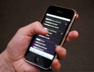
A browser prototype is simply a prototype that is rendered by using your mobile device’s browser, which is using HTML and other browser-based programming such as JavaScript. Screens can be created using HTML, which is potentially a great option, particularly if you’re building a mobile website and are proficient in HTML. However, for those less familiar with extensive markup, you can easily upload a series of linked image maps of screen layouts and view them through your phone’s browser.
Mobile prototype using presentation software
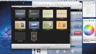
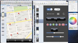
Creating prototypes using presentation software such as Apple Keynote or Microsoft PowerPoint is an efficient way to prototype interactivity and transitions on a mobile device. You can easily download platform components from the web, build your prototype using the presentation software, fine-tune the interactions and transitions included in the software, and download the file to your mobile device.
While designers use various types of tools to document their wireframe ideas, presentation software is emerging as a favourite tool in the mobile UX realm. In addition to specifying the placement of design elements on a screen, presentation software enables designers to turn their work into low-fidelity on-device prototypes. Instead of flat, static documents, presentation software offers designers the ability to experiment with transitions and interactivity.
Keynotopia is a fabulous resource for Keynote prototypers. The site’s creator, Amir Khella, has put together a truly useful collection of templates sporting a comprehensive collection of standard controls and widgets. Just drag these visual elements into place to build mock-ups that will run on a mobile device. Travis Isaacs also has created a great online resource for creating prototypes with presentation software like Keynote. His website, Keynote Kungfu, contains great resources for creating on-device prototypes.
Platform-specific prototype
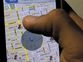
If you’re the type of designer who likes to roll up his sleeves and get into the code, then investing in the SDK (software developer kit) and creating your prototype using the programming language of a target platform might be the way to go. This approach allows you to create prototypes using native code, and while labour intensive, it provides the most interactivity of any prototyping method.
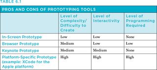
Pros and cons of common on-device prototyping tools
Although getting an interactive prototype up and running on a device is no small task, it is possible. The below table should help you get a sense of the benefits and drawbacks of common mobile prototyping tools, as well as help you determine what type of prototype is best given your project’s resources.
In-screen prototype basics
I’m a sketcher, not a coder, so in-screen prototyping is my favourite on-device prototyping method. While it’s not great for expressing detailed interactivity and transitions between screens, it’s an easy way to get your work on a device quickly. Here are the basics as outlined by Diego Pulido in his article published by UX Magazine:
1. Sketch screen layouts:
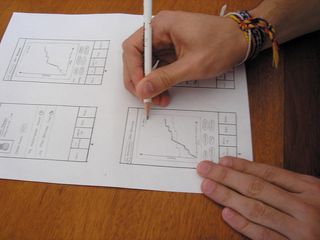
2. Scan or photograph the sketches:
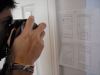
3. Make any necessary sizing adjustments to the files:
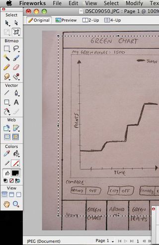
4. Save the resized images in a file format supported by the mobile device. Organise all the screen images into the correct order for the scenario. Be mindful of the sequencing of your screens and label files accordingly.
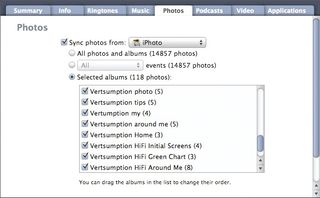
5. Import the files into the mobile device’s photo gallery:
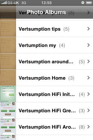
6. Click and swipe away:
This is an edited excerpt from Chapter 6 of The Mobile Frontier: A Guide For Designing Mobile Experiences, published by Rosenfeld Media. Please use the discount code NETMAG12, good for 20% off all products purchased from Rosenfeld Media

Thank you for reading 5 articles this month* Join now for unlimited access
Enjoy your first month for just £1 / $1 / €1
*Read 5 free articles per month without a subscription

Join now for unlimited access
Try first month for just £1 / $1 / €1
The Creative Bloq team is made up of a group of design fans, and has changed and evolved since Creative Bloq began back in 2012. The current website team consists of eight full-time members of staff: Editor Georgia Coggan, Deputy Editor Rosie Hilder, Ecommerce Editor Beren Neale, Senior News Editor Daniel Piper, Editor, Digital Art and 3D Ian Dean, Tech Reviews Editor Erlingur Einarsson and Ecommerce Writer Beth Nicholls and Staff Writer Natalie Fear, as well as a roster of freelancers from around the world. The 3D World and ImagineFX magazine teams also pitch in, ensuring that content from 3D World and ImagineFX is represented on Creative Bloq.
