Make your mobile site 70 per cent faster
From keepalives to HTTP compression, follow Joshua Bixby’s 12 techniques to optimise your site for mobile.
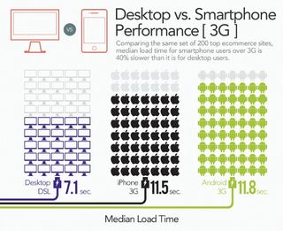
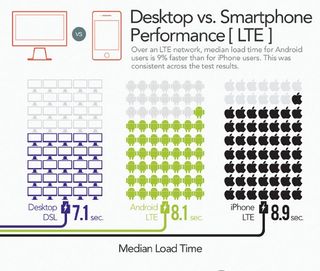
As mobile use is poised to overtake desktop use within the next year, there's a serious disconnect between users' performance expectations and performance reality. Three out of four mobile website users say they're willing to wait five seconds or less for a page to load (Gomez, 2011), yet a recent survey of top ecommerce sites found that the average site took 8.9 seconds to load over an LTE network and 11.5 seconds over 3G (Strangeloop Networks, 2012).
Site owners have tried to offset this disconnect by offering mobile-only versions of their websites, with limited success. Up to one third of mobile users will opt to visit the full site when given the option. Shoppers who stay on the mobile website generate less revenue than those who visit the full site: just 14 per cent compared to 79 per cent generated by mobile shoppers on the full site, and seven per cent via the mobile app (Strangeloop Networks, 2011).
Clearly, the onus is on site owners to ensure a speedy user experience across the board, despite performance constraints that are outside their control, such as inconsistent networks and low-powered devices.
Five performance culprits
To understand how to fix performance, first you understand the five primary performance culprits:
- Too many connections
- Too many bytes
- Too many server round trips
- Poor resource caching in the browser
- Third-party calls (marketing tags, analytics, ads)
These aren't just mobile problems. Desktop users suffer, too. But the impact on mobile is felt much more deeply. While many of the solutions outlined in this article are good practices for any site served to desktop and mobile, some are unique (and hard-won) solutions developed specifically for mobile. All will deliver significant benefit to mobile visitors.
Core optimisation techniques
Don't do anything until you've addressed these two best practices. These are the low-hanging fruit on the performance tree, but it's astonishing how often they're neglected. In a recent survey of 2,000 top ecommerce sites, 13 per cent of sites did not enable keepalives and 22 per cent failed to implement text compression (Radware, 2013).
01. Enable keepalives
The problem: TCP connection is the process by which both the user and the server send and receive acknowledgment that a connection has been made and data can begin to be transferred. Too many TCP connections will slow sites down.
To find out if your site has this problem, run a URL from your site through a performance testing tool and get its keepalive score. Try WebPagetest (www.webpagetest.org), which is a free online tool supported by Google. If the keepalives are anything less than an A, then take a look at your site's waterfall chart. If you see a lot of orange bars, you have a problem that could be fixed by using keepalives.
The solution: While it's not easy to speed up a TCP connection, you can control how many times the connection takes place. Make sure you have the proper configuration on your servers and load balancer. Also, a number of content delivery networks don’t do keepalives properly, so keep your eyes open for lots of orange bars on content coming from your CDN.
02. Add HTTP compression
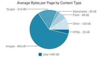
The problem: According to the HTTP Archive, the average web page is now well over 1MB in size. That’s a massive payload, especially for mobile.
The solution: Compressing resources can reduce the number of bytes sent over the network. Compressing text-based content (HTML, CSS, JavaScript) isn’t the only way to reduce your payload, but it's one of the easiest. As with keepalives, first test your site and get its compress text score, then check out its waterfall chart. If your page scores lower than an A, or you see a lot of bright blue bars on your waterfall, you have a problem that could be fixed through compression. Make sure your site follows Google's best practices for compression.
Intermediate optimisation techniques
Once you've nailed the low-hanging fruit, this set of techniques should be next on your list.
03. Compress images
The problem: Images account for a full 60 per cent of the average web page's payload. In my travels, I regularly see sites that use unoptimised and unnecessarily bulky images. Combating this bulk is a huge step toward making pages faster.
The solution: I can't stress enough the importance of ensuring your images are saved in the optimal compressed format. These formats are:
- Photos - JPEG, PNG-24
- Low complexity (few colours) - GIF, PNG-8
- Low complexity with transparency - GIF, PNG-8
- High complexity with transparency - PNG-24
- Line art - SVG
But it's not enough to use the right format. Whatever tool was used to create the graphic won’t save the file in the most efficient way, which is why you need to pass all images through a compression tool. (See the sidebar for a list of tools to consider.) After compression, you can typically expect to see a 10-40 per cent decrease in file size, without any noticeable sacrifice to image quality.
04. Minify JavaScript and CSS
The problem: A page's source code can contain a lot of unnecessary characters – such as spaces, new line characters, and comments - and these can consume bandwidth and cause additional latency.
The solution: Minification, which is usually applied only to scripts and stylesheets, eliminates inessential characters. On average, minified files are reduced by about 20 per cent. Minification can also mean the difference between a cacheable object and one that is too big for the cache on a particular mobile device.
05. Consolidate resources (images, CSS, JavaScript)
The problem: Latency can kill a page's performance right out of the gate. In web performance circles, latency is the amount of time it takes for the host server to receive and process a request for a page object. The amount of latency depends largely on how far away the user is from the server, but it's typically 75-140 millisecond per object for desktop users and up to a full second per object for mobile users over 3G. When you consider that a typical web page contains around 100 objects, you can see how these milliseconds pile up.
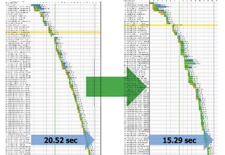
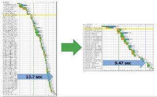
The solution: Consolidating similar page resources into bundles is an effective way to battle latency: fewer bundles equals fewer server round trips. As an example, take a before-and-after look at a page with 92 objects. Before consolidation, the page had a start render time of more than six seconds, meaning that it took that long for content to begin displaying in the mobile browser. After consolidation, the number of objects was reduced to 34, and the start render time was cut almost in half to 3.656 seconds.
Warning: Resource consolidation can be a double-edged sword for mobile browsers. Reducing requests speeds up page load the first time, but larger consolidated resources may not be cached efficiently for repeat visitors. If you're using this technique, make sure to balance it with techniques to optimise local storage.
06. Optimise localStorage
The problem: Caching is an essential technique for improving load times for repeat visitors, or for visitors who view multiple pages during a single visit, but desktop and mobile caches are not created equal.
Traditional browser caching doesn't work well for mobile devices. Mobile browser caches are usually much smaller than desktop browser caches: about 5-7MB on Android devices and 50MB for iOS compared to 250-700MB for desktop browsers. Page resources are flushed quickly, sometimes within a single visit.
The solution: While mobile browsers are getting better, they're still not where we want them to be. One positive development is the HTML5 Web Storage specification, which has been implemented in all major desktop and mobile browsers, providing a great alternative to relying solely on browser caching.
Because HTML5 localStorage is programmable and scriptable, it can be used for whatever you want, including acting as a programmable object cache. LocalStorage is typically good for caching CSS and JavaScript, especially site-wide files. LocalStorage can also be used for small images using the Data URI scheme.
07. Defer non-essential resources
(eg third-party scripts for ads, analytics, social widgets, etc)
The problem: Parsing JavaScript can take up to 100 milliseconds per KB of code on some mobile devices. Worse, poorly optimised script for ads, social media widgets, or analytics support can add precious seconds to load times and sometimes completely block a page from rendering.
The solution: Defer as much as possible until after onload. The scripts to defer could be your own, or they could be scripts from third parties. Many script libraries (such as scripts that support interactive user behaviour, such as drag and drop) aren't needed until after a page has finished rendering. Downloading and parsing these scripts can be deferred until after the onload event. The same logic applies to script execution.
You'll also want to carefully evaluate the use of large script frameworks like jQuery for mobile sites, especially if you are only using a couple of objects in the framework.
Advanced optimisation techniques
After you've successfully implemented the core and intermediate best practices, there are still a few things you can do to squeeze every last drop of performance from your pages.
08. Convert click events to touch events
The problem: Have you ever noticed the delay between the time you tap your screen and page activity? On touchscreen devices, the onclick event doesn't fire immediately. Instead, the device waits up to half a second (300 milliseconds on most devices), giving the user a chance to initiate some other gesture instead of a click.
The solution: To fix this, use the touchend event instead, which fires immediately when the user taps the screen. You may still want to handle the onclick event to ensure that the browser changes the appearance of the button to show a clicked state, and to support browsers that don't handle touch events. To prevent duplicate code execution when both touchend and onclick code fire, add a click event handler that calls preventDefault and stopPropagation if the click was the result of a user tap already handled by touchend.
09. Suppress redirects
The problem: When users try to navigate to a standard desktop site from a mobile device, this often generates an extra round trip to the client and back to the mobile site, consuming several hundred milliseconds over mobile networks.
The solution: For obvious reasons, it's faster to deliver the mobile web page directly in response to the original request, rather than delivering a redirect message that then requests the mobile page. As a courtesy to users who prefer to view the desktop site on their mobile device, you can provide a link on the mobile site that signals your application to suppress this behaviour.
10. Implement network-sensitive
(3G vs Wi-Firesource preloading)
The problem: Preloading resources in the user's browser, in anticipation of their visiting additional pages on your site, is a great technique for desktop users, where bandwidth isn't an issue. But for mobile users, preloading can eat up precious (and expensive) bandwidth.
The solution: Preloading should be used only when combined with code to detect the type of mobile connection. On Android 2.2+, the navigator.connection.type property returns values that allow you to differentiate Wi-Fifrom 2G/3G/4G connections. On Blackberry, you can check the value of blackberry.network to get similar information. In addition, server-side detection of user-agent header data or other information embedded in requests can alert your application to the type of connection in use.

11. Resize images
The problem: I'm filing this under advanced techniques because it's tricky to implement - especially for large, complex, dynamic sites - but it's a critical performance challenge. As I've already mentioned, images account for a huge portion of a typical page's payload, which is crippling for mobile, not to mention completely unnecessary for smaller screens.
The solution: Don't waste bandwidth by relying on the browser to scale a high-resolution image into a smaller width and height. Instead, dynamically resize images in your application, or replace images with smaller versions for mobile sites.
Another option is to load a very low-resolution version of an image initially to get the page up as quickly as possible, and then replace that with a higher-resolution version on the onload or ready event, after the user has had a chance to begin interacting with the page.
12. Simplify pages with HTML5 and CSS3
The problem: There's no real problem here, per se. This technique is a pure optimisation play.
The solution: The HTML5 specification includes new structural elements, such as header, nav, article, and footer. Using these semantic elements yields a simpler and more efficiently parsed page than using generic nested div and span tags. A simpler page is smaller and loads faster, and a simpler DOM means faster JavaScript execution. The new tags are quickly being adopted in new browser versions, including mobile browsers.
Similarly, new CSS3 features can help create lightweight pages by providing built-in support for things like gradients, rounded borders, shadows, animations, transitions and other graphical effects that previously required you to load images.
Take away
No matter what evolutionary leaps we make in mobile technology, web pages are only going to grow bigger and more complex. To keep pace and maintain some semblance of control, we need to continue to innovate our practices for optimising directly at the page level.
Words: Joshua Bixby
Joshua Bixby is vice president of application acceleration at Radware. He blogs about web performance issues and trends at webperformancetoday.com, where he also hosts a weekly podcast.
Liked this? Read these!
- Our favourite web fonts - and they don't cost a penny
- Choose a website builder: the best tools
- Free tools to help you send large files to clients
Got a great mobile design tip? Share it in the comments!

Thank you for reading 5 articles this month* Join now for unlimited access
Enjoy your first month for just £1 / $1 / €1
*Read 5 free articles per month without a subscription

Join now for unlimited access
Try first month for just £1 / $1 / €1
Get the Creative Bloq Newsletter
Daily design news, reviews, how-tos and more, as picked by the editors.
The Creative Bloq team is made up of a group of design fans, and has changed and evolved since Creative Bloq began back in 2012. The current website team consists of eight full-time members of staff: Editor Georgia Coggan, Deputy Editor Rosie Hilder, Ecommerce Editor Beren Neale, Senior News Editor Daniel Piper, Editor, Digital Art and 3D Ian Dean, Tech Reviews Editor Erlingur Einarsson, Ecommerce Writer Beth Nicholls and Staff Writer Natalie Fear, as well as a roster of freelancers from around the world. The ImagineFX magazine team also pitch in, ensuring that content from leading digital art publication ImagineFX is represented on Creative Bloq.
