Get started with mobile SEO
Optimise your site for its mobile audience and make the most of the mobile search opportunity: Aleyda Solis shows the way
If you're not currently preparing your website to make the most out of mobile search, then you're missing a trick – and your users aren't getting the best possible experience. But don't worry, there are a number of steps you can begin taking right now in order to rectify the situation – beginning with analysis, moving on to site design and optimisation and finally making sure you're keeping track of the ongoing situation.
The initial mobile SEO analysis
In order to have the necessary information to develop and optimise your mobile site according to your specific characteristics, it is important to first identify the type of activity of your present site and mobile audience, by analysing the following:
1. The current behaviour of your mobile audience
The first thing to do is to find out how mobile users are behaving on your site and how they're searching on Google.
What is the present volume and trend of mobile traffic in your site? Does your site already have enough visits to compensate the development of a mobile version? Which keywords are used to search for your site, and which pages are attracting organic mobile traffic?
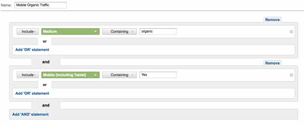
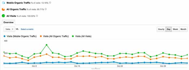
Use Google Analytics to find out. Create an advanced segment in Google Analytics to easily identify the behavior of users that have arrived to your site through mobile search engines’ results:
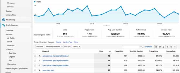
By going to Traffic Sources > Sources > Search > Organic with the Mobile Organic segment selected, you can visualise the keywords that your mobile users have used to access to your site:
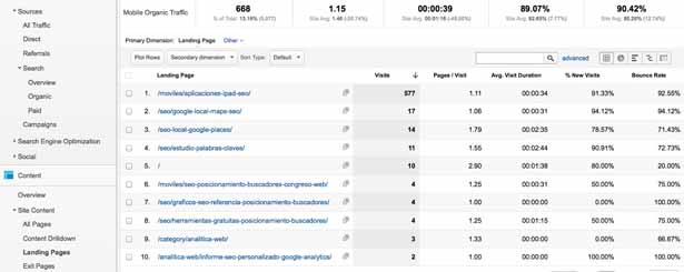
You can also see which pages have been attracting organic mobile traffic by going to Content > Site Content > Landing Pages:
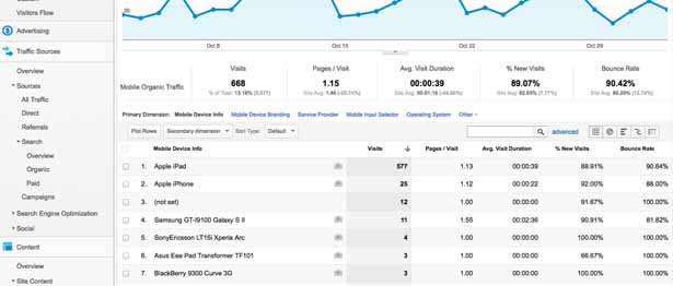
Make sure you identify which are the most popular devices used by your mobile organic audience – and their related characteristics such as operating system, screen resolution and so on – by going to Audience > Mobile > Devices:
Take a look at the difference between the Mobile Organic Traffic, All Organic Traffic and All Visits volume:
Get the Creative Bloq Newsletter
Daily design news, reviews, how-tos and more, as picked by the editors.
How does your audience search for your products or services in the tablet or smartphone version of Google? What’s the volume of searches? Which are the used keywords? Do they provide an opportunity to grow?
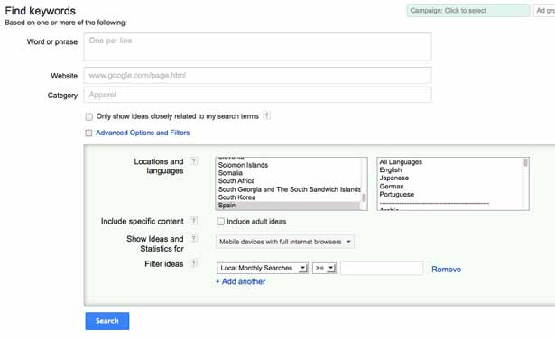
Use Google AdWords Keyword Tool filters to verify this information by selecting to show only the data for mobile devices:
2. The present behaviour of your mobile site
Besides the behaviour of your audience, you need to look at how your site is already shown in mobile devices. For this it’s recommended that you find out how your site appears in Google's mobile search results, and also look at how it actually appears on mobile devices.
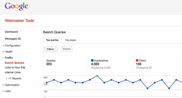
Verify the top queries and pages of your site in Google’s mobile search results using Google Webmaster Tools by going to the Traffic > Search Queries option and choosing the Search: Mobile filter:
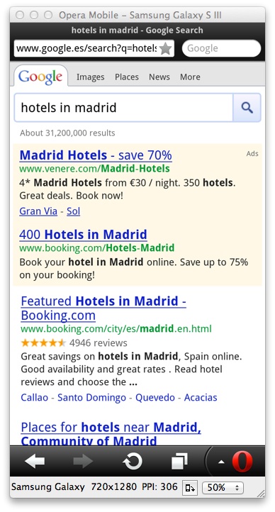
You can also use mobile emulators, such as the Opera Mobile Emulator to check how your pages are displayed in Google’s mobile search results:
Check how your site, especially the top pages visited by mobile users, is displayed in those mobile devices that are used by your mobile audience with mobile emulators such as the Opera Mobile Emulator or Screenfly:
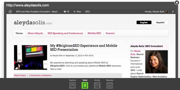
3. Your online business characteristics
After you have checked how your organic mobile audience is already visiting your site, searching for your business related keywords and how your present website is displayed in the mobile search engine results and in relevant mobile devices you can continue identifying your own online business mobile requirements and restrictions to choose the best alternative for your mobile site:
Content requirements. Do you have specific content, products or services to offer to your mobile audience? Take a look at the terms used by your present mobile users and the ones from your mobile keyword research to verify if your mobile users look for specific – maybe localised – information. It’s fundamentally important to plan the development of your mobile-focused content if you still don’t have it.
Technical restrictions. In order to see which mobile site option is the better suited for your situation it is also important to determine your capacity to technically implement the different alternatives.
The three most important questions to answer are:
- If you don't already have a responsive design, do you have the right CMS to implement one?
- Can you dynamically serve different HTML on the same URL?
- Can you implement HTTP 301 redirects?
Develop and optimise your mobile site
In general there are three ways to implement a mobile site:

A responsive site is the solution preferred by Google, but we include the others because they be a better fit for your particular circumstances or those of your users (see more on this here). All of the three options have pros, cons and specific aspects you need to take into consideration from an SEO perspective; nonetheless, there are also general SEO recommendations that are fundamental for any of them:
Mobile content relevancy
Make sure to optimise or create content taking into consideration the keywords used by your mobile audience, prioritising those with the highest relevancy to your business and search volume, especially those that are already providing traffic.
Use Schema.org to specify your business, reviews, ratings, places, events, breadcrumbs, etc. in your HTML.
Mobile content popularity
Enhance your mobile content popularity by attracting links, references, citations, especially from highly relevant and authority sources, such as local news sites, blogs, social networks and so on.
Remember to make the most out of Google’s own social platform, Google+ by creating presence for your business. This will help you to obtain more visibility in Google’s result pages.
Mobile user experience
Keep a consistent design in both your mobile and desktop interface, so users can easily browse your site in any of them.
Additionally, keep into consideration the possible restrictions to visualise or play some type of technology from mobile browsers, such as Flash.
Mobile pages speed
Optimise the speed of your mobile site (remember that mobile devices may have bandwidth restrictions) using the Mobile filter of PageSpeed Insights to easily see which are the aspects with room for improvement.
Besides the general SEO recommendations, the following are specific characteristics and SEO guidelines for each mobile site alternative:
1. Responsive web design
You can adapt the desktop version of your site to correctly fit mobile devices' interfaces, thanks to CSS media queries.
The pros:
- There is no content duplication. Desktop URLs with their content will be also shown to mobile users.
- It's easier and cheaper to maintain.
- Popularity consolidation –with one URL for both desktop and mobile versions you can take advantage of previous link building efforts for the desktop site.
- There is no need to implement redirects.
The cons:
- Possible need of a redesign to implement the responsive design.
The SEO recommendations that you especially need to take into consideration for mobile sites using responsive web design are:
- Allow search engines to crawl the pages' assets (CSS, JS, images).
- Beware of elements that might not display effectively in mobile browsers (large images, videos, scripts and so on).
- Use a CMS or framework (such as Bootstrap or Foundation) to facilitate the implementation of a responsive web design.
2. Dynamic serving
The server needs to respond with a different HTML on the same URL, depending on the user agent requesting the page. This means that mobile users and search engines bots should see a different, mobile–specific HTML version.
The pros:
- There’s no content duplication risk, since both the mobile and the desktop site versions will be shown through the same URLs.
- Popularity consolidation – with one URL for both desktop and mobile versions you can take advantage of previous link-building efforts for the desktop site.
- More flexibility to differentiate mobile content, since the mobile site's HTML will be different to that of the desktop one.
The cons:
- Higher technical complexity to implement due to the user agent identification and dynamic serving.
- Higher maintenance effort and costs with two HTML versions for every page – one for desktop and one for mobile – delivered in the same URL.
The SEO recommendations that you particularly need to take into consideration for mobile sites using dynamic serving are:
- Use the Vary HTTP header User-Agent to help Googlebot to discover your mobile-optimised content faster.
- Beware of cloaking by making sure you’re providing the same content to mobile users and search engine’s bots:
- Verify the HTML that is delivered to Googlebot mobile with Google Webmaster Tools' Fetch as Google option, using the Mobile: Smartphone visualisation.
- Verify the HTML that is shown to mobile users with mobile emulators.
3. Parallel mobile site
Create a parallel mobile version under an 'm' subdomain, reflecting the desktop web version but with a design and content targeted to mobile users, 301-redirecting users and bots to their appropriate versions.
The pros:
- Easier to implement than responsive web design and dynamic serving.
- The possibility of differentiating mobile content.
- More mobile-targeted user interface.
The cons:
- There is a content duplication risk – the mobile version could show the same content as the desktop one.
- Split of link popularity between two URLs for each page, the mobile and desktop version.
- Higher maintenance effort and costs because there are two URLs for every page.
The SEO recommendations that you particularly need to take into consideration for parallel mobile sites are:
- Enable a consistent URL structure under the 'm' subdomain, following the same nomenclature used in the desktop version.
- Use HTTP 301 redirects to refer mobile users and bots to the mobile web version and the desktop ones to their appropriate desktop version.
- Add Link rel=”alternate” tags in the desktop URLs pointing to their corresponding mobile URLs and Link rel=”canonical” tags in mobile URLs pointing to desktop ones.
- Include a link to the relevant desktop pages from their mobile versions.
- Generate a XML mobile sitemap, including the site’s mobile-specific URLs.
Measure your mobile SEO activity
Since SEO is a long-term strategy focused on conversion, it’s fundamental to track its results every month with the same tools used at the beginning of the process: Google Webmaster Tools to verify the pages and keywords visibility in search results and Google Analytics to check the organic mobile traffic per keywords and pages.
Remember: the ultimate goal of an SEO process is to achieve a high return on investment, so it’s important to verify that the long-term benefits are higher than the process related costs.
Conclusion
Mobile search represents a highly attractive opportunity for your online business, but it’s fundamental that you establish an effective, well-optimised mobile presence suited to your characteristics, restrictions and requirements.

Thank you for reading 5 articles this month* Join now for unlimited access
Enjoy your first month for just £1 / $1 / €1
*Read 5 free articles per month without a subscription

Join now for unlimited access
Try first month for just £1 / $1 / €1

The Creative Bloq team is made up of a group of art and design enthusiasts, and has changed and evolved since Creative Bloq began back in 2012. The current website team consists of eight full-time members of staff: Editor Georgia Coggan, Deputy Editor Rosie Hilder, Ecommerce Editor Beren Neale, Senior News Editor Daniel Piper, Editor, Digital Art and 3D Ian Dean, Tech Reviews Editor Erlingur Einarsson, Ecommerce Writer Beth Nicholls and Staff Writer Natalie Fear, as well as a roster of freelancers from around the world. The ImagineFX magazine team also pitch in, ensuring that content from leading digital art publication ImagineFX is represented on Creative Bloq.
