The best tools for mobile app development
Creating super fast, responsive, mobile apps with web standards has never been easier. Compose the right technology stack for your next mobile project with Brian LeRoux’s comprehensive guide.
The mobile web is emerging as something powerful and disruptive. Everything old is new again on a smaller screen with a sketchy battery and the likelihood of lost connectivity. It's tricky to know how to get started.
This article will provide you a high level view of the available tools, frameworks and libraries to help you get started with more confidence. The good news is that the mobile web isn't really much different from the regular web tools, libraries and frameworks. The bad news is that the performance characteristics and testing requirements are wholly different.
DOM frameworks
Building anything for the mobile web with any interactivity requires the language of the web, JavaScript, to work with the DOM (Document Object Model). Working with the DOM from JavaScript has been historically tricky. In the past, we needed DOM frameworks to paint over the differences between browser implementations. Thankfully, things are less fragmented today between implementations. In fact, modern browsers today are surprisingly consistent and powerful. This is especially true with mobile web browsers.
It's good to know when you need a technology, but it's even better to know when you don't require a dependency because the only thing faster than code you didn't write is code you didn't have to run in the first place.
If you're targeting recent versions of mobile browsers, and your app is fairly trivial, then authoring your code straight to the DOM is the way to go. If you find yourself adding lots of boilerplate for selecting/adding/removing DOM elements, network communication and animation, then it's the time to have a look at DOM frameworks.
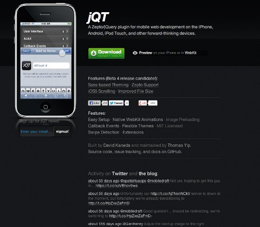
If you absolutely must use a DOM framework, then our old friend jQuery is the most adopted, battle tested and reliable choice. In 2.0, the jQuery team added conditional builds and a slimmer mobile friendly core. It works well with all modern mobile web browsers.
If you're only targeting mobile browsers based on WebKit, Gecko, or Google's Blink engine, consider upstart Zepto. It's smaller than jQuery while mimicking its API with some nice additions for touch mobile devices.
Get the Creative Bloq Newsletter
Daily design news, reviews, how-tos and more, as picked by the editors.
CSS frameworks
Authoring and testing CSS for the multitude of today's browsers across different devices is hard work. Developers can save time by using open libraries to share that testing, and bug fixes, and get a leg up on time to something that's demonstrable.
As with JS libraries and frameworks, these solutions for CSS can come with a size penalty.
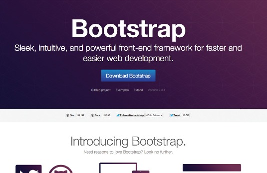
Bootstrap
Without question, Twitter Bootstrap is the most popular solution. In fact, with over 15,000 forks, it's the most popular project of all of GitHub! There's also a huge ecosystem of extensions, plug-ins and community supported documentation.
It contains everything you could possibly need including a responsive grid and a ton of common UI controls. Being so comprehensive comes with the aforementioned size penalty, so some sort of build step that removes unused CSS is common.
While customisation is possible through a web interface, it's not really exposed through the project itself, which makes projects that require automating custom builds difficult. You can use Bootstrap just for its CSS or compose an even more all-inclusive build with interactive controls as jQuery plug-ins. This means you'll have a jQuery dependency, but that's OK because you likely did anyhow.
Being a popular choice, Bootstrap is super active with regular releases. This healthy cadence can make upgrading occasionally difficult and, while the project has a responsive grid at its core, the mobile treatment in Bootstrap seems more of an afterthought.
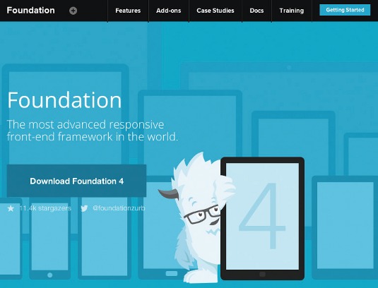
ZURB Foundation
The next most talked about solution in the space is ZURB Foundation. Foundation focuses on responsive design as a core tenant of its architecture and positions itself as a great solution for rapid prototyping. While the ZURB solution has a less comprehensive list of controls, the ones it does include are very common and completely responsive.
Much like Bootstrap, these controls do require JavaScript, which means a jQuery dependency is inherited too. ZURB has a build solution available via the website and within the project itself by way of some straightforward Ruby tooling.
The third solution comes with the disclaimer that I'm completely biased! We've been building packaged applications with the web stack at Adobe and found the aforementioned solutions failed to meet all of our needs. We needed something specifically for building web apps, rather than websites, with the ability to customise heavily. Most of all, we needed it to be fast!
Topcoat
The result is Topcoat. It's a CSS library (and only CSS) for building fast and clean apps. Our mantra has been 'performance first' and a part of that story has been optimised builds and deep performance benchmarking and monitoring.
Each control in Topcoat is in its own separate Git repo. Therefore, each control is independently revisioned and tracked, which makes upgrades and customised builds with correct dependencies control much easier. Further to this, each control is independently monitored for changes and fully benchmarked against FPS, load time and reflow. In this way, each time we update a part of Topcoat we ensure it's getting faster. If you're building web apps, you may wish to consider Topcoat.
Getting a mobile web frontend up and running quickly and consistently is tough business! Twitter Bootstrap is going to get you most of the way there very quickly, but optimising and maintenance is sort of messy. If your web project is being built with a 'mobile first' philosophy, you should take a serious look at ZURB. If you're focusing your efforts solely on CSS, are OK with writing up your JS, and are prioritising performance, Topcoat could be for you.
Never forget you always have the option of diving in and building out the CSS by hand. Occasionally, authoring and testing CSS can be infuriating, but overcoming those experiences is why this craft can be so rewarding.
JS frameworks
Any nontrivial application can end up on the wrong side of so-called callback hell: a malady of poor code organisation and structure. Sometimes, it's also known as the 'sideways triangle of despair, doom, agony'. Indeed, what's seen there cannot be unseen.
Anyhow, JS frameworks have emerged to solve this problem and make it easier to structure and extend your web apps. JS is the language of the web and, while jQuery is the language of the DOM, we're still left to our own devices to glue all these bits and bobs together.
Backbone
Backbone is a revolutionary step towards better code encapsulation and organisation. The real beauty of Backbone is the code itself is super short, very well documented and totally readable.
Backbone suggests an architecture but doesn't enforce a particular composition. You separate your concerns into views, models and collections with a very simple event system. Backbone does come with the dependencies that it requires jQuery (or Zepto) and Underscore, or Lo-Dash. The downside of Backbone is much of the work is left up to you for actually building out your application.
Angular
Angular goes beyond simple code organisation with very rich two-way databinding. When you're building an app with Angular, augment your HTML with attributes and it will automatically wire changes to your application state to its visual rendering.
Angular goes much deeper than Backbone with considerations for localisation, forms, modules, and much more. One thing I love about Angular is that it lacks dependencies and can work with any libraries you choose. That said, Angular includes all the batteries you could need, which is both its strength and downside as it may contain more than you want.
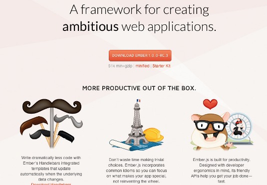
Ember
Ember is the new upstart, providing strong options on every facet of your application architecture with very sensible defaults. Ember has a simplified worldview separating your concerns into templates, views, controllers, models, and a router.
From a high level, Ember provides the benefits of Angular with the conceptual simplicity of Backbone. Databinding is a big feature of Ember, but it goes well beyond providing much of the infrastructure found elsewhere such as localisation, templating, and so on. Ember requires jQuery and Handlebars.
As with Angular, the strength of Ember is the only downside: it requires developers to opt into a formal structure and body of code they may not totally require.
There's no absolutely right choice for choosing a JS framework (if you choose to use one at all). Lightweight solutions should probably start by looking at Backbone. Ambitious projects should consider Angular or Ember. All projects should consider the development teams and pick a solution to meet the unique problem domains.
Complete UI frameworks
This class of framework bundles the entire development experience to include JavaScript and CSS designed to work in concert. These solutions will get you up and running immediately and provide a completely out-of-the-box experience for developers.
The downside is that you opt into the build tooling and development methodology of that chosen stack and, as a result, you'll be forced to follow its upgrade path. If the framework becomes abandoned, then it becomes your responsibility to maintain, which could be a big risk given your team didn't originally author the bulk of the code.
It's also crucial to note that, because these types of frameworks take on so much, they often leave some platforms behind on the testing front. (The mobile web often includes more than just developer-unlocked Androids and the latest iPhone!)
The most popular choices with the widest platform testing support include jQuery Mobile, Sencha Touch, Enyo and Kendo UI.
Useful utility libraries
The diversity of the web is its most compelling attribute and the open web community reflects this with a huge and ever growing ecosystem of libraries, frameworks and tools.
Some of these thing just fit nowhere else, but they are crucial to building apps quickly that are easy to maintain.
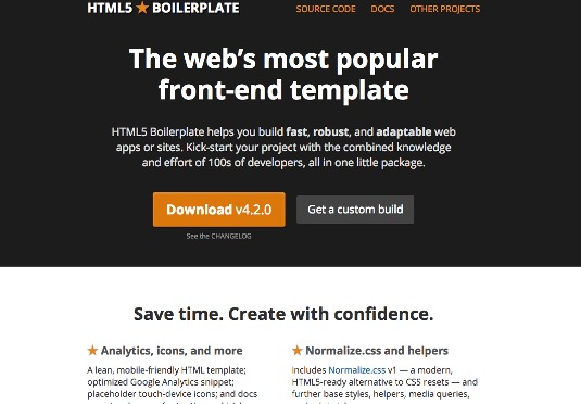
HTML5 Boilerplate
A blank page is powerful in its potential and as such it can be absolutely crippling. Where do you even start with all this stuff? There is an answer: it's called HTML5 Boilerplate.
Boilerplate puts all the bits into a single tidy package for you to begin your hacking. If you're sitting in front of that blank slate and are unsure where to begin, this is it.
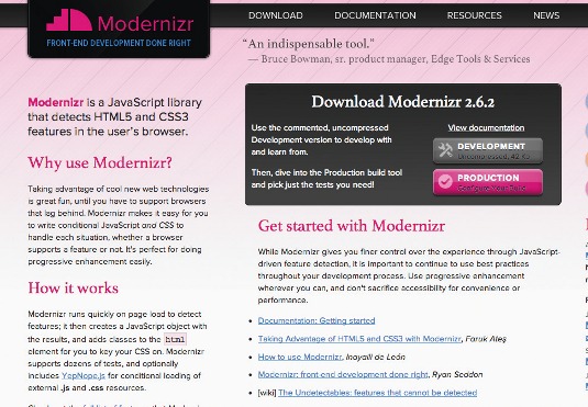
Modernizr
If your web app has old funky browsers in its requirements, Modernizr allows you to pinpoint modern browser features for polyfilling. Lots of organisations painfully version lock to the past, but that doesn't mean your code has to.
Underscore
Underscore is another must have library for making code easier to read and understand with a grab bag of JavaScript helper functions. Sometimes you don't need all those functions and, in those cases, Lo-Dash can offer a completely API compatible system, with better performance and customised builds. Shaving bytes never hurts performance and it's this attention to detail that will make the difference in a mobile web app.
Until the JavaScript language gets first class modules, we're left to our devices to compose our apps. Most of the time this means we throw a bunch of script tags in our document. A slight improvement is to move those tags to the bottom of the document to improve perceived performance. Next we concatenate all our scripts into a single file to minimise network chatter.
RequireJS
Dependency management is a tough problem and a big fat concatenated file is a poor solution for creating discreetly testable modules. Luckily, we can rely on RequireJS to help us put together sensible builds that are browser-performance friendly.
You're still left to compose your app as you see fit, but any remotely complex application can benefit from using it.
Lawnchair
When I was growing up as a mobile web developer I found a plethora of solutions for client-side persistence and, with many things of the web, the cross browser support was a total horror show. As a result, I wrote Lawnchair to make it easier to save data on the client with minimal fuss.
These days the browser is in much better shape and for most needs web storage (aka localStorage) should suffice and, with an eye towards sandboxed filesystem APIs and IndexedDB, life is going to get much better in the short term. That said, Lawnchair is still a very useful library for those targeting older mobile platforms, or when you just want to quickly save some data.
eCSSential
Responsive design is a complex and deep topic that has its humble roots firmly placed in CSS media queries. While using media queries helps us make informed decisions on the client about what CSS to render, it doesn't solve that we have to download all the CSS before we make that choice. This is a hit to the network and if your desktop assets are large it can really impact your mobile performance.
Luckily this too has been solved with eCSSential, which under the hood will use your media queries to only load the CSS you need for the device form factor your users are on. Even if you don't use eCSSential, I recommend reading the source for an example of well-written DOM code and window.matchMedia.
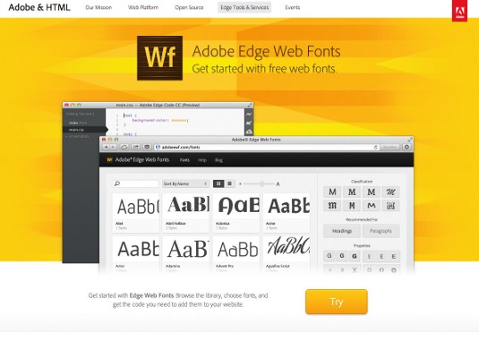
Edge Web Fonts
A beautiful web experience puts the content first and most content involves text. In the past, customising the fonts in our applications required kludgy solutions that hindered performance.
These days, the browser loves fonts and so should you. Edge Web Fonts from Adobe offers thousands of web-ready fonts that are completely free to use. Be sparing. You can be fast and beautiful with HTML. Just make sure you test on real devices under realistic network conditions.
Node.js
The frontend developer is spoiled these days with amazing tools for making our lives easier, which is a good thing because this stuff is super hard and we need these tools to get our job done! Without question every developer building web apps today should be using NodeJS if they aren't already.
While the premise of Node is to build networked applications using non-blocking IO it has quickly turned into a vast ecosystem of tools, libraries and frameworks in its own right thanks to its exceptional package manager, npm. Learning Node isn't just another option anymore, it's a requirement. Most solutions today extend or build on top of Node and the momentum is only growing.
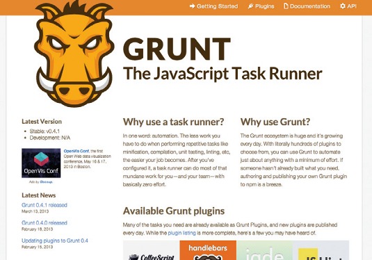
As part of the Node evolution, Grunt was introduced and quickly became the preferred solution for frontend project automation. Performance is the key and, in order for a web app to perform well, there's a ton of publishing work that needs to happen such as file concatenation, minification of assets, inlining images, and so on. Grunt makes all this work a single step and goes beyond with many userland extensions for common publishing workflows in the asset pipeline.
Editors
Editors are a touchy subject. Everyone has one and the only thing they all have in common is that the other editor is wrong!
Most web developers can agree that lightweight is the ticket: Textmate, Sublime and VIM are the popular choices today. But, if you haven't yet heard of Brackets, I highly recommend checking it out.
Brackets
What sets Brackets apart is that it's written in HTML, CSS and JavaScript and, as a result, it's a joy to hack on. There's already a growing ecosystem of extensions and that can only be expected to grow. LISP hackers have had this capability for a very long time. I suspect we'll see a rich ecosystem of hacking, but this time by the web community. (What could possibly go wrong?)
Brackets has other innovations, such as live debugging in Node and Chrome, inline editors and live Web Platform docs. All of that and it's aesthetically beautiful, too.
PhantonJS
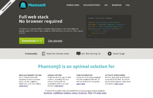
Testing is hard, thankless work that's an absolute requirement for shipping solid code into production. There's simply nothing more unprofessional than a regression: when you discover a bug you should always write a test, and before you deploy you should always run those tests. PhantomJS makes this life a little easier offering headless WebKit testing.
You can augment Phantom further with CasperJS to completely automate the testing experience. Having your tests run quietly in a background process allows you to focus on your code while you write it and be alerted to potential problems when you need to know without expensive context switching of moving between your browser, editor and devices.
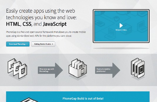
App store distribution for web technology is also possible of course. Firefox OS, Windows 8 and Chrome Packaged Apps are bringing the benefits of packaged apps to the world of web technology. If you require deployment to major mobile platforms such as iOS and Android you can use PhoneGap to package your HTML, CSS and JavaScript as a native app. It wraps your content into a native shell leaving the app creation part of the problem to you.
Summary
Okay, I just opened up a firehose of information into your face and there's no way any responsible developer should include all this contradictory thinking into a singular project. And that is exactly the point. This article highlights that the professional mobile web developer needs to carefully choose the right tools for each project, that there's really no one best way to go about it and that you always have the option of tackling these problems for yourself.
You need to measure the path to choosing the right library or framework for your project by reading its code, running the tests, having a good look at the community and the companies supporting that project. You have to understand the performance implications of your choice. You need to test all of this stuff on real devices.
You need to understand what spectrum of skills your team has to best understand what parts other application you need to build and which parts you can pull off the shelf to reuse. You need to look at the consuming audience, and make sure it's a community you want to interact with for help, and maybe even participate in yourself.
You have to be prepared to accept the risk of a project being abandoned and being left to maintain it. You have to constantly be upgrading your skills to match the right trends to deliver to your customers to make this whole thing work right.
The good ones in the web community recognise there's no correct way to do things and work together to help discover those right combinations, helping others find their right path.
Words: Brian LeRoux
Brian LeRoux is a beer enthusiast with a JS problem. He's also known as a mobile web hacker working on Apache Cordova, PhoneGap and Topcoat at Adobe.
This article originally appeared in .net magazine issue 243
Liked this? Read these!
- Check out these top JavaScript examples
- Pro tips for mobile website design
- Beautiful Drupal themes for designers
Furious that we left out a thing? Upbraid us in the comments!

Thank you for reading 5 articles this month* Join now for unlimited access
Enjoy your first month for just £1 / $1 / €1
*Read 5 free articles per month without a subscription

Join now for unlimited access
Try first month for just £1 / $1 / €1

The Creative Bloq team is made up of a group of art and design enthusiasts, and has changed and evolved since Creative Bloq began back in 2012. The current website team consists of eight full-time members of staff: Editor Georgia Coggan, Deputy Editor Rosie Hilder, Ecommerce Editor Beren Neale, Senior News Editor Daniel Piper, Editor, Digital Art and 3D Ian Dean, Tech Reviews Editor Erlingur Einarsson, Ecommerce Writer Beth Nicholls and Staff Writer Natalie Fear, as well as a roster of freelancers from around the world. The ImagineFX magazine team also pitch in, ensuring that content from leading digital art publication ImagineFX is represented on Creative Bloq.
