Microsoft goes 'beyond flat design'
It's not just about tiles and typography, says the tech giant as it explains its new design philosophy to the world.
Three years is a long time in the design world. Back in 2010, the year Apple released the iPad, it stood supreme as the only tech giant that 'got' design, from the aesthetic appeal of its products to the beautiful functionality of its interfaces. In contrast, Microsoft was seen by many in the web design community as the black sheep of the family, frustrated by the lack of standards support in Internet Explorer and unimpressed by the look of its operating system. Put simply, Microsoft was not cool, and looked like it never would be.
New design aesthetic
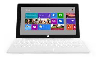
Today, though, the situation looks very different. Microsoft is now fully on board with web standards, with IE10 addressing most of the complaints made about previous versions. And the company surprised everyone with Windows 8, which not only unified the operating system across desktop, tablet and smartphones, but centred around a tile-based flat design aesthetic that drew admirers across the design community. Even if most of them didn't end up buying a Windows Phone, many cast Microsoft's new interface in a favourable light when compared with the skeuomorphism of iOS.

At today's WWDC conference, Apple is widely expected to launch an iOS7 interface (find out how to follow along at home here) that's more in line with a modern flat design approach. So in what's clearly an attempt to steal a march on Apple, Microsoft has published a piece by Steve Clayton entitled 'Modern design at Microsoft: Going beyond flat design', outlining the company's new design philosophy and stressing that it's not just a one-trick pony.
"Though 'flat design' is a popular meme right now, there is something much, much deeper going on here at Microsoft," says Clayton, pointing to a set of design principles that have been "organically adopted by every design team in the company".

The first is the Bauhaus, "with its focus on making the 'function' beautiful [...] When Sam Moreau, design director for Windows, says 'The content is the interface' he’s channeling his inner Bauhaus." The second, according to Clayton, is 'International Typographic Style' (or 'Swiss Style'), which he describes as "a graphic design style that emphasizes cleanliness, readability and objectivity".
Finally, the third plank of Microsoft's approach lies in the field of motion design, with Clayton namechecking Saul Bass in describing how Microsoft has created "a stage for creativity, expression and productivity in products such as Windows, Office, Bing, Visual Studio and Xbox".
More than tiles
Clayton resists the idea that Microsoft's design approach can be reduced to 'tiles and typography' and some key principles in defining Microsoft's design philosophy, including: "pride in craftsmanship", "[which is...] about engineering experiences that are complete and polished at every stage"; being "authentically digital", "[which is] about going beyond the rules and properties of the physical world to create new and exciting possibilities in a purely digital realm", and "making every element have a clear and useful purpose".
Get the Creative Bloq Newsletter
Daily design news, reviews, how-tos and more, as picked by the editors.

These principles are coming to the fore with the release of Window 8.1 and XBox One, says Clayton, and quotes design luminaries such as Pentagram's Paula Scher to back up his claims.
Microsoft is not going so far as to reveal the details of its design style guide, as Google did last week, and much of Clayton's essay sails close to typical Microsoft marketing speak. But the fact that the company can boast about its design philosophy at all, let alone discuss it with reference to movements like the Bauhaus, shows just how far it's come, and is a clear sign that Apple won't be able to rest on its 'cool' laurels for ever...
Liked this? Read these!
- How to build an app
- Download the best free fonts
- Brilliant Wordpress tutorial selection
What do you think of Microsoft's design aesthetic? Let us know in the comments below!

Thank you for reading 5 articles this month* Join now for unlimited access
Enjoy your first month for just £1 / $1 / €1
*Read 5 free articles per month without a subscription

Join now for unlimited access
Try first month for just £1 / $1 / €1
The Creative Bloq team is made up of a group of design fans, and has changed and evolved since Creative Bloq began back in 2012. The current website team consists of eight full-time members of staff: Editor Georgia Coggan, Deputy Editor Rosie Hilder, Ecommerce Editor Beren Neale, Senior News Editor Daniel Piper, Editor, Digital Art and 3D Ian Dean, Tech Reviews Editor Erlingur Einarsson and Ecommerce Writer Beth Nicholls and Staff Writer Natalie Fear, as well as a roster of freelancers from around the world. The 3D World and ImagineFX magazine teams also pitch in, ensuring that content from 3D World and ImagineFX is represented on Creative Bloq.
