Merge vectors with photographic imagery
Neil Stevens shows you how to take a more abstract approach to creating an illustration
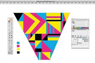
08 Now create four blocks of colour: I've gone for cyan, magenta, yellow and black. Randomly select these colours with the Eyedropper tool, choose the Paint Bucket and then fill the various shapes within your live image, creating an abstract pattern for your ray of light vector.
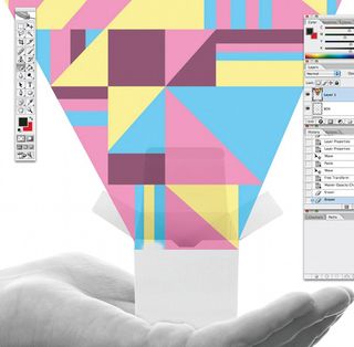
09 Copy and paste your new vector shape into the main Photoshop image with the hand and box. Position it so that it looks like it is shining out from the open box. Name this layer 'Ray Of Light' and set its opacity to 50 per cent. Don't worry that at this stage it looks a bit flat. We will use a few techniques to create a light effect later. As we did with the box and hand, use the Eraser tool to delete the bottom part of the ray of light layer so that it appears to be coming from within it. Once you're done, make sure you change back the opacity of the layer to 100 per cent.
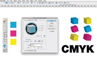
10 You now want to create your 3D blocks and letters. In Illustrator, create three flat boxes using the Rectangle tool: make them cyan, magenta and yellow, and about 20x20mm. Select one and go to Effect>3D>Extrude & Bevel. When the dialog box opens, all you need to worry about is Extrude Depth. Change this to 70pt. Click Preview and you will see the flat shape of your square in 3D. You can swivel this around with the cube visual in the dialog box for your ideal angles. Repeat this with each flat square of colour you create. With the type, simply spell out 'CMYK', select it with the Selection tool and then convert it to an outline (Type>Create Outlines). Ungroup them and individually use the Extrude & Bevel effect to make them 3D in appearance.
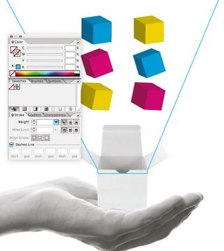
11 Bring these blocks and letters into the placement.jpg file you created earlier. Use this as a rough guide of your backdrop. You can now add the shapes to make them appear as though they are exploding out of the box. Before this, it's important to convert your shapes to symbols to make them easy to resize by dragging each into the Symbols panel. Next, position and paste them into your main Photoshop image on top of all the other layers, and name it 'Blocks'.
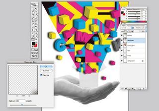
12 Underneath the new Blocks layer, create a new layer and call it 'Shadow'. Select the Blocks layer again and, with the Magic Wand tool, select the negative space around the blocks. Invert it, re-select the Shadow layer and fill this area with black using the Paint Bucket tool. Slightly move this layer with the Selection tool so you can just about see it. We need to blur this thick black layer to make it appear like a shadow so, with the layer selected, go to Filter>Blur>Gaussian Blur. A dialog box will appear – give it a radius of 18 pixels. The shadow might still look too fake, so decrease the opacity of the layer and add the Darken filter. Once the shadow is in place, use the Eraser tool to delete the shadow behind the outer blocks, as they don't have the ray of light behind them.

13 We now want our ray of light to seem as though the colour is getting brighter the more it reaches out of the box. Select the Ray Of Light layer and duplicate it. Make the colours black and white and, with your duplicated layer, go to the Image drop-down menu and select Adjust>Gradient Map to make the new layer grayscale. Rename it 'Ray Of Light / Gray'. Make sure this grey layer is behind the coloured version. Now gently erase the bottom part of your coloured layer so that it shows the layers below. It should now appear to be blending from grayscale to colour.
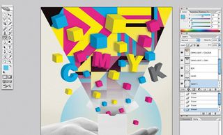
14 The image still looks a little too bright, so we need to tone it down by adding texture and backgrounds. Create a new layer called 'Colour Background' and place it at the bottom of the Layer stack. Fill the layer with the Paint Bucket tool using a colour combination of C:7, M:3, Y:18 and K:0. This gives us an off-white colour that ages the look and feel of the illustration. Create a new layer above this one named 'Circle'. With the Ellipse tool create a large circle that will appear behind the hand, and give it a pastel blue colour. Next, with a large, soft-edge eraser (1000px) and an opacity of about 30 per cent, erase the centre of the circle so it isn't as flat. Now flatten the whole file.
Get the Creative Bloq Newsletter
Daily design news, reviews, how-tos and more, as picked by the editors.

15 With just a couple of simple techniques we can give the final image a sense of age and a retro feel. I have a set of backgrounds and patterns in my library of images, and for this final step I chose a background of tiny vector dots that I created in Illustrator, which I pasted in on top of the flattened file. I then used the Overlay blending mode and changed the opacity of the layer so you could barely see them, deleting any bits that were showing too much. You want it to be subtle. The final technique to age the image more is add a colour filter. Go to Image>Adjustments>Photo Filter. Use the Warming Filter (85) from the drop-down menu in the dialog box and set the density to 25 per cent. And with that simple technique, you have finished the illustration.

Neil Stevens
Neil Stevens is an illustrator who works under the Crayonfire moniker. He has produced work for clients such as The Guardian, Wired and Computer Arts and also produces prints that he sells on his online shop.
www.crayonfire.co.uk

Thank you for reading 5 articles this month* Join now for unlimited access
Enjoy your first month for just £1 / $1 / €1
*Read 5 free articles per month without a subscription

Join now for unlimited access
Try first month for just £1 / $1 / €1
The Creative Bloq team is made up of a group of design fans, and has changed and evolved since Creative Bloq began back in 2012. The current website team consists of eight full-time members of staff: Editor Georgia Coggan, Deputy Editor Rosie Hilder, Ecommerce Editor Beren Neale, Senior News Editor Daniel Piper, Editor, Digital Art and 3D Ian Dean, Tech Reviews Editor Erlingur Einarsson and Ecommerce Writer Beth Nicholls and Staff Writer Natalie Fear, as well as a roster of freelancers from around the world. The 3D World and ImagineFX magazine teams also pitch in, ensuring that content from 3D World and ImagineFX is represented on Creative Bloq.
