Paint an epic manga monster fight scene
Artist DCWJ shows how to paint sexy ninja girls fighting zombie warriors in this manga art tutorial.
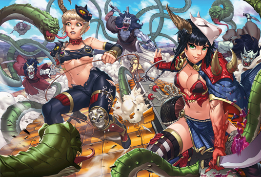
I'm drawing a scene of creepy snake monsters and ghost zombie warriors doing battle with a couple of cat and fox ninja girls, because... well, why the hell not!
- Also, check out these basic skills on how to draw manga
In this workshop I'm going to show you my usual approach for creating artworks that are more of an anime or manga style. Lets get to it!
01. Composition sketch & detailing
I start drawing rough sketches. These don't need to be proportionally correct: they're more to get a feel of the character's pose, much like a gesture drawing. The aim of a rough sketch is to bring together the composition and overall feel.
02. Detailing the rough sketch
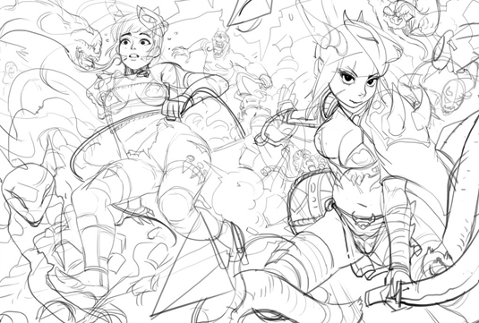
Once satisfied with the feel of the rough sketch, I add smaller details. I'm designing the overall look of the costumes for the girls and defining more of the background and tightening the composition of the piece.
03. Finalising the line art
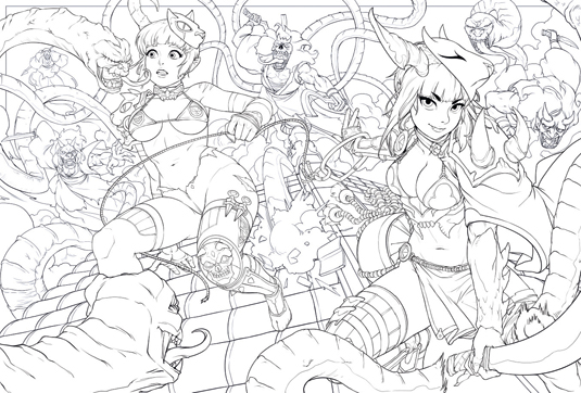
This is the stage where elements such as the character's proportion, design and composition are finalised. As I go into the final lines, I adjust and correct anything that looks wrong or needs improving.
I always feel that line art is one of the more important factors in anime or manga. Having clean and clear line art can help a lot, especially when you’re ready to move on to the painting stage.
04. Preparing lines for flatting
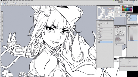
Keeping all the characters and backgrounds on different layers helps when beginning to add the flat colours. Furthermore, when I'm drawing the line art, I need to ensure that all the outlines of each character close up properly, without breaks in the lines.
Get the Creative Bloq Newsletter
Daily design news, reviews, how-tos and more, as picked by the editors.
This is for effective use of the Selection/Magic Wand tool, enabling me to easily select the whole silhouette of each character. Once this is done, I can fill the selection with the Paint Bucket tool.
05. Colour flats
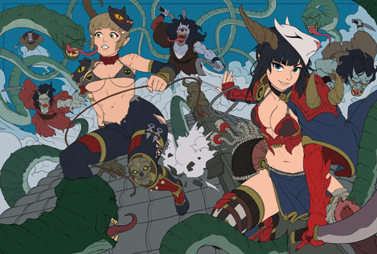
Now I separate out parts of the characters. This also serves as a rough colour palette of the artwork.
The most important aspect of this stage is to separate the parts cleanly and neatly, for when I later use the Selection/Magic Wand tool on each part that I want to paint.
This ensures that I only paint within the selected areas. It can be a tedious and repetitive process at first, but it helps with the painting process.
06. Rendering the characters
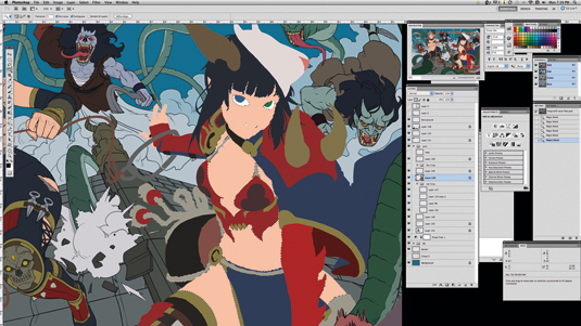
By selecting each part that I had earlier separated off, I can create a boundary of the areas that I want to paint.
For example, by selecting the flesh colour with a selection tool, I'm able to freely paint within the selected flesh part of the character without bleeding over the area.
This enables me to keep my painting neat and also enables me to subsequently make changes to areas that requiring editing or repainting.
07. Introducing key lighting
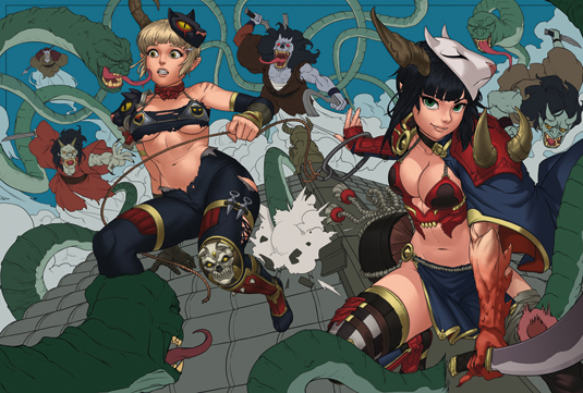
Painting an image bit by bit using selections can be tricky, because it can be challenging to see the overall lighting scheme.
I have to constantly remind myself about the general light direction as I paint each part. Another way is to paint the lighting of each part that’s already been rendered in relation to another. This way, I can try to keep the light source in check and depict it as accurately as possible.
08. Rendering the background
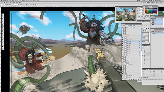
Once I start painting the background, I have to start thinking about the atmospheric perspective. For example, objects that are further away have to be pushed back further by lightening the values and reducing the contrast.
Right now, I'm still mainly focused on rendering everything before I start adjusting the tonal values and colours for the whole piece.
09. Adding smoke effects
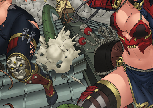
Now that everything's been rendered out, I begin adjusting the lighting and adding more elements, such as some drifting smoke and fog.
The smoke can convey a sense of motion and also helps to creates a more dynamic scene. At this point, I start to fog out the background, the secondary characters and other elements that aren't important. The main focus of this artwork should be the two ninja girls. Natch!
10. Enhancing key lighting
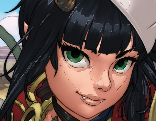
I use the Lasso tool and the Gradient tool to enhance the key lighting. First, I use the Lasso tool to draw the shape of the area that I want to brighten, then fill in a gradient on the selected area.
I find that by controlling how much gradient I want on each of the Lasso selections, I can create a faded 'cell-shaded' look that helps defines the edges and forms to make the image pop out at the viewer.
11. Time for highlights
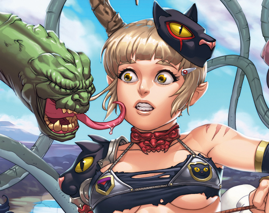
Now I add the specular highlights that give certain objects a reflective property. This can help to further define the forms. Elements that are matte, such as cloth, won't have as much specularity as those that are glossy – metal or glass, for instance.
So by adding specular highlights to a character's eyes, it can make them feel alive. However, do this selectively or else everything will look overly glossy.
12. Secondary light source

To further integrate the characters into the scene, I add a backlight to the characters and the roof.
Because there are no other notable secondary light sources (for example, a full moon or a fireplace in the background), I feel the secondary light source would perhaps be more like an ambient light coming from the sky. By adding this additional light source, the characters now look more three-dimensional.
13. Applying clothing textures
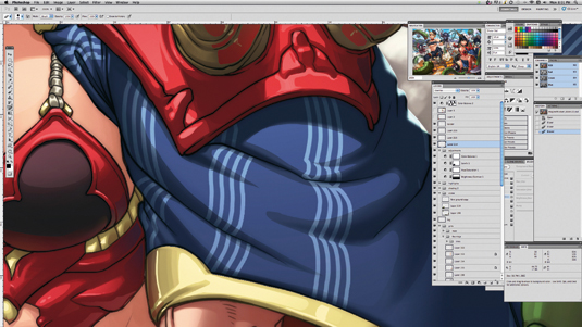
By making some simple custom brushes, I'm able to create some textures for the clothes of the fox ninja girl. I match the textures from the brushes to the clothes by following the folds on the cloak while painting.
After that I use the Warp function from the Transform tool (press Ctrl+T to select the Transform tool, then right-click and choose the Warp function) to make the textures wrap around the clothes accurately.
14. Tweaking the colours
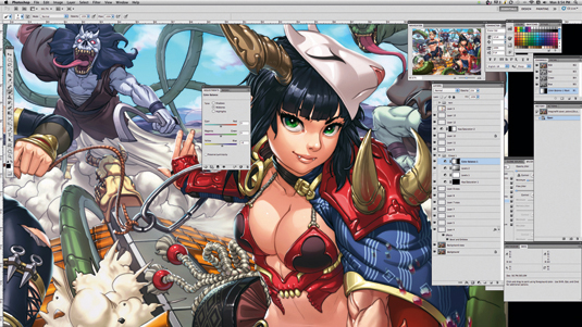
Now that the rendering is almost done, I tweak the colours and saturation to make the whole piece stand out more. To make this step easier, I keep all the original uncoloured flats for all characters and background on a different layer.
I can now target and select the specific areas that require tweaking by selecting the parts on the uncoloured flats using the Selection tool. I then click back on a specific layer and adjust the image accordingly.
15. Final touches
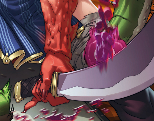
To complete the image, I use the Liquify tool to make some small adjustments to the faces of the characters. This is a handy tool to make minor changes to an artwork without redrawing or repainting it.
I then add some moving debris and purple blood from the slain snake's body, using the Motion Blur filter to give it a sense of movement.
Words: DCWJ
Derrick 'DCWJ' Chew was born in Singapore. Ever since he was a kid, he’s always been fascinated by anime and superheroes on TV. He hopes that one day people can enjoy his art as much as he enjoys painting it. This article originally appeared in ImagineFX magazine issue 95.

Thank you for reading 5 articles this month* Join now for unlimited access
Enjoy your first month for just £1 / $1 / €1
*Read 5 free articles per month without a subscription

Join now for unlimited access
Try first month for just £1 / $1 / €1

The Creative Bloq team is made up of a group of art and design enthusiasts, and has changed and evolved since Creative Bloq began back in 2012. The current website team consists of eight full-time members of staff: Editor Georgia Coggan, Deputy Editor Rosie Hilder, Ecommerce Editor Beren Neale, Senior News Editor Daniel Piper, Editor, Digital Art and 3D Ian Dean, Tech Reviews Editor Erlingur Einarsson, Ecommerce Writer Beth Nicholls and Staff Writer Natalie Fear, as well as a roster of freelancers from around the world. The ImagineFX magazine team also pitch in, ensuring that content from leading digital art publication ImagineFX is represented on Creative Bloq.
