The making of Hotel Transylvania
Renee Dunlop discovers how the characters in Hotel Transylvania were brought to life using simple silhouettes, vivid colours and strong graphic clarity.
After facing its own death and resurrection as frequently as a vampire feeds, Hotel Transylvania takes its cast of happy monsters into a world of colour that Halloween candy would envy. Departing from the grey and gothic look, the crew of 400 artists, under the guidance of production designer Marcelo Vignali, animation supervisor Bill Haller and model supervisor Mark Krentz, release their monsters to cinemas this autumn. At the head of the pack is Dracula, owner of the high-end hotel, who finds his human-free resort playing host to an unexpected visitor…
The journey
Marcelo Vignali dreamed of monsters for nearly a decade, but initially the trip to this beastly getaway was no vacation. He started visual development on the film in 2004, and came on board full-time in 2006. Soon after, the project went into a short period of hiatus while the story was rewritten. “This is just a theory of mine,” says Vignali, “[but] Hotel Transylvania is such a compelling title that people get a very strong image in their head. I believe that a lot of people had different ideas [of] what our movie would be about.”
Jill Culton was one of the earlier directors. “[She provided] the design direction to create that rich, lush look you see in our film,” says Vignali. Culton’s style, combined with artist Neil Ross’s concepts – whose compositions used rich textures and bright colours balanced with large open areas where the eye could rest – offered the look Vignali wanted. Culton developed the project for a year and a half, but the studio was considering a different story direction, and when Culton realised this she decided to step away from the project. There were six directors in all. Two other directors, Todd Wilderman and Chris Jenkins, joined the project and stayed on for a year before the final director, Genndy Tartakovsky, came on board. “I think at this point the studio had a clear idea about the film they wanted to see and the story they wanted to tell,” says Vignali. “Even though our movie had gone into hiatus a few times – when we would lose a director and another would come on board – our core team members creating the visuals remained in place.”
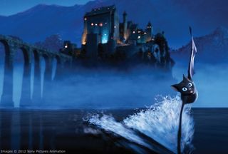
One of those visuals was Vignali’s decision to make the hotel architecture Romanesque, which has far fewer windows – perfect for vampires. “Typically, Dracula movies always use Gothic architecture because it’s really beautiful and elaborate, but we went with something a little older and simpler – and I think a little creepier.” The spaces were huge, so Vignali’s background in theme-park design and how to use pools of light to guide the viewers’ attention came in handy. “We wanted to create spaces that were really inviting,” says Vignali, who strived for a theatrical quality. As the light goes up it drops off naturally, keeping the viewers’ eyes lower, where the characters are going to be. This was particularly helpful in the massive lobby. “[This was] probably one of the largest spaces I’ve had to design,” says Vignali.
The characters
Animation supervisor Bill Haller had been with Sony for over seven years, and Hotel Transylvania had been in development throughout that time. “I’ve been chasing it the whole time, it’s been a dream project,” he says. “I mean, cartoony monsters? What animator wouldn’t want to work on that?”
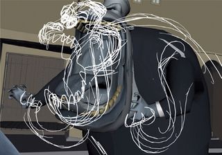
Some character designs were inherited from earlier directors. Initially the animation was reminiscent of the traditional Disney style, but it evolved into more of a classic Tex Avery look. The animators would provide basic postures, then Tartakovsky would sketch his desired pose over the image. Smears were also used – Haller explains that they simulated smears in 2D with long, stretched poses and had to use all kinds of deformers to keep artistic control. Motion blur didn’t cut it, but the proprietary deformers could be used to squash and stretch characters into whatever form was desired. “If Dracula flies across the lobby in five or six frames, we could have two of those frames smear back to his original location in a convincing shape,” he says.
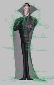
Of course, you can’t do Tex Avery without a strong silhouette. “In this film we had a lot of instances where a character would hit a pose and freeze, almost like in a 2D film, and the silhouette had to be really strong,” says Haller. Proprietary tool Silhouette was used to create the poses, enabling animators to draw wires on top of the geometry and then pull those wires to manipulate it.
Get the Creative Bloq Newsletter
Daily design news, reviews, how-tos and more, as picked by the editors.
While the frozen positions reduced some of the character animation requirements, additions such as Dracula’s cape added more. “Sometimes we wanted the cape to be closed, sometimes open, and sometimes we wanted it to come off his body and do its own thing,” Haller explains. This required an elaborate cape rig with five layers of controls. The controls brought the cape to 60-80 per cent completion before it was handed to the cloth department for final detailing.
The Mummy is a round, blobby character with eyes peering from between the bandages. Tartakovsky wanted to make him lively and eccentric, running animation tests ranging from moving him about like a big ball to more traditional Egyptian mummies’ movements. They went for personality, starting with his entrance. As the Mummy comes into the hotel, he enters in a sandstorm tornado that stretches towards the ceiling. A particle system and an elaborate series of rings acted as a sand emitter. Animated and scaled, the rings would emit sand particles in the shape of a gyrating tornado traversing the lobby.
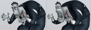
Frank was another challenge, spending many of his scenes dismembered. He arrives at the hotel in boxes and is assembled, often improperly, by the hotel’s inefficient zombie staff. Frank’s disassembly and reassembly required multiple characters, and body parts often had to be shrunk to a single point to achieve the required effects.
The models
Model supervisor Mark Krentz was tasked with figuring out how to provide some pretty hefty landscapes within the budget. Working closely with the layout department, he started with low-resolution proxy models representing the assets for each environment, and then published those to the layout team. Layout dropped in cameras and worked with the director to figure out where the focus was and what was important.
“We were basically developing the pre-viz, and [that] was very helpful,” says Krentz. “In the past we’d have a full set of designs for an environment, spending days modelling high-resolution geometry that never made it into frame.” The improved process meant some of the larger interior castle environments could be built, scaled, published and set-dressed in just a day or two.
Modularity was also important, particularly with the town, which consisted of just seven buildings. “We had Mr Potato buildings,” says Krentz. “We took two sides of the buildings and made them our street view, and the other two sides for an alley view, so we’d get much more mileage out of them.” Set dressing helped make the buildings appear unique.
Rocks can be surprisingly difficult to model convincingly. Krentz realised that a micro-polygon sculpting tool such as ZBrush or Mudbox was the only solution. The trees also took some R&D. The subtle style of paint strokes and layering of textures in Neil Ross’s concepts resulted in wispy leaves that blended into each other – something that couldn’t be modelled and made to work in the dimly lit 3D environment. The trees ended up looking like the lollipop trees you drew as a child – but there was nothing selling them as trees, so the modellers added leaves and twigs off the volumes to break up the edges.
The freedom of digital modelling all too often results in anomalies such as disproportionately large rooms, but the hotel was created so that the rooms not only fit inside the exterior walls, but also are connected to each other. “You could walk from room to room through that entire hotel, run one camera from outside through the lobby doors and take a tour of the hotel without having to turn off any geometry,” says Krentz. “It was almost like an architectural piece.” That made it easier for the layout team to work with the hotel because they didn’t have to worry about turning off different environments because of interpenetrating geometry.
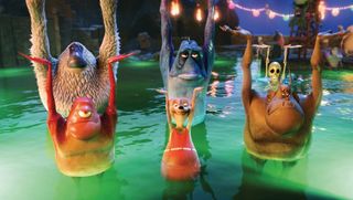
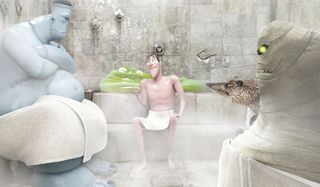
The hotel retained some earlier elaborate rooms that you barely see, a variety of different sets and locations that were featured prominently in the story, such as the spa – essentially the renovated dungeon where monsters can relax, be stretched on the rack or be boiled. “A certain amount of attention went into those sets,” says Vignali. “We don’t spend a lot of time in them but I don’t think that’s such a bad thing – it really does create a sense that there’s a lot more to Hotel Transylvania. And hopefully audiences will want to spend more time in these various locations in the sequel!”
Learn where to find textures for 3D projects.
Want more making of articles?
Let us know what you're interested in finding out more about via the comments box below, or via Facebook or Twitter: @3DWorldMag.

Thank you for reading 5 articles this month* Join now for unlimited access
Enjoy your first month for just £1 / $1 / €1
*Read 5 free articles per month without a subscription

Join now for unlimited access
Try first month for just £1 / $1 / €1
The Creative Bloq team is made up of a group of design fans, and has changed and evolved since Creative Bloq began back in 2012. The current website team consists of eight full-time members of staff: Editor Georgia Coggan, Deputy Editor Rosie Hilder, Ecommerce Editor Beren Neale, Senior News Editor Daniel Piper, Editor, Digital Art and 3D Ian Dean, Tech Reviews Editor Erlingur Einarsson, Ecommerce Writer Beth Nicholls and Staff Writer Natalie Fear, as well as a roster of freelancers from around the world. The ImagineFX magazine team also pitch in, ensuring that content from leading digital art publication ImagineFX is represented on Creative Bloq.
