Make your graphics shine
Luke O'Neill demonstrates how you can quickly and easily add a layer of gloss to your graphic elements
- Software Any version of Illustrator
- Time needed 10 minutes
- Skills-Use the Pathfinder-Create shapes-Use the Pen tool to draw Bazier curves
Slick, shiny graphic buttons, icons and other elements seem to be everywhere you look at the moment. The blame for the widespread use of these glossy design elements could arguably be laid at the door of Apple, whose rapid rise has seen all kinds of glossy products, screens and interfaces enter the consciousness of your average Joe on the street.
Whatever the reason for this sudden layer of gloss being painted over everything, the chances are that if you're a designer, at some point in the not so distant future you'll be asked to create something similar. Through this tutorial, I'll demonstrate how you can quickly and easily make icons and text look shiny, bevelled and embossed without having to rely on Photoshop's default effects.
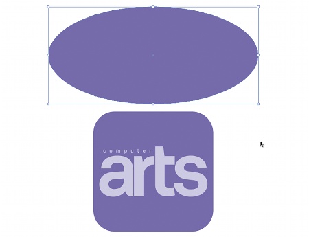
01 To start with, we want to create a shiny icon. In Illustrator, draw a square with round corners using the Rounded Rectangle tool. Above this, draw a short, wide oval using the Ellipse tool. In this case I've added the CA logo, but you may wish to use your own logo or an image of some description. With the ellipse and square selected, hold Alt and drag them to duplicate them.
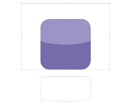
02 Next, create a highlight layer. Change the ellipse's fill colour to white. Then in the Transparency palette, set its Opacity to 30%. With both elements horizontally aligned, position the ellipse so that the bottom of the curve sits in the centre of the rounded square. With both objects selected - ensuring that the ellipse sits above the square - select Intersect from the Pathfinder palette.

03 Now with Snap to Grid turned on from the View menu, position the highlight layer that we created in the previous step over the top of your icon from step one. Then hit Ctrl/Cmd+Shift+] to ensure that the highlight sits neatly over the top of the other layers and affects all the elements contained within your icon.

04 In this step we're going to use the same technique, but this time we're going to apply a highlight sheen to some type. Instead of using an ellipse, use the Pen tool to plot a rectangle with a curved edge, as pictured above. Then repeat the earlier process using the Pathfinder to intersect the shapes.

05 In this case, rather than just setting the Opacity to 30%, I've chosen to accentuate the sheen effect by applying a gradient, running from white through to the purple base layer. I set the Angle to 90 degrees, increased the severity of the gradient and then set the Opacity to 30%.
Get the Creative Bloq Newsletter
Daily design news, reviews, how-tos and more, as picked by the editors.
Luke O'Neill
Newly-appointed art editor of Computer Arts Projects, Luke is a graphic designer and illustrator able to turn his hand to anything from complex layouts to illustrations and branding projects. Along with his usual magazine duties, Luke is currently working on designing his long overdue portfolio website.

Thank you for reading 5 articles this month* Join now for unlimited access
Enjoy your first month for just £1 / $1 / €1
*Read 5 free articles per month without a subscription

Join now for unlimited access
Try first month for just £1 / $1 / €1

The Creative Bloq team is made up of a group of art and design enthusiasts, and has changed and evolved since Creative Bloq began back in 2012. The current website team consists of eight full-time members of staff: Editor Georgia Coggan, Deputy Editor Rosie Hilder, Ecommerce Editor Beren Neale, Senior News Editor Daniel Piper, Editor, Digital Art and 3D Ian Dean, Tech Reviews Editor Erlingur Einarsson, Ecommerce Writer Beth Nicholls and Staff Writer Natalie Fear, as well as a roster of freelancers from around the world. The ImagineFX magazine team also pitch in, ensuring that content from leading digital art publication ImagineFX is represented on Creative Bloq.
