Make a CSS animated sprite in Photoshop
With new CSS features come opportunities to animate without the need for script. Sam Hampton-Smith demonstrates how to produce a retro gaming-inspired sprite
- Knowledge needed: Graphics editing, CSS, basic HTML
- Requires: CSS3 capable browser (Safari, Chrome, Firefox, IE10+), Photoshop or other image editor
- Project time: 6 hours
- Download source files
This article first appeared in issue 229 of .net magazine – the world's best-selling magazine for web designers and developers.
While web designers get to grips with new CSS3 features, web design has become an uncharted frontier, with many new techniques out there waiting to be discovered and developed. One of the most exciting aspects of the draft specification is the ability to animate without the need for scripting. While this offers a huge amount of opportunity, there’s still a place for good old-fashioned pre-rendered graphics. Indeed, a common technique to reduce page load time – the CSS sprite – can be regressed back to something close to the original meaning and used to create sophisticated flipbook-style animations.
- Don't forget to check out this Photoshop CS6 review over at Creative Bloq
A sprite, if you’re unfamiliar with the term, refers to a set of graphics stored in a single external file. Many large websites use one background image to load all their graphics, relying on the background-position CSS property to place each graphic in the right place. The term sprite originates in 8-bit gaming, and referred to the manner in which graphics were loaded and used to present an animation inside a game. In this tutorial we’re going to use the same approach as those pioneering game designers, creating a retro-inspired character and animating him using a sprite with six different character positions.
By flipping between the different positions, we’ll create the impression of movement and animate our character. Finally, we’ll place him on a perpetual animated background complete with appropriate parallax scrolling. We’re going to do all of this using just our image editor (we used Photoshop but any bitmap editor will do) and CSS – no scripting required.
1. Transparency
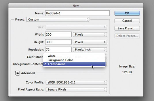
Create a document in Photoshop or other image editor. Make it taller than it is wide, to suit a character standing upright; we chose 300px tall by 200px wide. Ensure your document has a transparent background – we’ll need to see behind the character later.
2. Outlines
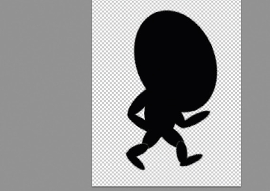
Sketch out the basic outlines of your character, separating each body part onto a different layer. Don’t worry about the details – either draft on paper first, scan the image and use it as a guide, or just feel your way by starting off with filled ovals rotated to form a basic body.
3. Head first
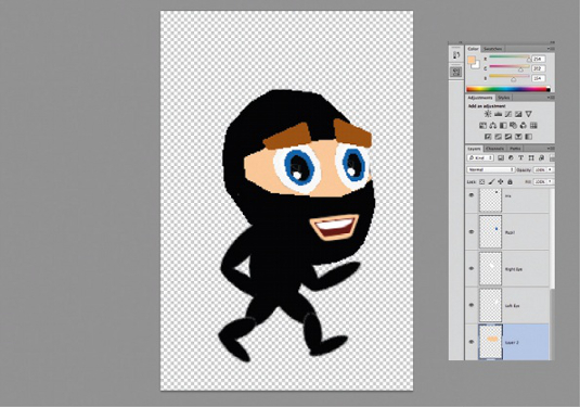
Start by working on the head. We’ve chosen a ninja character here, so the black oval works as it is for the character’s head. Add an eye slit by drawing with the lasso tool and filling with a flesh tone. Add eyeballs, pupils and catch lights to make them look alive.
4. Old school
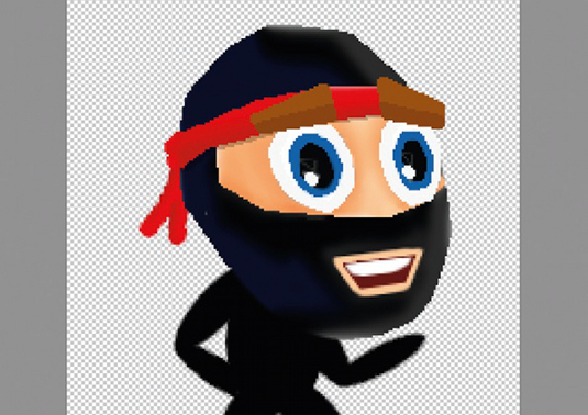
We’re going for a retro feel, so don’t worry too much about perfect gradients and smooth transitions – you may even want to choose the pencil tool and deliberately add a pixellated effect to each of the elements within your design. Do what you feel works best.
Get the Creative Bloq Newsletter
Daily design news, reviews, how-tos and more, as picked by the editors.
5. Shading
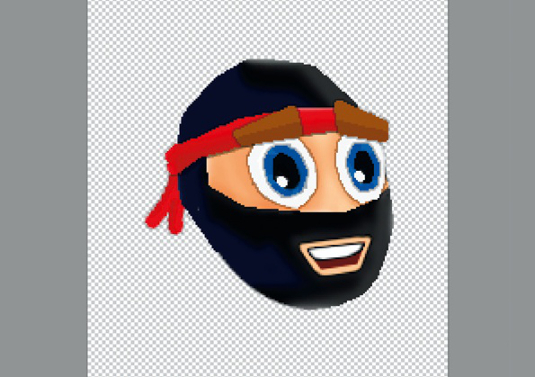
We can use some simple shading to make out character look more 3D. For each facial element, sample the source colour using the Eyedropper tool; paint over the top using a brush set to Multiply for shadows, and set to Screen for highlights.
6. 8-bit effect
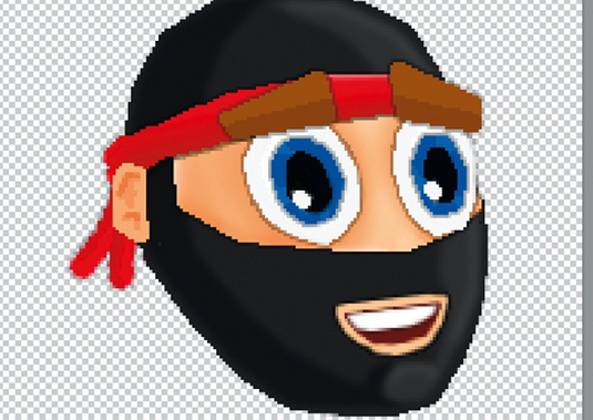
For a full-on 8-bit effect, outline each of your elements by using a layer style with stroke set to 1px. Ensure that the stroke is set to Multiply, and reduce the opacity of the effect within the layer styles dialogue box so that it’s not overpowering.
7. Tweaks
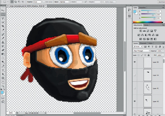
Add some additional overall shading and continue to tweak until you’re happy that you’ve got a sense of a 3D character living inside a 2D sprite. This process may take several hours, so don’t lose heart and keep at it until you find something that works.
8. Details
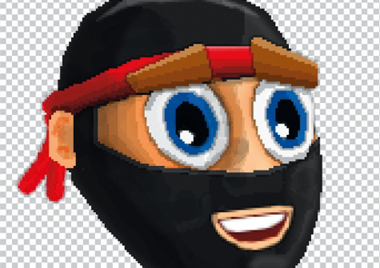
Add final details, such as to the tied bandana, ears and extra eyebrow shading. Make sure you zoom in and out regularly to get a different perspective on your character’s head. It’s essential that you view at 100% regularly to get a feel for the final look of your design.
9. Body parts
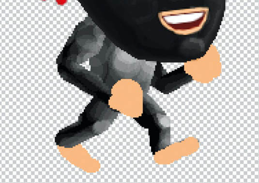
Repeat the process for each of the body elements. We’ve build up the body shading using white set to Screen, and dabbing on with the Pencil tool to create a pixellated muscle effect. This makes the body looks too light, but we’ll counter that later.
10. Limb layers
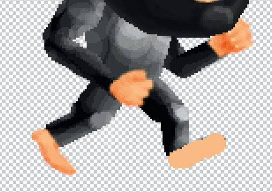
It’s vital you rig up your character correctly. For our ninja, the right leg and arm are closest to the camera, with the left limbs behind the body. Position your layers so that as limbs move behind the body, they are obscured correctly. Get it right now to save headaches later!
11. Add polish
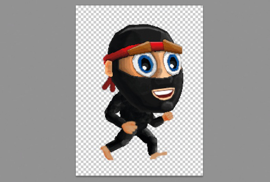
Refine your design, ensuring that all the individual elements work together and create a coherent whole. Once you start positioning the final animation frames it’ll be a nuisance to make edits to the overall design, so ensure you’re happy before proceeding to the next steps.
12. Start position
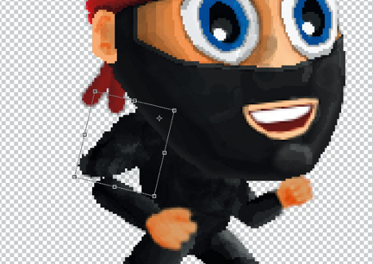
Position limbs, hands and feet, body and head into the first position for a walking animation. We’ve decided to lead with the left foot, so the right foot is drawn back along with the right arm, and the left foot and arm are both forwards. Tilt the torso to match.
13. Group layers
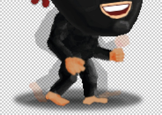
Select all the layers that make up the body, excluding the head, and group them. Name this position 1. Duplicate the group, renaming the copy position 2, and reduce the opacity of the first group to around 20%, so you can compare the start frame with the second frame.
14. In motion
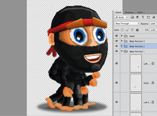
Alter the position of the head, arms and legs a little to suggest movement. We’re animating a single full step across six frames, which we’ll play forwards and backwards to create a full cycle. As such, by the time we get to position 4 we should have crossed the legs.
15. Add positions
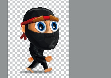
Duplicate and reposition a further four times until you have six different body positions, each showing a different frame in the animation. You may need to come back and tweak the limb positions later on to get the best effect, so save your document!
16. Export PNGs
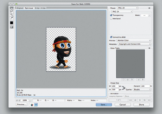
Export the six different bodies as transparent PNGs, complete with the head. Make sure you move the head a tiny bit for each frame – it will help sell the animation! Remember this animation will loop, so each frame’s head position should be close to the previous one.
17. Arrange frames
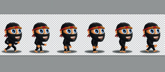
Create a new document six times wider than your main character document. Import and arrange your six frames into this single image, placing until you have the set aligned perfectly. Use Photoshop’s Distribute horizontal centers function to get this right.
18. Add styles
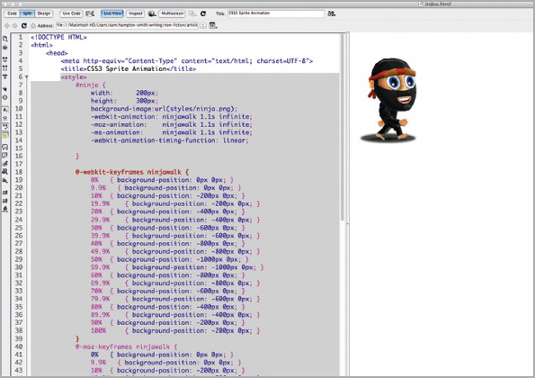
Open the start file, adding a set of styles defining your ninja’s width, height and background image. We’ve included the first animation in the start HTML document; you may need to adjust values to your character’s dimensions. Tweak design and animation to taste.
19. Keyframes

You’ll notice in the code provided that we’ve got a set of styles to assign basic character properties, and a set of animation keyframes that are used by the main character style declaration. These position the background image at intervals so we get a flipbook effect.
20. Rough up
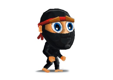
By default the browser will smoothly animate the background-position property between values; we don’t want that so we’ve created ‘holding keyframes’ before each switch. These are set using 1/1000 of a per cent less than the next frame to avoid flickering and artifacts.
21. Ground work
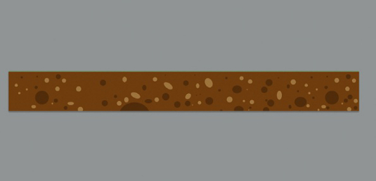
In Photoshop, create elements for background and foreground. We’ve used some Illustrator symbols to create a grassy field in one image, large plants in another, smaller plants in a third and a cross-section of the earth in a fourth. These must be seamless images.
22. Animate
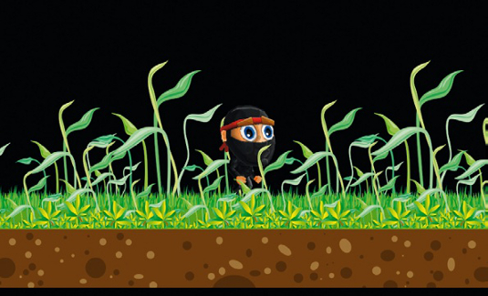
Return to your HTML and CSS. Add keyframes to animate the background from 0px 0px to 0px –1200px. Create styles for each ground element, placing and applying keyframes at varying speeds according to proximity to the camera. We’re aiming for a parallax effect.
23. Parallax
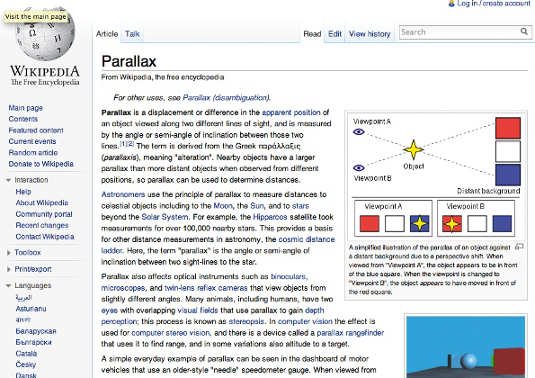
Another technique used in early video games to imply depth, this works on the basis that objects closer to the camera seem to move more quickly than ones further away. Adding and scrolling our ground elements at different speeds, we can create parallax and suggest depth.
24. Sky’s the limit
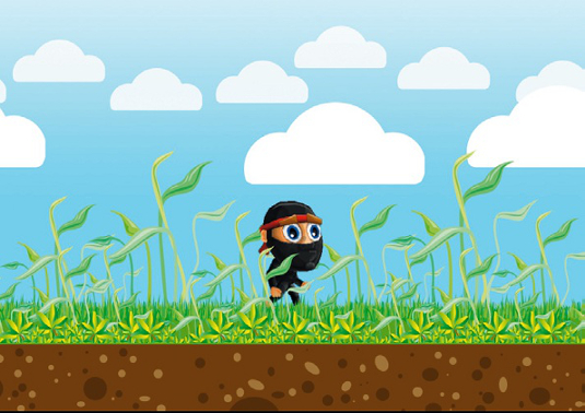
Repeat this process for a background sky (you don’t need to animate this), and two layers of clouds – one positioned closer to the camera than the other to complete the parallax effect. Add the HTML and CSS code to put these into your page.
25. Testing time

Thoroughly trial your page and tweak the timings to get the best effect. Pay particular attention to the speed of the grass that the ninja walks on – it needs to match so that the grass moves at the appropriate rate for the ninja’s footsteps to appear correct.
26. Title deed
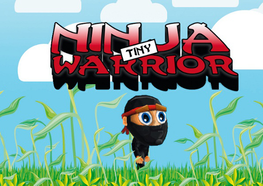
Add a final flourish and nod to the game-inspired theme with a Ninja title. We downloaded a free Ninja font (included in tutorial files) and created a title in Illustrator with a nice 3D effect to complement the rest of our artwork. Create the CSS to import this into your page.
27. Bring to life
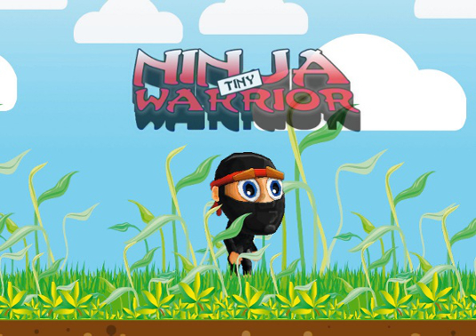
Animate the title element’s scale and opacity of using the same approach as for the character animation. Set the scale and opacity at 0 until 80%, then scale up to 1 for both properties at 100%. Experiment with timings to suit – between six and 10 seconds works for us!
28. Next steps
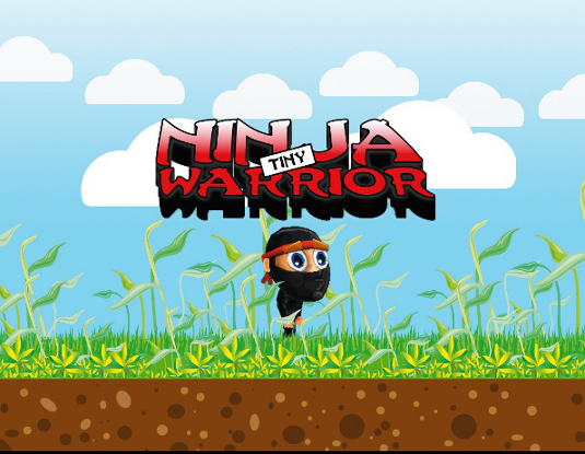
You’ve completed the CSS3-powered animation, but you needn’t stop here – you could use either the :target selector or script to turn this animation into a simple platform game, or use a similar animation approach to create simple interactive videogram images that subtly change over time. Experiment and try pushing the boundaries!

Thank you for reading 5 articles this month* Join now for unlimited access
Enjoy your first month for just £1 / $1 / €1
*Read 5 free articles per month without a subscription

Join now for unlimited access
Try first month for just £1 / $1 / €1

The Creative Bloq team is made up of a group of art and design enthusiasts, and has changed and evolved since Creative Bloq began back in 2012. The current website team consists of eight full-time members of staff: Editor Georgia Coggan, Deputy Editor Rosie Hilder, Ecommerce Editor Beren Neale, Senior News Editor Daniel Piper, Editor, Digital Art and 3D Ian Dean, Tech Reviews Editor Erlingur Einarsson, Ecommerce Writer Beth Nicholls and Staff Writer Natalie Fear, as well as a roster of freelancers from around the world. The ImagineFX magazine team also pitch in, ensuring that content from leading digital art publication ImagineFX is represented on Creative Bloq.
