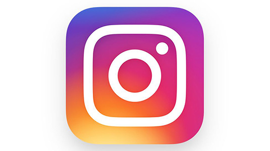
Instagram reveals a vivid new logo design
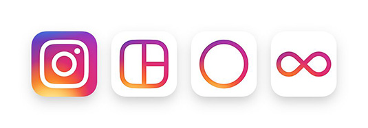
The new logo and icons for the photo editing app channel its most popular features.

For an app that's renowned for its beautiful filters that can spice up even the dullest holiday snaps and still life photography, Instagram's old school instamatic camera logo never really reflected this key selling feature. All that looks set to change though, as the photo editing app has revealed a new logo design and set of icons.
With over 400 million users, and 80 million photos and videos uploaded to the app every single day, Instagram's redesign is sure to cause a few waves in the online photography community. The company itself says it reflects how "vibrant and diverse your storytelling has become".

Gone too is the distinctive blue background, replaced instead with a crisp white. Instagram says this change hopes to put more focus on the user's photos and videos. "We wanted to create a look that would represent the community's full range of expression – past, present, and future," they added.
The new logo is the result of a redesign that has been in the works since last year. Instagram's supporting apps, including Boomerang, Layout and Hyperlapse, have all been given an overhaul with a similar colour scheme.
Get the Creative Bloq Newsletter
Daily design news, reviews, how-tos and more, as picked by the editors.

Thank you for reading 5 articles this month* Join now for unlimited access
Enjoy your first month for just £1 / $1 / €1
*Read 5 free articles per month without a subscription

Join now for unlimited access
Try first month for just £1 / $1 / €1

Dom Carter is a freelance writer who specialises in art and design. Formerly a staff writer for Creative Bloq, his work has also appeared on Creative Boom and in the pages of ImagineFX, Computer Arts, 3D World, and .net. He has been a D&AD New Blood judge, and has a particular interest in picture books.
