Designers react to the Tokyo Olympics logo
Yesterday saw the unveiling of the Tokyo 2020 Olympics logo, but how has the design been received?

Yesterday saw the unveiling of the new logos for both the 2020 Olympic and Paralympic Games in Tokyo. Following on from a previous logo design, which was withdrawn seven months ago due to plagiarism accusations, a competition was held to create a new identity for the games.
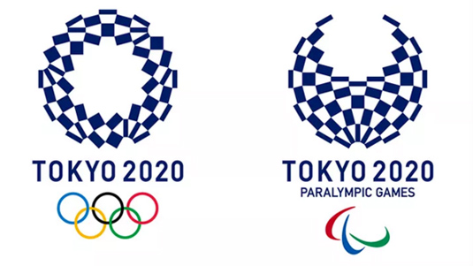
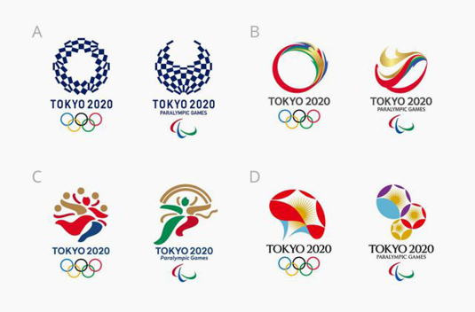
Over 15,000 new logos were submitted and the contenders were whittled down to a shortlist of four designs. The public was invited to vote for the winner, with Japanese designer Asao Tokolo's geometric patterns emerging on top.

Dubbed the Harmonized Checkered Emblem, the blocky yet circular logo represents different countires, cultures and ways of thinking all coming together. Meanwhile the indigo blue is a traditional Japanese colour that expresses elegance and sophistication.
Created in the wake of a plagiarism scandal, this logo was always going to have to work extra hard to prove itself. However it has already won over fans thanks to its clever, subtle reflection of Japanese culture, as well as the inclusive nature of the games in general.
Super pumped about the Tokyo 2020 logo selection, excited to see what Asao Tokoro does with the full identity — https://t.co/dqyCd0iARmApril 25, 2016
Loving the reworked logo for the Tokyo 2020 Olympic Games. https://t.co/ygCv8StTvdApril 26, 2016
But when it comes to logo designs, there are always going to be critics. And the Harmonized Checkered Emblem is no exception. Many designers felt let down that the design didn't reflect the culture of the country, choosing to overlook the careful use of colour.
Some even went further and drafted a new design that should have been used in the place of the winning creation.
Big mistake - @Tokyo2020 - does not properly represent such an amazing city, shame! https://t.co/b9bWAFNs4e https://t.co/91zf8akAztApril 25, 2016
I'm not a fan of the Tokyo 2020 logo they chose #design https://t.co/yVLhCFdHEjApril 26, 2016
The Tokyo 2020 Olympic logo is ugly.
What're they doing??April 25, 2016
Tokyo 2020 Olympics 1st logo on left, 2nd attempt after plagiarism issues on right. Can't say I like either. pic.twitter.com/xesQ3HQ6MXApril 25, 2016
Sorry - not keen! Final logo revealed for Tokyo 2020 Olympic games https://t.co/SQ6Swi3fdlApril 25, 2016
With so many images associated with the Olympics and host countries, any logo is going to be accused of being either unoriginal or missing the mark. But with the public backing this design, there's no arguing that it's the most popular graphic for the games. Roll on 2020 when we can see it in action!
Get the Creative Bloq Newsletter
Daily design news, reviews, how-tos and more, as picked by the editors.

Thank you for reading 5 articles this month* Join now for unlimited access
Enjoy your first month for just £1 / $1 / €1
*Read 5 free articles per month without a subscription

Join now for unlimited access
Try first month for just £1 / $1 / €1

Dom Carter is a freelance writer who specialises in art and design. Formerly a staff writer for Creative Bloq, his work has also appeared on Creative Boom and in the pages of ImagineFX, Computer Arts, 3D World, and .net. He has been a D&AD New Blood judge, and has a particular interest in picture books.
