Chris Murphy: Why I'm alarmed by Yahoo's approach to logo design
Designer and educator Christopher Murphy explores what it means when the CEO of a Fortune 500 company rolls up their sleeves and gets creative.

As a designer intimately involved in a number of startups, not to mention working as an educator, I found the unveiling of Yahoo's new logo last week alarming. What it says about Yahoo's CEO, Marissa Mayer, and her perception of design and its value (or lack of value) is startling and should encourage anyone interested in design to take note.
The new logo's shortcomings notwithstanding - which were very well-documented by iA's Oliver Reichenstein, writing in Logo, Bullshit & Co., Inc and Stephen Coles, writing in Fonts In Use - what was most interesting was the sheer sense of hubris the unveiling conveyed.

When the CEO of a company, with a brand that hasn't been updated in nearly two decades and is valued at $10 billion, writes -
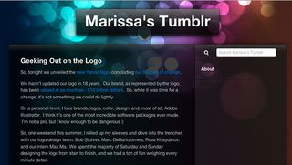
"So, one weekend this summer, I rolled up my sleeves and dove into the trenches with our logo design team: Bob Stohrer, Marc DeBartolomeis, Russ Khaydarov, and our intern Max Ma. We spent the majority of Saturday and Sunday designing the logo from start to finish, and we had a ton of fun weighing every minute detail"
- it sends out an alarming message of a compete lack of self-awareness.

A 'ton of fun' it might have been, but rolling out a rebrand over weekend (or, at the very least, projecting that message), suggests a very real lack of strategic understanding of the power and potential of design. It's certainly not the message one would hope to expect from Marissa Mayer, employee number 20 at Google and, now, employee numero uno at Yahoo.
As designers, we've all been there, "in the trenches," as Mayer puts it, when a well-meaning CEO rolls up a chair and proceeds to give us a little 'creative direction'. It sends out a message of a complete lack of awareness of design and the deeper purpose it can represent. We usually nod a little, humour them for a few moments, before getting back to the serious business of the important task at hand. The task we've spent years developing the understanding and ability to deliver.
We've all been there when a well-meaning CEO rolls up a chair to give us a little 'creative direction'
Mayer, however, is a hands-on CEO, who, "a personal level, loves brands, logos, color, design, and, most of all, Adobe Illustrator". Oh dear. One can't help but feel empathy for Messrs Stohrer, DeBartolomeis, Khaydarov and Ma.
One might expect the superficiality of Mayer's post Geeking Out on the Logo from an undergraduate student, but this is the CEO of a Fortune 500 company. It would be laughable if it wasn't being written by a highly paid executive who really should know better.
One might expect this superficiality from a student, but this is the CEO of a Fortune 500 company
Credit where credit's due, Mayer's been doing a very good job of righting the Yahoo ship. (A ship that was in considerable need of direction, not to mention a firm hand on the tiller.) Mayer's 'Geeking Out on the Logo' post, however, undoes a great deal of that good work. As Oliver Reichenstein puts it, it sends out the message:
> Anybody can make a logo. No doubt. It's not complicated. Just try a couple of fonts and colors, choose the one you like, then change the font a little so it becomes special.
Reichenstein's assessment neatly summarises the misguided experiment that preceded the Yahoo reveal, the much-criticised 30 Days of Change. This equally ridiculed piece of 'brand strategy' - how on earth did this happen? - served, helpfully, to underline the fact that switching your typeface on a daily basis demonstrates very little understanding of what branding is really about.
Trooping out 30 typefaces, chosen with no apparent rhyme or reason, is what one would expect from a first year design student, not a multi-billion dollar company.
Switching your typeface on a daily basis demonstrates little understanding of what branding is really about
Back to Mayer, however, who - let's not forget - has form when it comes to 'driving design'. Reading Mayer's piece, with its 'blueprints' and over-reliance on the 'mathematical', one can't help but recall Doug Bowman's frustrations evident working with her at Google. As Bowman put it, on saying, Goodbye, Google:
"I had a recent debate over whether a border should be 3, 4 or 5 pixels wide, and was asked to prove my case. I can't operate in an environment like that."
In ancient Rome, power and hubris went hand-in-hand. It's said that, on returning from war, victorious generals were followed by a slave who whispered: "Respice post te! Hominem te memento!" or, "Look behind you! Remember that you are but a man." It's advice Mayer, for all her well-deserved praise in other areas, would do well to heed.
Words: Christopher Murphy
Christopher Murphy is a writer, designer and educator based in Belfast. Adrian Shaughnessy, writing for Creative Review, described him as, “A William Morris for the digital age,” (an epithet he aspires to fulfil daily).
Liked this? Read these!
- Yahoo CEO forced to defend new logo
- Free graphic design software available to you right now
- Download the best free fonts
- The best 3D movies of 2013
What do you make of Yahoo's approach to logo design? Let us know in the comments below!

Thank you for reading 5 articles this month* Join now for unlimited access
Enjoy your first month for just £1 / $1 / €1
*Read 5 free articles per month without a subscription

Join now for unlimited access
Try first month for just £1 / $1 / €1
Get the Creative Bloq Newsletter
Daily design news, reviews, how-tos and more, as picked by the editors.
The Creative Bloq team is made up of a group of design fans, and has changed and evolved since Creative Bloq began back in 2012. The current website team consists of eight full-time members of staff: Editor Georgia Coggan, Deputy Editor Rosie Hilder, Ecommerce Editor Beren Neale, Senior News Editor Daniel Piper, Editor, Digital Art and 3D Ian Dean, Tech Reviews Editor Erlingur Einarsson and Ecommerce Writer Beth Nicholls and Staff Writer Natalie Fear, as well as a roster of freelancers from around the world. The 3D World and ImagineFX magazine teams also pitch in, ensuring that content from 3D World and ImagineFX is represented on Creative Bloq.

