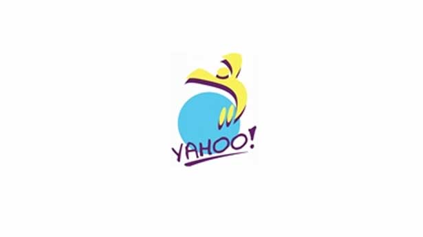
'Day 10' Yahoo logo passes the voter test
Poll shows most people prefer this redesign of Yahoo's logo to the old one - but are they right?

One of the leading voices in mobile devices, Luke Wroblewski has radically changed the way we go about building apps and sites for portable devices over the last few years with his 'mobile first' philosophy. He's clearly a man with influence in the world of design, so we were intrigued when Wroblewski launched an online poll to discover what people think of the new logos Yahoo is releasing this month.
Yes, you read that right - logos plural. Rather than just changing its logo and having done with it, Yahoo is releasing 30 new logos over 30 days in the run-up to the launch of a new 'permanent' logo in September.
Poll result
So which ones are going down well with the public, and which ones don't they like? In the poll, which has so far attracted 59,861
people, Yahoo's new 'Day 10' logo (above) has so far come out on top, with voters preferring it to the original by 987 to 426.
But there's also bad news for Yahoo - all its other new logos have got the thumbs down so far. Two others came close: Day 2 (48%) and Day 5 (45%). And several others were really disliked: only 10% liked Day 6 and only 14% liked Day 4.
So what do you think? Here we've brought all the new logos together in one place, along with a reminder of the company's past logos to keep everything in perspective. We'd love to hear your views in the comments section at the bottom...
Day 1

Day 2

Day 3

Day 4

Day 5

Day 6

Day 7

Day 8

Day 9

Day 10

Day 11

Day 12

Day 13
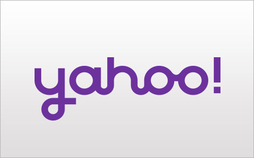
Day 14

2009-2013 logo
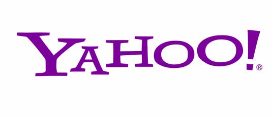
1995-2009
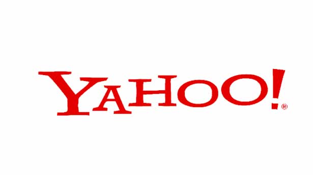
1995
1994

Liked this? Read these!
- The ultimate guide to designing the best logos
- The best free web fonts for designers
- Useful and inspiring flyer templates
- The best 3D movies of 2013
Which is your favourite Yahoo logo so far? Let us know your views in the comments below!
Get the Creative Bloq Newsletter
Daily design news, reviews, how-tos and more, as picked by the editors.

Thank you for reading 5 articles this month* Join now for unlimited access
Enjoy your first month for just £1 / $1 / €1
*Read 5 free articles per month without a subscription

Join now for unlimited access
Try first month for just £1 / $1 / €1

The Creative Bloq team is made up of a group of art and design enthusiasts, and has changed and evolved since Creative Bloq began back in 2012. The current website team consists of eight full-time members of staff: Editor Georgia Coggan, Deputy Editor Rosie Hilder, Ecommerce Editor Beren Neale, Senior News Editor Daniel Piper, Editor, Digital Art and 3D Ian Dean, Tech Reviews Editor Erlingur Einarsson, Ecommerce Writer Beth Nicholls and Staff Writer Natalie Fear, as well as a roster of freelancers from around the world. The ImagineFX magazine team also pitch in, ensuring that content from leading digital art publication ImagineFX is represented on Creative Bloq.
