Why one designer is breaking all the logo design rules
This leading creative launches portfolio website with a new logo each week.
If you've read our pro guide to logo design, you'll know the most effective logos are those that are simple, memorable, timeless, versatile and appropriate.
That's why we were particularly interested in the portfolio of Tim Smith – studio lead at digital agency Ustwo by day and My Poor Brain illustrator by night – which flies in the face of conventional logo design wisdom.
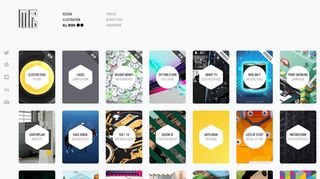
Instead of creating a single logo for his relaunched website, Smith asked his favourite designers, artists and illustrators to create their own, distinct versions, and will display a different one each week.
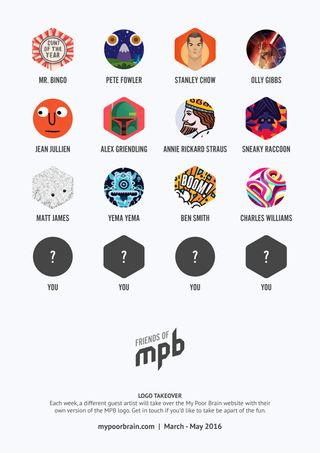
Launching today with a design from London-based illustrator Mr Bingo, the site will house logos from a number of high-profile creatives over the coming weeks, including Jean Jullien, Pete Fowler, Olly Gibbs, Annie Rickard Straus, Alex Griendling, Stanley Chow, Ben Smith and more.
We sat down with Smith to find out the risks involved in showing a different logo each week – and what he's going to do with all the logos at the end of the project..
What do you hope to achieve with multiple logos that you couldn't with one design?

I think that this will help ring in the new website and celebrate its launch; both myself and James Hambly who built it together are very pleased with it.
Having a different logo each week is a fun way to bring people back to the site, sort of like an advent calendar: whose logo will they find next time they visit? It'll also be more fun to have other artists get involved and spread the love on social media and the like.
Get the Creative Bloq Newsletter
Daily design news, reviews, how-tos and more, as picked by the editors.
Do you think you risk confusing or alienating your site visitors?
Well, unlike most designers portfolios out there, the purpose of mine isn't to illicit more clients. I'm happily employed, I simply put things on my website that I'm proud of and want to share with others.
The artists I've invited to contribute have inspired me greatly over the years and I want to celebrate them. I hope it'll encourage other creatives to revisit the site to see the new logos, sort of like a curated gallery, and while they're there they may see a new portfolio project of mine that they hadn't seen previously. I always enjoy engaging with other creatives.
How many creatives have you got lined up so far?

My first artist will be Mr Bingo. I asked him to do it in black and white, so he gave it to me in colour. Classic Bingo. I have 12 creatives involved so far, but I'll be asking others if they'd like to contribute soon.
What brief are you giving them?
It's very simple: it should be black and white and somehow include the letters 'M', 'P' and 'B', but beyond that they can do whatever they want. For example, Pete Fowler has created a three-eye monster, with one of the letters in each eye.
What are your three best logo design tips?
- Consider the audience, a clever logo is wasted if it has the wrong personality
- Your focus should not be "create something different", but to do what's right for the logo
- Put yourself in the shoes of the company and brand. Their personality should come through
Can anyone get involved in this project?
Anyone can get involved and I encourage anyone who would like to to get in touch. Ultimately I'm looking to engage with the creative community, to share my work with them and perhaps even collaborate with them.
What will you do with all the logos when the project is over?
I have a number of ideas, including creating a collection of them all, writing a blog post about the experience and many others. I'll be discussing with the guest artists in the near future.
Keep an eye on the My Poor Brain website over the following weeks to see the brilliant guest logos in action.

Liked this? Read these...
- Check out these amazing band logos through the years
- How to become an art director
- What do you need to do to become a creative director?
- We reveal where to find logo design inspiration
- Get to grips with the golden ratio in this easy guide

Thank you for reading 5 articles this month* Join now for unlimited access
Enjoy your first month for just £1 / $1 / €1
*Read 5 free articles per month without a subscription

Join now for unlimited access
Try first month for just £1 / $1 / €1

Julia is editor-in-chief, retail at Future Ltd, where she works in e-commerce across a number of consumer lifestyle brands. A former editor of design website Creative Bloq, she’s also worked on a variety of print titles, and was part of the team that launched consumer tech website TechRadar. She's been writing about art, design and technology for over 15 years.