6 unconventional logo designs that actually work
Looking to create something different with your next logo design? These cool creations take an unusual but inspired approach.
A company's logo design says a huge amount about its personality, tone of voice and service. For this reason, most large companies opt for a smart, formal logo to convey a business-like, professional image.
But some brands prefer to be a bit more quirky and unusual with their logo. If a company is a little off-the-wall, an unusual logo design can be a great way of getting attention and standing out.
Here we've rounded up seven logo designs that are a little out of the ordinary. Each one is beautifully designed, unusual and creative. We hope this collection gives you some ideas for your next logo design project, and encourages you to do something a bit different...
01. Hipmunk

Hipmunk is a travel search site that aims to take the agony out of planning your trips, and this fun and friendly logo was created by company founder Alexis Ohanian. We love the subtle arrow that forms the dot above the 'i' – it's this kind of subtle but important detail that makes a logo design work just that bit harder.
03. MNML
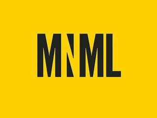
MNML is a publication that informs readers about minimalist architecture and design, aimed at 20-35 year old art lovers. It uses a minimalist design and colour palette to portray the topic, and this logo design by its creator, graphic designer Cassandra Cappello, is a brilliant use of negative space.
04. GitHub

Back in 2013, social coding community GitHub streamlined its logo design. It continues to use of the Octocat mascot to give it a fun and friendly feel.
- Empty list
Get the Creative Bloq Newsletter
Daily design news, reviews, how-tos and more, as picked by the editors.

Thank you for reading 5 articles this month* Join now for unlimited access
Enjoy your first month for just £1 / $1 / €1
*Read 5 free articles per month without a subscription

Join now for unlimited access
Try first month for just £1 / $1 / €1

