We turn our eye to some top designs inspired by the biggest event in cycling, starting with the Tour de France logo.
We know that cycling's a passion for a great many designers, as the volume of bike art out there testifies to, so we're sure that many designers will have at least half an eye on this year's Tour de France – the high point of the cycling calendar.
The Tour has been through a few rebrands since its conception in 1903 (it's run every year since then, except during the two World Wars), and it has even inspired other designs. Here we take a design-focused look at cycling's most prestigious event – starting with the striking Tour de France logo design.
The current Tour de France logo design
The current Tour de France logo was spawned from the 100e anniversary design
The current Tour de France logo was created by French designer Joel Guenoun back in 2002 and it's remained unchanged ever since. The playful brush script gives it a distinctly Gallic feel, while the splash of yellow reflects the famous yellow jersey awarded to the winner of each stage. It also forms part of a neat little typographic sketch of a cyclist formed within the word 'Tour'.
Latest Videos From Creative Bloq
The current Tour de France logo was introduced in 2003 for the race's 100th anniversary, with a 100e (French for 100th) in grey underneath and cleverly superimposing the 'e' over the last letter of 'France' to create a drop shadow effect. The main part of the logo has been retained ever since.
Previous Tour de France logos were austere by comparison
It's all in marked contrast to the previous Tour de France logo, which feels a lot more corporate and a lot less fun in comparison. The basic blue and white logo – stern sans serif capitals ringed by a series of lines that we suppose are meant to evoke bicycle spokes – had little going for it.
The more colourful version used from 2000 to 2003, with the year added in red italics to the side, is a little more lively, but still not as fun.
Grand Départ designs
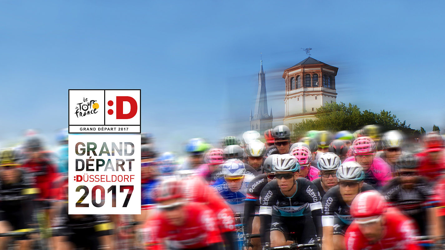
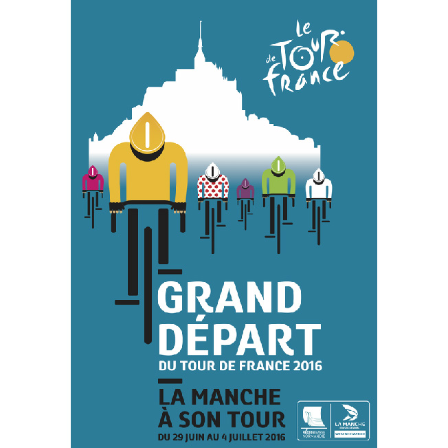
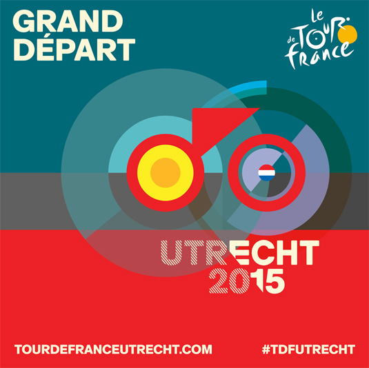
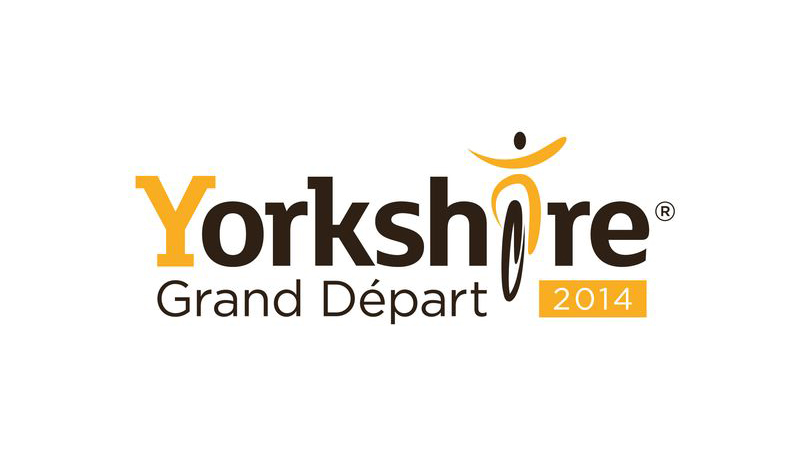
The Tour De France begins with a Grand Départ that regularly takes place outside of France. In 2014 it was in Yorkshire, UK; in 2015 it set off from Utrecht, Netherlands; in 2016 it left from La Manche, France; and in 2017 it left from Düsseldorf, Germany.
Get the Creative Bloq Newsletter
Daily design news, reviews, how-tos and more, as picked by the editors.
Scroll through the gallery below to see how these events have been branded.
Image 1 of 4
2017's Grand Départ began in Düsseldorf, Germany. We love the fun derived from playing with the umlaut here
2016's Tour began in La Manche, Normandy. The branding featured the silhouette of the area's famous Mont Saint-Michel
2015's Grand Départ from Utrecht featured some striking artwork
The yellow theme featured heavily in the 2014 Yorkshire, UK, Grand Départ
The Dutch city of Utrecht marked the occasion of its Grand Départ with a fantastic set of city branding designed by Total Identity, the only agency whose pitch didn't contain any realistic bicycle elements.
Utrecht's logo was formed around a red triangle, the central part of the city's ancient coat of arms. It connects a yellow circle that represents the start of the Tour de France to another circle containing a rotating tricolour that cleverly alternates between the Dutch and French flags.
The whole campaign, says Total Identity, combined urban dynamics and pride with speed and narrative sports elements, and the whole cross media campaign even included an animated short soundtracked by top Dutch pop band C-mon & Kypski.
Designs inspired by the Tour de France
At this early stage it's too early to say who'll win this year's Tour de France. Although Britain's Chris Froome appears to be a strong contender, Richie Porte, Geraint Thomas, Romain Bardet and friends pose a strong threat.
If you struggle to name any Tour de France winners other than Bradley Wiggins and Lance Armstrong (who doesn't count any more since he got stripped of all his wins) then this print project by Neil Stevens could be a helpful aide-mémoire.
Neil Stevens' Tour de France-themed artwork includes this tribute to Bernard Hinault
Stevens – clearly a massive cycling fan, as a brief glance at his site will tell you – has created a series of prints inspired by iconic cycling jerseys from throughout the Tour's history. "I've always loved the look, style and even feel of those old cycling jerseys," he explains.
"The colours, logos, type and design style always grabbed my attention and in many ways they're what makes the Tour the big draw that it is."
Bradley Wiggins is there of course, with an eye-catching maillot jaune enhanced with a mod target symbol, but Stevens also celebrates winners going as far back as Fausto Coppi in 1949. Our favourite, though, is definitely Bernard Hinault's Mondrian-inspired jersey from 1984.
Otto Von Beach's Tour de France artwork employs his trademark lithographic style
Going even further back, modern Victorian illustrator Otto Von Beach created a set of six prints in his trademark lithographic style, commemorating the original Tour de France back in 1903.
Von Beach's prints celebrate some key moments from the inaugural Tour, including the moment when race leader and eventual winner Maurice Garin nobbled fellow racer Fernand Augereau by bending his rear wheel. Cycling was a serious business, even back then – Garin went on to be stripped of his 1904 title for cheating and was banned for two years.
For electronic music fans, Tour de France means only one thing
Of course, we can't discuss the Tour de France without mentioning Kraftwerk's song of the same name. Released in 1983, the minimalist electronic anthem was inspired by the band's love of cycling, and uses sampled voices and mechanical sounds to evoke the spirit of the race. The single's cover is a similarly minimal masterpiece.
Uncredited, but most likely the work of long-time Kraftwerk collaborator Emil Schult, the cover depicts four cyclists in a paceline, on a road formed by the French flag. The cyclists were adapted from a 1953 Hungarian postage stamp, and the artwork was updated in 2003 for the release of Tour de France Soundtracks, an album recorded for the race's centenary.
Jim McCauley is a writer, performer and cat-wrangler who started writing professionally way back in 1995 on PC Format magazine, and has been covering technology-related subjects ever since, whether it's hardware, software or videogames. A chance call in 2005 led to Jim taking charge of Computer Arts' website and developing an interest in the world of graphic design, and eventually led to a move over to the freshly-launched Creative Bloq in 2012. Jim now works as a freelance writer for sites including Creative Bloq, T3 and PetsRadar, specialising in design, technology, wellness and cats, while doing the occasional pantomime and street performance in Bath and designing posters for a local drama group on the side.