The tale behind the Penguin logo
We take a look at the history of book publishing's most famous bird, and speak to the man charged with updating it.
A flightless bird might seem an unusual logomark for a company on the cusp of revolutionising the publishing industry. But in the 78 years since its first iteration, Penguin's charming icon has become one of the top brands on the planet, charged with cultural and political significance.
Penguin's logo design is instantly familiar and represents more than books and publishing. The most recent revision saw Pentagram partner Angus Hyland decrease the white space of the stomach, add a thicker black outline for increased legibility on the spine, and subtly alter the orange background.
Dignified but flippant
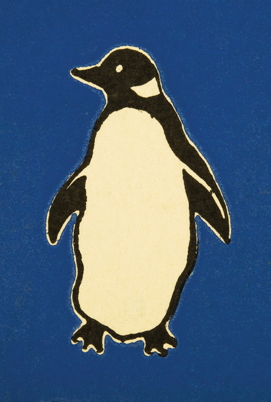
Allen Lane had already decided that he wanted an animal logo for his revolutionary new publishing house, which would make inexpensive but high-quality paperbacks available to the mass market. It was 1935, and according to company legend, Lane’s secretary suggested ‘Penguin’ as a “dignified, but flippant” name for the new company. Edward Young, a 21-year-old office junior, was immediately dispatched to London Zoo to sketch the bird in every possible pose for the rest of the day.
Article continues belowDancing bird
Young was asked to design the covers of the first set of 10 Penguin paperbacks, which appeared in the summer of 1935. Deeming illustrated covers trashy, Allen insisted on a straightforward jacket design based on a horizontal grid, using bands of colour to signify genre.
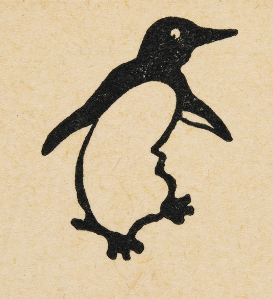
A number of logo variants emerged over the next decade, including a 'dancing' bird with a curled stomach, facing to the viewer's left. First used in June 1937, it features thinner flippers with a backwards-looking pupil. Thanks to Lane and Young, Penguin was starting to take its place in design history.
Uniform aesthetic
In 1946, Young’s amateurish logo was modified by forward-thinking German typographer Jan Tschichold, who was invited by Lane to give Penguin a uniform aesthetic. Fast-forward to 2003 and we have the current Penguin logo, refreshed by Angus Hyland in 2003. He explained to us some of the changes made and the reasoning behind them.
"The project was a classic formal exercise of how to evolve a recognised trademark, with a ton of brand equity, without losing any of the crucial characteristics which give it its unique character. The crucial difference between before and after was the narrowing of the mark on its vertical axis.
Sign up to Creative Bloq's daily newsletter, which brings you the latest news and inspiration from the worlds of art, design and technology.
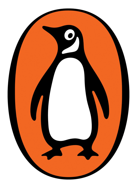
"The new Penguin is 15 per cent slimmer. Since he was 50 years old - the original Edward Young drawing was made in 1935 - we put him on the treadmill. He had become stodgy with middle age. But it was for functional rather than aesthetic reasons he was slimmed.
"If you consider the most common view of a publisher's colophon which is the book shelf, the spine of a book is the Penguin's natural habitat. A 15 per cent thinner bird enables him to be made considerably bigger on the spine of a 100 page paperback."
Words: Julia Sagar
The 50 Best Logos Ever

This is an edited version of a chapter from The 50 Best Logos Ever, the definitive guide to the greatest identity work ever created. Over 180 premium pages, the book dissects the world's greatest logos, showing their origins, their evolutions and interviewing the designers behind them.
So where did the Penguin logo come in the top 50? The only way to find out is to pick up the book at all good newsagents today or order it online. Or you can download a digital edition directly to your iPad from the Computer Arts app on iTunes.
Julia is editor-in-chief, retail at Future Ltd, where she works in e-commerce across a number of consumer lifestyle brands. A former editor of design website Creative Bloq, she’s also worked on a variety of print titles, and was part of the team that launched consumer tech website TechRadar. She's been writing about art, design and technology for over 15 years.
