5 logos that have stood the test of time
If it ain't broke, then don't fix it. Here are five examples of logos that definitely don't need a redesign.
Great logo design means a brand is recognisable at just a glance. However, even some of the world's top brands find it hard to resist making a complete overhaul of their logos on a regular basis.
This is often force of habit - a marketing tactic to convey that has something changed or that the brand is 'still relevant' in the modern age. Some classic logos, however, command such authority that it would take someone either very brave or very foolish to attempt to replace them.
Here are five such logo designs that have remained in place for decades, with only the odd minor tweak, and still make an impact to this very day.
- Read all our logo design posts here
01. Coca Cola

The Coca-Cola logo was created in 1885 by Mark Mason Robinson, the company’s bookkeeper at the time, Robinson went on to play a major role in advertising. The typeface used is called Spencerian script, which was popular font used by bookkeepers of the time.
The Coca-Cola script remains one of the most recognized trademarks in the world. Over the years the logo has seen minor tweaks, but nothing in comparison to that of its main competitor Pepsi. In contrast to all of Pepsi’s changes, there’s something comforting about Coca Cola’s steadfast image.
02. Lyle's Golden Syrup
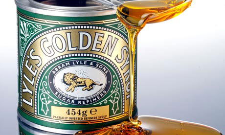
In 2007 Tate & Lyle was confirmed by Guinness World Records as the world's oldest brand. And one of its most iconic products, Lyle’s Golden Syrup, has used the same packaging design on its tins for almost 130 years. The golden syrup was invented in 1883, with the trademarked 'lion and bees' tin design coming around 20 years later in 1904.
To those who didn't attend Sunday school, the design might seem a little peculiar. It's actually a reference to a Bible story in which Samson was travelling in search of a wife. On the journey he killed a lion, and when he passed the same spot on his return he noticed that a swarm of bees had formed a comb of honey in the carcass. Samson later turned this into a riddle: "Out of the eater came forth meat and out of the strong came forth sweetness".
Get the Creative Bloq Newsletter
Daily design news, reviews, how-tos and more, as picked by the editors.
03. Campbell's Soup
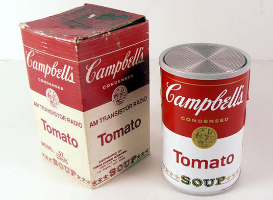
Born 1869, Campbell's Soup Company, with its famous red and white label, remains a staple in the American kitchen and culture and its products are sold in 120 countries around the world.
Originally, the label was orange and blue, then in 1898, Herberton L Williams, who became the company's treasurer, comptroller, and assistant general manager, saw a football game at which Cornell played in red and white uniforms. He was so taken with the colour scheme he suggested adopting it for the soup cans.
The Campbell script typeface of the logo is said to be very similar to Joseph Campbell's original signature. Handwriting fonts were used to attract the housewife of the time, honing on handwritten recipes.
In 1962 pop art guru Andy Warhol confirmed the brand's central role in American culture by painting a series referred to as '32 Campbell's Soup Cans'.
04. Absolut Vodka
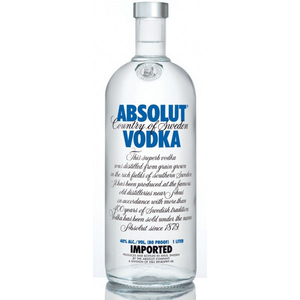
Swedish vodka brand Absolut was first established in 1879 by Lars Olsson Smith. In 1979 it was introduced to the global market with this iconic logo which still remains in force today. Yet although the logo design remains untouched, the company is far from bashful about creating new packaging and bottle designs - such as this campaign in which it designed 4million unique bottles.
05. Cadbury
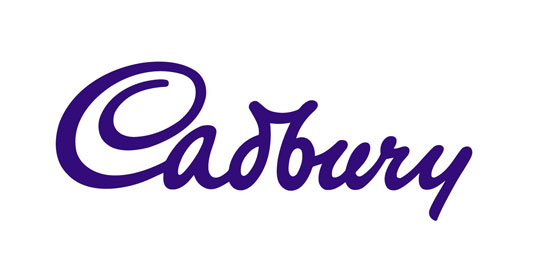
The Cadbury script logo was originally based on the signature of William Cadbury (the grandson of John Cadbury), and was first seen on the transport fleet in 1921. The initial logo was very thin and hardly recognisable. It was then simplified and made bolder in 1961, and has fundamentally stayed the same since 1951.
Words: Aaron Kitney
Aaron Kitney is a freelance graphic designer and art director based in London and Vancouver. He specialises in branding, identity, web design, publication design, packaging and book design. Follow him on Twitter at @aaronkitney.
Like this? Read these!
- The biggest logo design trends
- Our favourite web fonts - and they don't cost a penny
- Useful and inspiring flyer templates
What other classic logos deserve to be added to this list? Let us know in the comments box below!

Thank you for reading 5 articles this month* Join now for unlimited access
Enjoy your first month for just £1 / $1 / €1
*Read 5 free articles per month without a subscription

Join now for unlimited access
Try first month for just £1 / $1 / €1

The Creative Bloq team is made up of a group of art and design enthusiasts, and has changed and evolved since Creative Bloq began back in 2012. The current website team consists of eight full-time members of staff: Editor Georgia Coggan, Deputy Editor Rosie Hilder, Ecommerce Editor Beren Neale, Senior News Editor Daniel Piper, Editor, Digital Art and 3D Ian Dean, Tech Reviews Editor Erlingur Einarsson, Ecommerce Writer Beth Nicholls and Staff Writer Natalie Fear, as well as a roster of freelancers from around the world. The ImagineFX magazine team also pitch in, ensuring that content from leading digital art publication ImagineFX is represented on Creative Bloq.
