Online payments service PayPal has unveiled a new logo and brand identity, which was created in collaboration with San Francisco design agency Fuseproject.
It's very much an evolution, not a revolution from its previous designs, which are shown below:
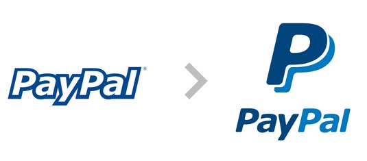
The refreshed branding features four key elements -
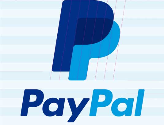
- a new wordmark in a new typeface (Futura)
- a new version of the double-P monogram
- a refreshed colour palette
- a new 'dynamic angle graphic'
- while the wordmark and the monogram lock up together for PayPal’s new signature:

Why refresh now?
Online payments service PayPal first launched in 1999, and last changed its identity in 2007.
"But a huge amount has changed since then", the company's UK marketing director Alison Sagar tells us. "Particularly the profileration and rapid adoption of mobile which is changing the way that people shop and pay for things.
"That's really been the driver of us thinking about the brand refresh, along with the fact that we've made a huge number of product improvements to make people's daily lives simpler in terms of paying for things."
Get the Creative Bloq Newsletter
Daily design news, reviews, how-tos and more, as picked by the editors.
Typographic considerations
"The new wordmark is slightly tighter, so it's more able to be used on smaller screens," Sagar explains. "Also the monogram has been refreshed and tightened up, and it's going to be used in conjunction with the wordmark to form the new signature.
"So we're actually bringing together some of the artifacts from online and mobile so that we have a single identity, irrespective of where you might see us."
PayPal's blue colour palette has very strong brand recognition, Sagar adds, so they didn't want to change that too radically. "But we've made those colours more vibrant so that they really pop out more effectively," she says.
"That's particularly so on mobile and smaller screens, but also as we expand in the physical world - because we're being seen more and more in shops, restaurants and so on."
Finally, Sagar describes the new angle of the letters as "a more forward looking slant, to reinforce the theme of innovation" - citing the 58 product enhancements PayPal has introduced in the last year.
Global ad campaign
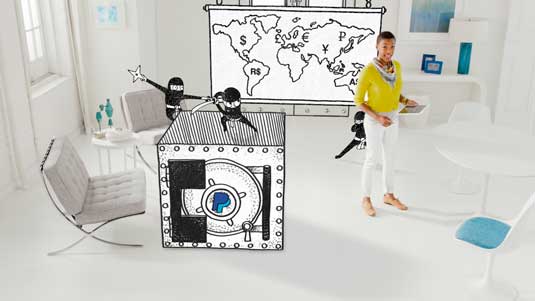
Over time, the new identity will be applied globally to all of PayPal’s core applications, including checkout buttons, apps, 'PayPal Here' devices, and sales and marketing materials.
It will also be incorporated into PayPal's first ever global advertising campaign, which launches today and is themed on a 'people first approach'.
"The campaign will show how consumers view the world and what we can do to make their lives easier and simpler," explains Sagar. The multi-channel campaign will cover TV, outdoor, digital, mobile and social across UK, US, Germany, and Australia.

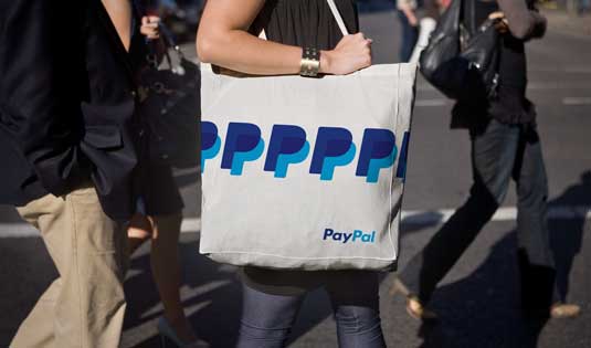
What do you think of the new branding and advertising campaign? Share your views in the comments below!

Thank you for reading 5 articles this month* Join now for unlimited access
Enjoy your first month for just £1 / $1 / €1
*Read 5 free articles per month without a subscription

Join now for unlimited access
Try first month for just £1 / $1 / €1

Tom May is an award-winning journalist and editor specialising in design, photography and technology. Author of the Amazon #1 bestseller Great TED Talks: Creativity, published by Pavilion Books, Tom was previously editor of Professional Photography magazine, associate editor at Creative Bloq, and deputy editor at net magazine. Today, he is a regular contributor to Creative Bloq and its sister sites Digital Camera World, T3.com and Tech Radar. He also writes for Creative Boom and works on content marketing projects.
