Is this new Apple logo an iPhone 5S teaser?
Apple reveals a new logo for its developer conference. Is it any good, and what does it tell us about the future of the iPhone?

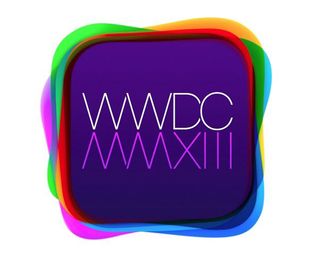
This is the freshly minted logo design for the Apple Worldwide Developers Conference (WWDC), which takes place in San Francisco this year on June 10-14. And it's grabbing our attention for two reasons. First as a piece of design in itself, and second for the clues it may hold to the big 'reveal' of the conference (in the same way that the 2012 logo contained clues to the launch of the MacBook with Retina display during that event).
Colour mashup
On first sight, it looks like Apple's mashed up every app icon that's ever graced the App Store to make the 2013 logo. But pundits have suggested the multiplicity of colours - including green, orange, red, purple, and different shades of blue - is a foretasting of the much-anticipated next generation of iPhone, which is rumoured will come in a range of colours (there's a related rumour that the current iPhone will soon be released in new colour variations).
The use of semi-transparent round rectangles is also intriguing. Could their interconnectedness be related to some clever new feature as part of an upgrade to the iOS interface? We're not sure what that might be but as Apple is well known for thinking through every design decision carefully, we think it may be trying to tell us something here.
Aside from possible new functionality, the phrase 'flat design' has also been raised by commentators in connection with the WWDC 2013 design. And if that's the shape of things to come, we could be looking at a very different approach to the iOS interface in the months to come...
Typography
What of the logo design itself? Well, it's certainly attention grabbing, and we love the use of Roman numerals to spell out the year (2013) in a way that cleverly mirrors the name of the event. But we're not sure about the choice of typography.
For reasons only Apple can explain, it seems to have abandoned Myriad, which it's used for all previous WWDC branding, for a new, stylized font. Unfortunately, we think it doesn't mesh with rest of the design particularly well. But we'd love to hear what you think...
Liked this? Read these!
- How to build an app
- Illustrator tutorials: amazing ideas to try today!
- The best free web fonts for designers
What do you think of the logo? Let us know in the comments!
Get the Creative Bloq Newsletter
Daily design news, reviews, how-tos and more, as picked by the editors.

Thank you for reading 5 articles this month* Join now for unlimited access
Enjoy your first month for just £1 / $1 / €1
*Read 5 free articles per month without a subscription

Join now for unlimited access
Try first month for just £1 / $1 / €1
The Creative Bloq team is made up of a group of design fans, and has changed and evolved since Creative Bloq began back in 2012. The current website team consists of eight full-time members of staff: Editor Georgia Coggan, Deputy Editor Rosie Hilder, Ecommerce Editor Beren Neale, Senior News Editor Daniel Piper, Editor, Digital Art and 3D Ian Dean, Tech Reviews Editor Erlingur Einarsson and Ecommerce Writer Beth Nicholls and Staff Writer Natalie Fear, as well as a roster of freelancers from around the world. The 3D World and ImagineFX magazine teams also pitch in, ensuring that content from 3D World and ImagineFX is represented on Creative Bloq.
