Microsoft reveals new logo for Bing
The Microsoft search engine shows no signs of slowing with this forward facing logo update.

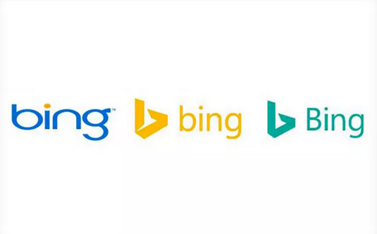
In terms of logo designs, 2016 shows no signs of slowing down any time soon. We've already seen a controversial rebrand from BBC3 and a vibrant new logo for Gumtree, but now Microsoft is getting in on the act with this refreshed design for its search engine, Bing.
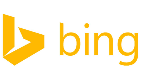
Building on the angular logo that was at the centre of its 2013 rebrand, this new design has an easier to read pine green palette paired with an upper case 'b' for the wordmark itself.

The polished design also reflects the improving performace of the search engine itself. "We expect Bing to continue to grow and are thrilled with our trajectory," says Rik van der Kooi, Microsoft's corporate VP of advertiser and publisher solutions.
"We are the only search engine that is experiencing steady, consistent growth and have increased our share for 26 consecutive quarters. And we’re not slowing down," he adds.
Motivated in part by the desire to display well across all Windows devices and services, users can expect this new wordmark to roll out gradually across all its properties.

Is this logo up there with Google's recent logo redesign? Let us know in the comments below!
Liked this? Read these!
Get the Creative Bloq Newsletter
Daily design news, reviews, how-tos and more, as picked by the editors.

Thank you for reading 5 articles this month* Join now for unlimited access
Enjoy your first month for just £1 / $1 / €1
*Read 5 free articles per month without a subscription

Join now for unlimited access
Try first month for just £1 / $1 / €1

Dom Carter is a freelance writer who specialises in art and design. Formerly a staff writer for Creative Bloq, his work has also appeared on Creative Boom and in the pages of ImagineFX, Computer Arts, 3D World, and .net. He has been a D&AD New Blood judge, and has a particular interest in picture books.
