March's biggest logo redesigns
Five big brands reinvented their logos this month - but did the redesigns hit the spot, or was it a step backwards?
As creatives we constantly strive to reinterpret the world in new and visually exciting ways. Yet we can also be conservative and often have a knee-jerk reaction to something new.
So on the day a new logo design is launched for a familiar brand, the first reactions are usually negative. Once some time has passed and the new design has been seen in action, though, it can be a different story. So here we take a look back at the month's biggest redesigns: with a bit of fresh perspective, what do you think of them now?
- For all our logo-related posts, click here
01. South Australia
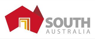
This new logo was designed to promote South Australia, a state in the southern central part of the country whose capital is Adelaide, as the "doorway to Australia". It depicts a stylised map of the whole country in red, with the state depicted in ochre as a door.
The new design, created by Ken Cato of Cato Partners, replaces the old star-based logo shown below.
The rebrand was commissioned by South Australia premier Jay Weatherill who said he was tired of people overseas confusing South Australia with South Africa.
02. Spotify
Here's the new logo music streaming giant Spotify recently slapped across its website. The Spotify globe emblem has lost much of its styling, most noticeably the shadow effect, to give it a more two-dimensional look.

It's complemented with a more measured and serious typeface that's light years away from the bubbly, bouncy font of the old identity (below). Overall, the look is of a company that wants to look more grown-up and professional, and in that sense it's reminiscent of last year's eBay logo update.
Get the Creative Bloq Newsletter
Daily design news, reviews, how-tos and more, as picked by the editors.

The logo is already in action across the website, with different colour combinations depending on whether it appears against a white or black background.
03. Ford Mustang
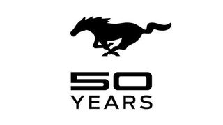
Global automobile giant Ford's 50th anniversary logo for the enduring Mustang sports car represents a radical change of direction for the brand.
The logo, created by designer Michael Thompson following an internal design competition led by chief designer J Mays, ditches the familiar, blingy chrome-effect 3D galloping pony (shown below) for a flat silhouette.
The logo will feature on various pieces of Mustang merchandise in the build-up to the car's 50th anniversary on April 17, 2014.
Ford has also found another, unusual way to show off new logo. The 2013 Ford Mustang GT is equipped with side-mirror-mounted lights that project the Mustang's pony onto the ground when the driver unlocks the door (shown below).

04. Doritos
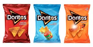
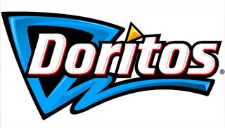
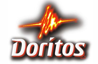
Popular tortilla chip brand Doritos released this new logo and packaging in March that gives it a unified global identity for the first time ever.
The new look was designed by PepsiCo’s Frito-Lay division in partnership with Hornall Anderson, whose UK team visited cities across the world to find out how to best achieve an emotional connection with its core demographic of teens and young adults.
05. Miami Dolphins
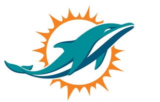
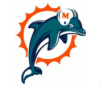
The Miami Dolphins logo has remained relatively unchanged since 1966, with just minor tweaks in 1974, 1989 and 1997. So this striking new look is a shock to the system - the helmet is no more, the colour palette has changed, and the aquatic mascot seems to have more confidence and forward-motion than its snarly predecessor (below).
Like this? Read these!
- The ultimate guide to designing the best logos
- The best free web fonts for designers
- Useful and inspiring flyer templates
What did you think of March's logo redesigns? Discuss the pros and cons of the month's rebrands in the comments below!

Thank you for reading 5 articles this month* Join now for unlimited access
Enjoy your first month for just £1 / $1 / €1
*Read 5 free articles per month without a subscription

Join now for unlimited access
Try first month for just £1 / $1 / €1
The Creative Bloq team is made up of a group of design fans, and has changed and evolved since Creative Bloq began back in 2012. The current website team consists of eight full-time members of staff: Editor Georgia Coggan, Deputy Editor Rosie Hilder, Ecommerce Editor Beren Neale, Senior News Editor Daniel Piper, Editor, Digital Art and 3D Ian Dean, Tech Reviews Editor Erlingur Einarsson, Ecommerce Writer Beth Nicholls and Staff Writer Natalie Fear, as well as a roster of freelancers from around the world. The ImagineFX magazine team also pitch in, ensuring that content from leading digital art publication ImagineFX is represented on Creative Bloq.
