HTML5 animated logo design made easy
James O’Connell shows you the power of Creative Cloud – using Illustrator CC, Edge Animate CC and Muse CC to design an animated logo that works across all devices and browsers.
We see brands everywhere adorning the walls and products of daily life. They have become another layer in our field of vision. The ones that tend to illuminate more than others have a sense of humility and resonance – there is something dynamic and humane about their narratives.
I’ve often noticed that the brands I fall in love with are the ones that keep on changing with the times. Deep down, though, we’ll never truly break away from a static device. Rather, we’ll evolve its status in our social bubbles.
The term ‘dynamic branding’ has been around for a few years now – most notably utilised by branding specialists such as global creative company Moving Brands. Today, almost everyone owns a digital device and, safely in the knowledge of this, we can begin to cater our design approaches, enabling our brands to breathe and take on multiple personalities.
Game changer
Below, I’ll introduce you to Adobe Edge Animate CC – a game changer in my eyes; one that has the ability to throw its weight around with the big wigs of design software.
One of the most remarkable facets of Edge Animate CC is that it enables the user to create experiences that are compatible with most common mobile devices and browsers – meaning your design can be seen by any person, at pretty much any time, and in the way you intended.
Using the project featured here as an example, I’m going to run you through the entire process of creating a logo for a fictional creative agency called Mind Altering Design, MAD for short. I’ll then animate it and apply it to a website using Adobe’s Muse CC.
01. Sketching it out
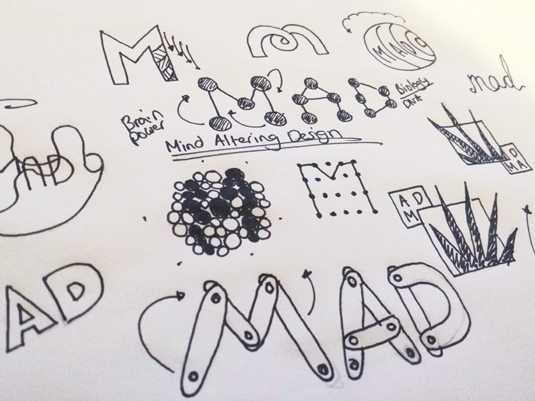
Like any project, I always start with a good bout of scribbling and for this particular project I began by figuring out the logo’s style in my sketchbook. This is really an idea-generating session – hopefully you can see how I’ve come to the final concept, which I’ll take into Illustrator CC when I’ve fleshed it out.
Get the Creative Bloq Newsletter
Daily design news, reviews, how-tos and more, as picked by the editors.
02. Sketching the animation
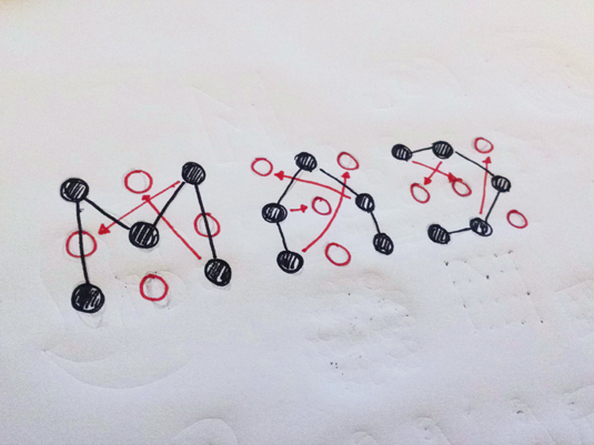
The next stage is to roughly sketch out how the different elements are going to animate and plan any potential interactive movements. It’s handy to do this early in the process, rather than just diving into Edge Animate CC. Getting an animated logo right is often as much about good planning as anything else.
03. Into Illustrator CC

Here I’ve started working up the dots in Illustrator CC. If it was a more complicated design I might have imported the sketch into Illustrator and worked that way. Since this is a more simplistic approach, I can do it directly in Illustrator. Here, I’ve begun to work up a 3x3 column dot grid, which I’ll be using to build the type.
04. Logo structure

With the dot grid firmly in place, it’s time to move onto subtracting the circular elements to create the structure of the ‘MAD’ logo. I’ve done this in grayscale to begin with – purely to give me an idea on whether the concept is working before I start adding a colour palette.
05. Choosing the colour palette

I’ve chosen a series of subtle colours to align with the five elements that make up each of the logo’s letters. If you’re struggling for a colour palette, try Adobe Kuler – either the app for iPhone or the excellent site at https://kuler.adobe.com. You can sync your palettes across Kuler and Illustrator CC. See page 68 for more on this.
06. Applying the palette
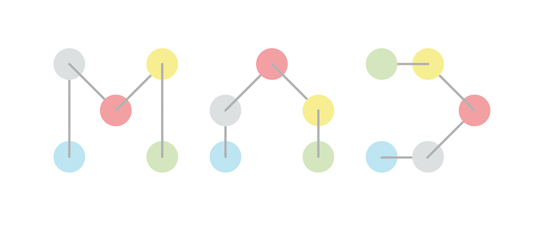
With the colours chosen, it’s time to apply them to the logo, with each letter receiving the same treatment for consistency. If you’ve used Kuler, you can open up the Kuler panel in Illustrator CC and add your colours directly from there. It’s a great way to get inspiration from the real world and integrate it with your work.
07. Artboards for assets

Next, it’s time to get your assets ready for animation in Edge Animate CC. To do this, we need to set up each shape with its own artboard to enable it to be individually exported. Do this by using the Artboard tool, creating artboards and then saving each artboard individually.
08. Saving to the right format
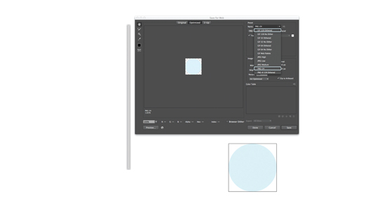
There are a few options available to you when creating assets for Edge Animate CC. The most popular ones can be found in the Save For Web dialog (File>Save For Web). For this kind of project, GIF and PNGs are most suitable, but you can also save in JPEG format.
09. SVG benefits
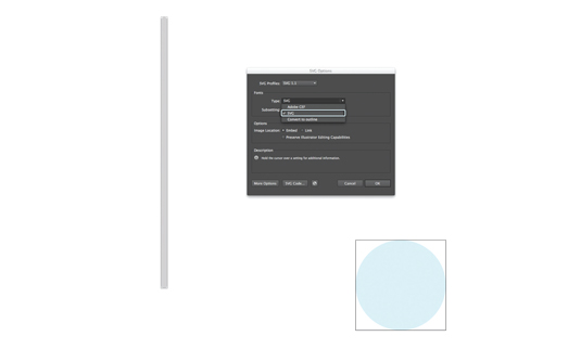
Edge Animate CC also has the native ability to read the XML-based file format SVG, a vector format renowned for its minuscule file sizes. If your project is completely vector-based, it’s worth saving your assets in this format using File>Save As and then choosing SVG.
10. Now over to Edge Animate CC
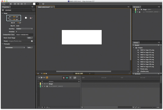
Now it’s time to get animating. On opening Edge Animate CC, the first thing to do is set the size of your stage – for this particular project I’m basing it on a header logo for a website portfolio. 320x114 pixels works very well, but the size will depend on your own project, of course.
11. Importing assets
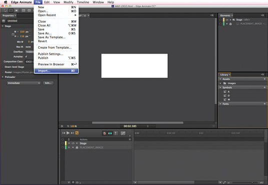
To get your assets into Edge, navigate to File>Import and select the already-created assets. Make sure that your assets are named up correctly and placed in suitably labelled folders. It will make it much easier if you need to find them again at any point.
12. Laying the foundations
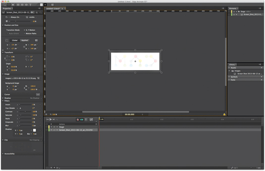
As I’ve mentioned before, it’s important to make sure you plan your animation before jumping in (although you can of course experiment as you go). For this reason, the first asset I start with is a JPEG of the logo’s final composition, reducing the opacity to help me work over it. This acts as a guide while you create the building blocks for animation.
13. Staging the animation
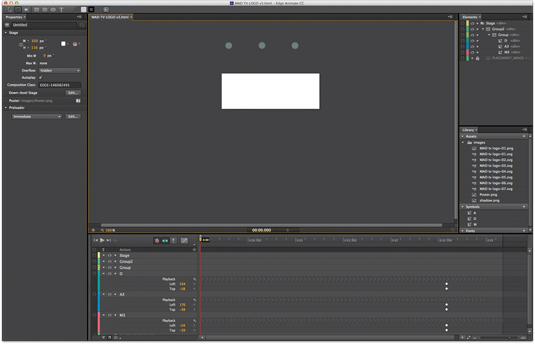
Bringing in the first circular assets using the Import command places them just outside the staging area, so they can be dropped down from above. Just like in Illustrator, After Effects or even InDesign, you can use the pasteboard to hold your graphic elements before animating them.
14. Get it all in-sync
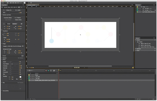
With the first circle placed and beginning the animation, the rest of the elements can now be brought in and laid out in sync with the JPEG guide. If you’ve sized any graphics incorrectly in Illustrator CC and need to resize them, you can easily do this in Edge Animate using the normal Free Transform tools.
15. Get stuck in to the timeline
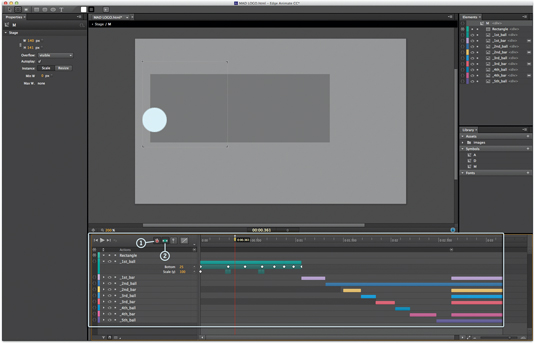
The timeline is where all the magic happens, particularly with the Auto Keyframe (1) and Auto Transition (2) modes selected. These will fill in the gaps as you go along: think of it like tweening in Flash. In fact, Edge Animate CC works in a very similar way to After Effects CC, presenting your graphic elements visually on the timeline – so if you’re familiar with this you’re a step ahead.
16. Keyframing options
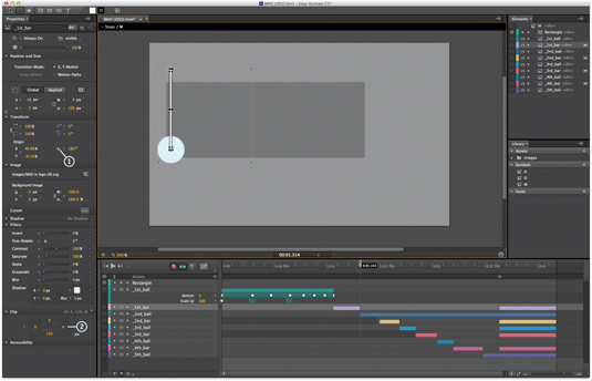
The side panel is also ladened with keyframing options, including rotational movement (1) and clipping options (2). Experiment with these.
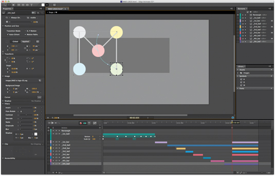
17. Motion Path
Another fantastic feature of Edge Animate CC is its motion path functionality. The arc of your paths are fully customisable by adding Bézier points along the axes.
18. Convert to symbols
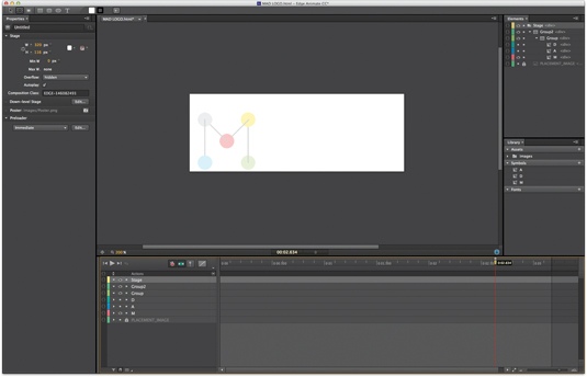
Now that each of the letters are animated, we can select all the layers in each letter and convert them to a symbol, represented by the chevron segment in the timeline.
19. Simple code
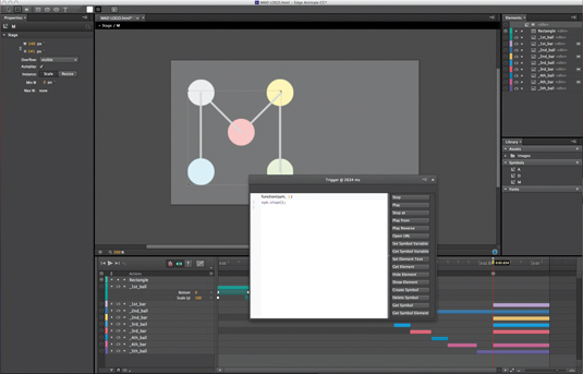
Clicking within the curly brackets next to any element accesses the coding element of Edge. Alternatively you can hit Cmd/Ctrl+E to see the full code. Here, I’m adding a simple JavaScript ‘stop’ setting for when the logo has completed its animation (when the playhead has reached the end of the timeline – we don’t want this to repeat). Just hit the Stop button in the code dialog with the playhead at the end of the animation. The timing will be shown (in this case ‘Trigger @ 2634 ms). It simply adds a sym.stop() function.
20. More simple code
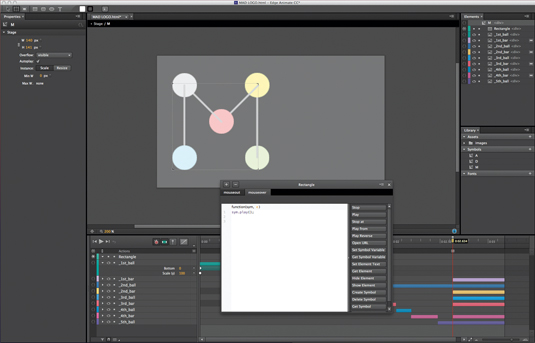
As well as the logo animating when the user loads the site, we want each letter to animate when the user hovers over it on a desktop browser. We can easily do this by adding a mouseover command to an invisible rectangle shape above each letter.
21. And... rewind

A mouseout adds the finishing touch, rewinding the letter to a legible structure. This is done using the sym.playReverse() function, which can be added from the dialog seen above.
22. Exporting as HTML5
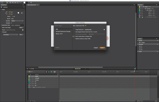
When you’re happy with your animation and have double-checked all your timings and functions, hit the Export button. The first option enables you to export a fully workable HTML5 document. This is useful for quickly testing the animation in a browser. Go back and make any tweaks if necessary.
23. OAM format
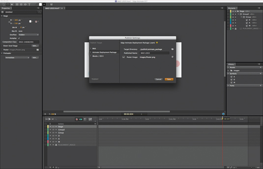
The second available option (Animate Deployment Package) is what we’re looking for in this particular workflow. This exports a file in the .oam format (Edge Animate Composition), which is readable by InDesign and Muse – enabling you to bring your animation into a site design or digital publication.
24. File breakdown
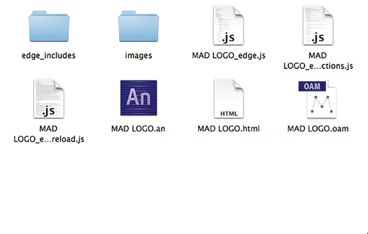
In the screenshot above you can see a breakdown of the files produced when saving and exporting from Edge Animate – including the .an working file (the original Edge Animate file) and the .oam file. Edge Animate will also generate an HTML file so, again, you can quickly preview your animation in a browser.
25. Placing in Muse CC
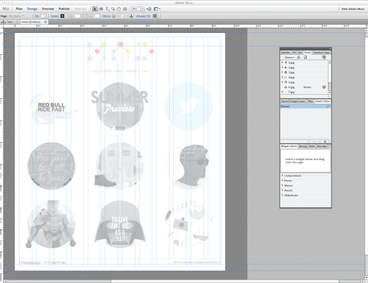
With our MAD portfolio site coming together nicely, it’s time for the finishing touch – to import our OAM animation file into the header. In Muse CC, navigate to the Design tab, choose File>Place and go to the OAM file you generated in the previous steps. Position your animated logo and you’re done.
26. Preview page
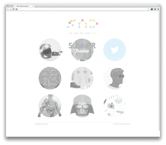
Using Adobe Muse CC’s Preview tab, you can quickly and easily look at how the interactive elements work when a user hovers their cursor over the animation. If anything is wrong, you can go back into Edge Animate CC, tweak the design and re-import it. Now, there’s only one thing left to do…
27. Publish for testing
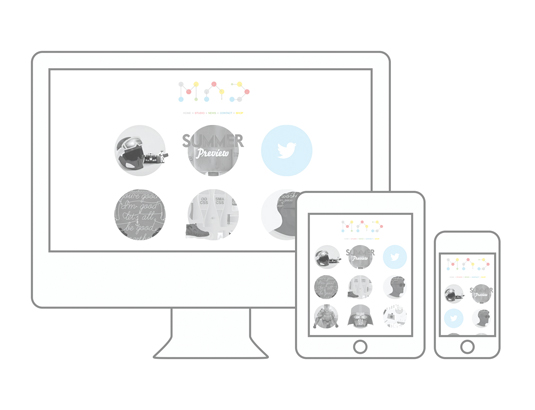
The last step is to use Business Catalyst to publish your site for testing. Go to File>Publish in Muse CC and follow the options to create a temporary Business Catalyst site (which will stay online for 30 days). For your reference, you can find the working version of this project online at: www.james-oconnell.com/MAD.
Words: James O'Connell
An award-winning creative with a global reach, O'Connell's attention to detail and colourful imagination has earned him clients such as Time Out NY, BBC and net magazine.
This article was originally published in The Ultimate Guide To Adobe Creative Cloud.
Now read these:
- Designers speak out about Adobe's Creative Cloud
- New tools in Adobe Creative Cloud: 12 revealing videos
- Free Photoshop actions to create stunning effects

Thank you for reading 5 articles this month* Join now for unlimited access
Enjoy your first month for just £1 / $1 / €1
*Read 5 free articles per month without a subscription

Join now for unlimited access
Try first month for just £1 / $1 / €1

The Creative Bloq team is made up of a group of art and design enthusiasts, and has changed and evolved since Creative Bloq began back in 2012. The current website team consists of eight full-time members of staff: Editor Georgia Coggan, Deputy Editor Rosie Hilder, Ecommerce Editor Beren Neale, Senior News Editor Daniel Piper, Editor, Digital Art and 3D Ian Dean, Tech Reviews Editor Erlingur Einarsson, Ecommerce Writer Beth Nicholls and Staff Writer Natalie Fear, as well as a roster of freelancers from around the world. The ImagineFX magazine team also pitch in, ensuring that content from leading digital art publication ImagineFX is represented on Creative Bloq.
