Google gives Motorola a striking new logo
Motorola's classic logo is put to rest, as the search giant creates a brand new design for its recent acquisition.

There are logo redesigns and there are logo redesigns. And this could reasonably be described as the mother of all redesigns.
Motorola is a company with a huge and emotive history behind it. Founded in Chicago in 1928, the company manufactured one of the first car radios, the first walkie-talkie, and a series of communications devices that were vital to Allied forces during the Second World War. The Cathode Ray tube it c0-developed became the TV industry standard; in 1969 Neil Armstrong said "One small step for a man, one giant leap for mankind" from the Moon on a Motorola transceiver; and in 1973, Motorola demonstrated the first hand-held portable telephone.
Over more than half a century of technological innovation, Motorola devices have carried the same 'batwing' logo, created by award-winning Chicago graphic designer Morton Goldsholl in late 1954. Then in January 2011, the company split into two: Motorola Solutions, an enterprise- and government-facing wing, and Motorola Mobility, focusing on handsets and set-top boxes.
The latter was bought by Google in 2012 - and the search giant has now made it clear who's calling the shots with the new design.
Birth of a classic

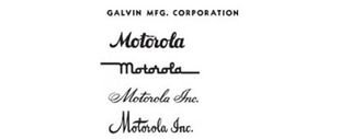
Although the brand name 'Motorola' was established in 1930 for its in-car radio, it wasn't until 1947 that the company, which was originally called the Galvin Manufacturing Corporation, took the same name. The logo originally leaned toward a handwritten, cursive look (above).
Then in 1954 when Morton Goldsholl, an award-winning Chicago graphic designer, proposed establishing a visually strong graphic mark. "It should capture the eye of all observers–consumer, dealer, salesman, casual onlooker, or the most prejudiced company employee… [and] it should have the visual strength to last," he said at the time.

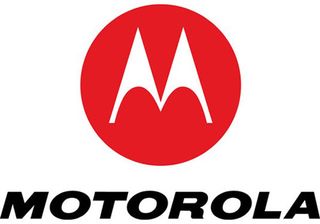
The 'M' insignia was born (above). Designed in 1954 and released the following year, , it featured two aspiring triangle peaks arching into an abstracted 'M', and became known as the batwings.
Get the Creative Bloq Newsletter
Daily design news, reviews, how-tos and more, as picked by the editors.
Also referred to as the 'emsignia', this logo served the company for decades, with only minor variations. Then when the company was broken into two in 2011, the Motorola Mobility arm kept hold of the old logo, giving it a vibrant red twist.

Other than that, though, little changed - so Google's new take on the design is a shock to the system.
New look
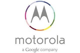
The new design, revealed by The Verge, features a new, strikingly thinner font that seems well in line with the current trend for minimalist, flat design typified by the recent iOS7 makeover of the iPhone interface.
The much loved batwings remain, but the solid single-colour disk has been replaced by a 12-coloured outer ring, the letters are a softer grey and the whole feel to the design is much more in keeping with Google's own visual identity. And just to ram home the point, there's a new tagline: "A Google company".
If ever a logo spoke a thousand words, this is it. Google's the daddy now. And with the Moto X, the first phone Motorola has produced with Google, rumoured to be out later this year, we're very excited about what's to come from this tech giant team-up...
Liked this? Read these!
- The ultimate guide to logo design: 40 pro tips
- The biggest logo design trends
- The good, the bad and the ugly: typography in Olympics logo design
We'd love to know what you think of the logo design. Share your views in the comments below!

Thank you for reading 5 articles this month* Join now for unlimited access
Enjoy your first month for just £1 / $1 / €1
*Read 5 free articles per month without a subscription

Join now for unlimited access
Try first month for just £1 / $1 / €1
The Creative Bloq team is made up of a group of design fans, and has changed and evolved since Creative Bloq began back in 2012. The current website team consists of eight full-time members of staff: Editor Georgia Coggan, Deputy Editor Rosie Hilder, Ecommerce Editor Beren Neale, Senior News Editor Daniel Piper, Editor, Digital Art and 3D Ian Dean, Tech Reviews Editor Erlingur Einarsson and Ecommerce Writer Beth Nicholls and Staff Writer Natalie Fear, as well as a roster of freelancers from around the world. The 3D World and ImagineFX magazine teams also pitch in, ensuring that content from 3D World and ImagineFX is represented on Creative Bloq.
