10 redesigns for the Google Chrome logo
If Google were to redesign its Chrome logo, what could it look like? Several designers have given their own interpretations of the twirly wheel.
Chrome is a free web browser that was launched by Google back in 2008. In just six short years it’s gone on to be a massive success, occupying around a 39 per cent share of the worldwide usage of web browsers, and for very good reason.
It’s fast, blisteringly fast in fact; loading web pages in lightening-bolt time and running complicated web applications in a snap. It’s also super-secure, streamlined and easy to use. Hardly surprising it’s made such an impact. So to pay homage to this digital smash hit, here’s a showcase of new Google Chrome logo designs - enjoy!
01. Alistair Holt
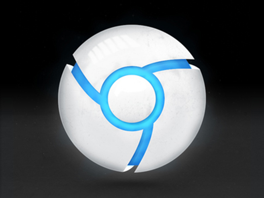
Combining the smash-hit game Portal with the Google Chrome logo is a sure fire recipe for success. This redesign takes inspiration from the Portal gun; game geeks across the planet fall to their knees.
02. Claudio Guglieri
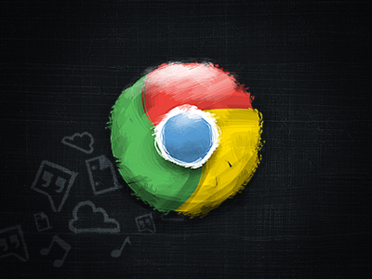
A gorgeous hand-made treatment of the Google Chrome logo that has plenty of texture, character and cool. We love the chalkboard-like background complete with quirky hand-drawn illustrations.
03. Celegorm
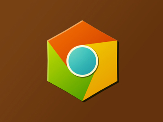
Ahh, the old '70s combination of orange-brown with Happy Shopper-esque colours. This retro redesign of the Google Chrome logo is horribly nostalgic yet honest to the original.
04. Baldvin Mar Smarason

Using folding techniques is a great way to add unparalleled amounts of realism. So much so, in fact, we think we like it more than the original Google Chrome logo.
05. Gianluca Divisi

A super-shiny treatment of the Google Chrome logo that’s suitably space-age for the mark that symbolises the future of web browsers.
Get the Creative Bloq Newsletter
Daily design news, reviews, how-tos and more, as picked by the editors.
06. Logan Ogden
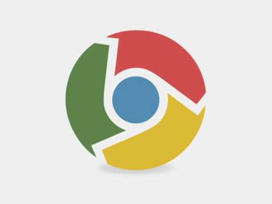
A lovely mosaic incarnation that adds interest and a structure to the standard Google Chrome logo.
07. Joy-Vincent Niemantsverdriet

Here’s an innovative approach that abandons the primary colour palette of the original Google Chrome logo in favour of hard metal and icy cold hues.
08. Damian Kidd
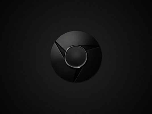
And taking the minimal colour approach even further, here we have black Chrome, looking very much like something hacked off the mother ship in the movie Alien.
09. Browser Cookie
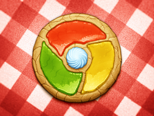
So much fun and good enough to eat! The Chrome cookie makes the logo even more appetising and adds a homely-feel you’d never associate with a technology brand.
10. Matthew Daniels

And finally, here’s the Google Chrome logo in 3D. Through clever use of shading and shadows, the creative behind this redesign brings life and depth to the 2D original.
Words: Amie Pallen and Craig Stewart
Amie Pallen loves creative logo designs, and currently she is working at Who is hosting this.com reviews; a useful webmaster tool that lets you discover which web host any website uses.
Liked this? Read these!
- Our awesome guide to designing the best logos
- Download free textures: high resolution and ready to use now
- The best free web fonts for designers
Have you seen or designed a Google Chrome logo, or been creative with another famous piece of branding? Let us know in the comments!

Thank you for reading 5 articles this month* Join now for unlimited access
Enjoy your first month for just £1 / $1 / €1
*Read 5 free articles per month without a subscription

Join now for unlimited access
Try first month for just £1 / $1 / €1

The Creative Bloq team is made up of a group of design fans, and has changed and evolved since Creative Bloq began back in 2012. The current website team consists of eight full-time members of staff: Editor Georgia Coggan, Deputy Editor Rosie Hilder, Ecommerce Editor Beren Neale, Senior News Editor Daniel Piper, Editor, Digital Art and 3D Ian Dean, Tech Reviews Editor Erlingur Einarsson, Ecommerce Writer Beth Nicholls and Staff Writer Natalie Fear, as well as a roster of freelancers from around the world. The ImagineFX magazine team also pitch in, ensuring that content from leading digital art publication ImagineFX is represented on Creative Bloq.
