DC Comics release edgy new Superman logo
The superhero celebrates his 75th birthday with an eye-catching logo design. What do you think of this striking new look?
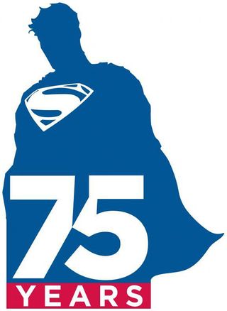
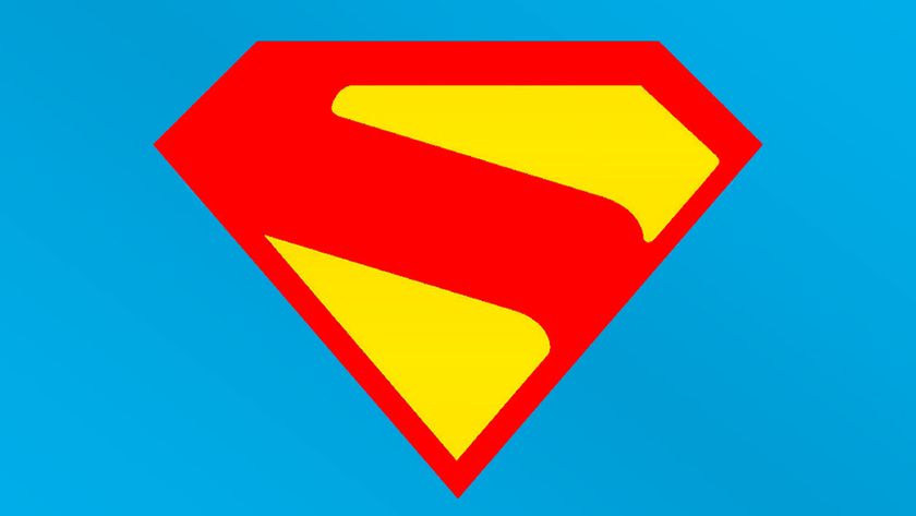
DC Comics have released this new logo design to celebrate Superman's 75th birthday. It's a classy bit of work - and in our opinion, a much needed revamp of the pensionable superhero's 'clean cut' image.
- Read all our comics-related posts here
While comic aficionados know there's more to Superman these days than neat hair, white teeth and impeccable manners, many of those familiar with the Christopher Reeve movies haven't caught up. So as Superman is about to be rebooted in one of the year's biggest 3D movies, Man of Steel, it's apt that this special anniversary logo shows a slightly edgier side to the Kryptonian.
Jagged edges
In fact, edges are the first thing that grab the attention: there are no smooth curves here. The jagged, outline of the silhoutte give a rougher look to Supes that suggests hidden depths to the character, while the typography continues the theme, surgically removing a shard from the '5' to create an starkly angular effect.
Most strikingly (and stop us if we're reading too much into this), the Superman shown here seems to be gazing down, reflectively - a big departure from the über-confident, upward facing gait we're used to seeing in past incarnations.
21st century look
While the trademark red, white and blue colour scheme is still present and correct, the character himself entirely in blue (need we say more there?). Even the famous cape seems muted.
All in all, we'd argue this design serves well to reposition Superman for the modern take on the superhero, which less about the upbeat, gungho attitude of old, and more about the kind of brooding, introspective outlook portrayed in the Dark Knight movie trilogy.
*PS: We've since seen the Jim Lee image that the silhoutte seems to have been cut out from (the artist won't let us or anyone else hotlink to it, so you'll have to take our word for that). That image is actually fairly upbeat - but we're sticking to our view that the treatment that's been applied to it here provides a very different perspective on the character.
Get the Creative Bloq Newsletter
Daily design news, reviews, how-tos and more, as picked by the editors.
The new logo which, significantly, features the 'S' emblem design from the forthcoming Man of Steel movie, will make its first appearance on the cover of 'Superman Unchained' on June 12, along with a new animated short being produced by Zack Snyder, portions of which will be shown at San Diego Comic-Con in July.
Liked this? Read these!
- Free graffiti font selection
- Illustrator tutorials: amazing ideas to try today!
- Great examples of doodle art
What do you think of the new logo design? Let us know in the comments below!

Thank you for reading 5 articles this month* Join now for unlimited access
Enjoy your first month for just £1 / $1 / €1
*Read 5 free articles per month without a subscription

Join now for unlimited access
Try first month for just £1 / $1 / €1
The Creative Bloq team is made up of a group of design fans, and has changed and evolved since Creative Bloq began back in 2012. The current website team consists of eight full-time members of staff: Editor Georgia Coggan, Deputy Editor Rosie Hilder, Ecommerce Editor Beren Neale, Senior News Editor Daniel Piper, Editor, Digital Art and 3D Ian Dean, Tech Reviews Editor Erlingur Einarsson and Ecommerce Writer Beth Nicholls and Staff Writer Natalie Fear, as well as a roster of freelancers from around the world. The 3D World and ImagineFX magazine teams also pitch in, ensuring that content from 3D World and ImagineFX is represented on Creative Bloq.

