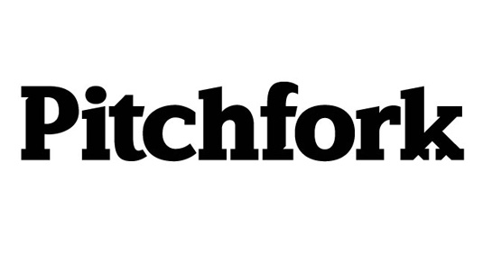
Designers react to the new Pitchfork logo
Pitchfork has revealed an updated website and logo - but what do designers think of the new look?

The online world has changed a lot since Chicago-based music website Pitchfork last had a redesign in late 2011. To keep up with the times, Pitchfork has revealed a new site layout and logo design. But have fans embraced the change, or are they still pining for the old format and retro fonts?
Having worked hard on the new design for over a year, Pitchfork unveiled its new look earlier this week. With a layout that aims to simplify the user experience, plus a unique logotype designed by Swiss type foundry Grilli, these changes are just the first in a series of updates.
The redesign also follows on from a change in management, as Pitchfork Media was acquired by Condé Nast in October 2015.
"Pitchfork is a distinguished digital property that brings a strong editorial voice, an enthusiastic and young audience, a growing video platform and a thriving events business," says Condé Nast president Bob Sauerberg, but does this update bring out the best Pitchfork has to offer?

As is to be expected with a major reddsign, the finished article has split opinions across the board. However there are plenty of designers who love the revamp, especially the new bespoke typography.
Brand new https://t.co/htSltEtPPn design and build looks lovely (and blazing fast). Nice work @mattdennewitz and team.March 14, 2016
There's some really nice touches on the new https://t.co/KqOLoy89pa designMarch 14, 2016
Looking good @pitchfork! I'm digging the new site design.March 14, 2016
@pitchfork have a new website and a fresh new logo type thanks to the super awesome type wizards @grillitype pic.twitter.com/7SWizggtESMarch 14, 2016
@grillitype @pitchfork ugh that k is tight!March 14, 2016
@grillitype This is beautiful, I absolutely love the 'c'!March 14, 2016
Moderate opinions are a rare thing on the internet, but while this designer doesn't approve of the visuals he can at least find some positives on the new site as well.
...on second look, I think it's because @pitchfork's re-design has a visual hierarchy problem. Articles look great, homepage is a mess.March 14, 2016
Though when your site caters to discerning music fans, there are always going to be those who don't approve of change. Especially when it comes to the typography.
Get the Creative Bloq Newsletter
Daily design news, reviews, how-tos and more, as picked by the editors.
Why did you get rid of that amazing "k" in your logo @Pitchfork?! pic.twitter.com/pPr9Gu34B6March 14, 2016
My initial reaction to @pitchfork's new site design: Now you look like every other hipster music blog. Lame @CondeNastMarch 15, 2016
I hate @pitchfork's new site design. Hate it. Worse than ESPN's redesign a while back. Ugh.March 14, 2016
Liked this? Read these!
- Check out these amazing band logos through the years
- We reveal where to find logo design inspiration
- Can you guess the logo in this design quiz?
- We reveal the best web fonts for your site
- The beginner's guide to flat design

Thank you for reading 5 articles this month* Join now for unlimited access
Enjoy your first month for just £1 / $1 / €1
*Read 5 free articles per month without a subscription

Join now for unlimited access
Try first month for just £1 / $1 / €1

Dom Carter is a freelance writer who specialises in art and design. Formerly a staff writer for Creative Bloq, his work has also appeared on Creative Boom and in the pages of ImagineFX, Computer Arts, 3D World, and .net. He has been a D&AD New Blood judge, and has a particular interest in picture books.
