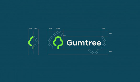
Designers react to the new Gumtree logo
Gumtree has spruced its branding up – we asked designers what they think of the fresh new look.

It was high time the UK's digital classified ads giant modernised their site. With one in four people in the UK using Gumtree at least once a month, the brand's identity needed to be recognisable on all formats – from billboards to mobile devices.
Part of the re-design was, of course, a new logo design. Customer research indicated that the original tree logo wasn't particularly admired and lacked practicality. The new tree design, Koto's James Greenfield says, is "all the positive natural connotations of growth, stability and diversity whilst making [Gumtree] an instantly recognisable icon."

However, he continues, "[The new logo] isn't about visual seduction. It's functional." The tree had to be successful on a range of scales.
The site tweeted a cheeky poll to ask users opinions on the new design and had varied responses – as typical when a major brand makes a change.
What do you think of our new logo?January 7, 2016
But what do designers think? Is this new icon really immediately recognisable, making an impact alongside other online brands like Google, Facebook and parent company, Ebay?
Gumtree has rebranded for 2016 – with help from Koto design studio. Much better!! https://t.co/5Oks5xuE6Z #Design pic.twitter.com/Z35k8sm6XsJanuary 8, 2016
In a first for most major rebrands, the overwhelming response was that of approval, with designers actively tweeting about their love for it.
Quite like the new @Gumtree logo and branding. https://t.co/1SoZM32IBHJanuary 8, 2016
The new @gumtree logo looks a bit of alright pic.twitter.com/m0Vu9mz2WgJanuary 6, 2016
@hunterlangston Like the negative space in the branding. Nice and clean. Nice work on your website too!January 8, 2016
Nice rebrand of @Gumtree #design #logo #branding good work @studiokoto https://t.co/tLuc2emgibJanuary 7, 2016
However, many have pointed out the similarity to other brands, making it not so individual and recognisable as they hoped...
@Gumtree not sure, looks quite similar to @parkrunUK #logo #rebrandJanuary 7, 2016
Ermmm @Gumtree I'd have a word with your designers! #stolen #copied #design #creative #logo #gumtree #rebrand #fail pic.twitter.com/Y1uyh9T4IqJanuary 8, 2016
And others don't think it's quite as "on-brand"...
@Gumtree @Gumtree why simplify? Just makes you look more corporate. Also doesn't mean anything clear. Dislike.January 7, 2016
What do you think? Is Gumtree growing in the right direction or should it snip its new look in the bud?
Liked this? Read these!

Thank you for reading 5 articles this month* Join now for unlimited access
Enjoy your first month for just £1 / $1 / €1
*Read 5 free articles per month without a subscription

Join now for unlimited access
Try first month for just £1 / $1 / €1
Get the Creative Bloq Newsletter
Daily design news, reviews, how-tos and more, as picked by the editors.

The Creative Bloq team is made up of a group of design fans, and has changed and evolved since Creative Bloq began back in 2012. The current website team consists of eight full-time members of staff: Editor Georgia Coggan, Deputy Editor Rosie Hilder, Ecommerce Editor Beren Neale, Senior News Editor Daniel Piper, Editor, Digital Art and 3D Ian Dean, Tech Reviews Editor Erlingur Einarsson, Ecommerce Writer Beth Nicholls and Staff Writer Natalie Fear, as well as a roster of freelancers from around the world. The ImagineFX magazine team also pitch in, ensuring that content from leading digital art publication ImagineFX is represented on Creative Bloq.
