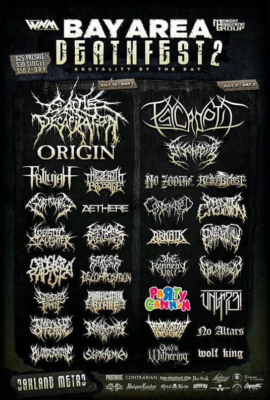
This death metal logo goes against the grain
Wilfully perverse death metal band logo proves you don't have to be a design sheep.

We've already explored 20 great hard rock logos which demonstrate the importance of branding at the harder end of the music spectrum – and this poster for Bay Area Deathfest 2 (the place to go if you're after 'brutality by the bay') perfectly shows how bands can use logo design to get noticed… but maybe not how you'd expect.
While the perceived wisdom of death metal logos dictates that they have to be indecipherable heaps of spiky words and gothic typefaces, Scottish band Party Cannon throw all of those clichés out of the window.
Thanks to a bright bubble writing logo that looks like it came straight out of Toy 'R' Us, Party Cannon are instantly recognisable and focus the reader's attention. They might not be the top billing, but Party Cannon definitely get seen.
EDIT: As Digital Spy's Matt Hill has pointed out, the poster has been tampered with for effect, however the colour logo is Party Cannon's genuine logo, and even without colour it emphatically doesn't follow the death metal logotype template…
Liked this? Read these!

Thank you for reading 5 articles this month* Join now for unlimited access
Enjoy your first month for just £1 / $1 / €1
*Read 5 free articles per month without a subscription

Join now for unlimited access
Try first month for just £1 / $1 / €1
Get the Creative Bloq Newsletter
Daily design news, reviews, how-tos and more, as picked by the editors.

Dom Carter is a freelance writer who specialises in art and design. Formerly a staff writer for Creative Bloq, his work has also appeared on Creative Boom and in the pages of ImagineFX, Computer Arts, 3D World, and .net. He has been a D&AD New Blood judge, and has a particular interest in picture books.
