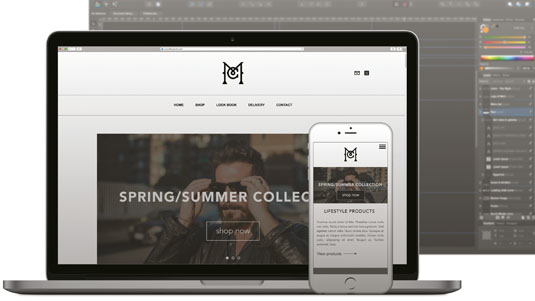
Affinity Designer is a fresh new design and illustration app that burst on to the scene last year and immediately won Editors' Choice, before becoming a runner up in the contest for Best App of 2014. Yesterday, Serif announced some top new features in Affinity Designer 1.4.
Here, I'll walk you through how to create a unique logo using the software. I'll cover the basics of the app, including working with lines and shapes, laying out a page, and exporting various elements as efficient web graphics.
Affinity Designer is Mac-only for now, but that may change once the developers finish up the suite of tools (which will also include Affinity Photo and Affinity Publisher).
Before you get started, download the 10-day Affinity Designer trial and install it (or dive in and buy it from the Mac App Store). Affinity Designer works on OS X 10.7.5 or newer and only requires a Core 2 Duo processor.
Step 01

Launch the app and create a new doc from the startup panel. As we're designing a scalable vector logo, the document type and pixel size aren't critical – we've chosen 'Web' at WXGA (1280x800) for ease. To prepare for the design, turn on Snapping and select the UI design preset from the drop-down list, which also enables Force Pixel Alignment mode. You should also enable Guides and Rulers from the View menu.
Step 02
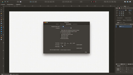
Select the Pen tool from the left, and choose the 'Line Mode' option on the top Context toolbar to restrict creation to straight lines. On the Stroke panel at the right, set the stroke weight to 9.6pt (or type 40px, and it will convert for you). To have stroke weights displayed in pixels rather than the normal points, uncheck 'Show Lines in Points' in Affinity Designer > Preferences.
Step 03

Click and hold, starting from above and left of centre of the design area, holding Shift to constrain the line to vertical, and drag downwards. Release to draw the stroke (ours is 580px tall). Set the Cap type to 'Butt' to give a flat end. Switch to the Move tool (V), hold cmd, then click and drag your line to create a copy, moving it to the right. Hold Shift to keep the copy aligned.
Get the Creative Bloq Newsletter
Daily design news, reviews, how-tos and more, as picked by the editors.
Step 04
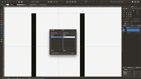
It's evident now that some layout guides will help keep the growing number of elements neat. Our first vertical stroke is at X=425 and you can position the second by eye, or add guides by clicking on the rulers and dragging right or down. To suit our logo, we're adding horizontal guides at 110, 400, 690px and vertical guides at 425, 640, 855px using View > Guides Manager.
Step 05
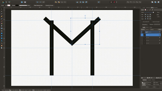
Position the right line over the guide at 855px – it should snap nicely into place. Select the Pen tool again and draw a diagonal line from the top-left of the logo to just above the middle of the logo space. Switch to the Move tool (V) again, hold cmd and drag to duplicate this as we did for the vertical line. Flip it using the 'Flip Horizontal' button on the top toolbar. Position it to the right.
Step 06

You can edit these strokes by moving end nodes using the Node tool (A). If you're happy, select both the diagonal lines by Shift-clicking them, then choose Layer > Expand Stroke. This converts them to rectangular shapes that are easier to select and align. Zoom in to the point of the 'M' and use the Node tool again to position the lowest corners together on the centre line.
Step 07
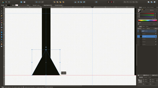
Time to embellish the 'M'! Click on the Triangle shape on the left toolbar to select it (more options become available if you hold down), then click and drag to draw a triangle 130px wide by 115px tall. Fill it black via the Colour panel and remove the stroke. Position at the bottom-left of the 'M', then duplicate it for the right. If you haven't yet saved your design, hit cmd+S and name your file.
Step 08
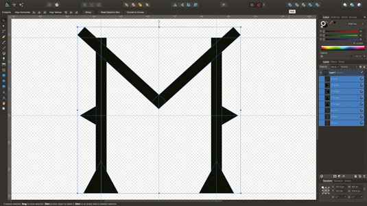
Duplicate the triangle again, then use the Transform panel at the lower right to set its size to 70px wide by 60px high. Rotate 90° using the shape's rotation lollypop, holding Shift to constrain. Position one triangle at the left middle of the first stroke, duplicate and flip to position another on the right stroke. 'Expand Stroke' on the two vertical lines, then cmd+A to select all, then join the shapes using the 'Add' button at the top right.
Step 09
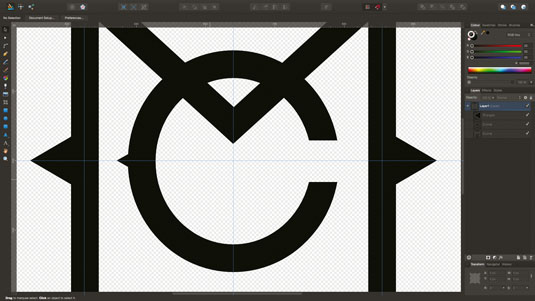
Now we're going to create the 'C' that will sit inside our 'M'. Create an ellipse 265x280px, with no fill and a 40px stroke. Centre it in the design area, then convert it to a shape (Layer > Expand Stroke). Next, create a rectangle 60px high and position it over the mid-right of the ellipse (this will form the break in the 'C'). Shift-click to select both objects and cut the rectangle from the ellipse using the 'Subtract' button. I've also added a small triangle on the letter's left side.
Step 10
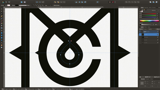
If you're feeling up to some curve manipulation, we can add some interest to the middle point of our 'M'. Add a small circle with 40px stroke and convert to curves. Break the curve at the top node and move the loose ends to make a teardrop shape that meets the 'M''s arms. Some practice with curves can be had at bezier.method.ac. You can also add a neat 5px rounding inside the top of the 'M''s upper points using the Corner tool – select both the nodes, then click and drag to smooth.
Step 11
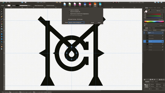
Now we want to save your file again and export the logo as an SVG so we can easily use it in other projects. Press cmd+A to select everything, go to File > Export and choose 'SVG' from the icons at the top of the Export dialog. Choose 'Selection without background' from the Export dropdown, then click 'Export'. Now you just need to give your logo a name, choose a folder (remember where it is!) and hit 'Save'. Close your design from the File menu.
Step 12
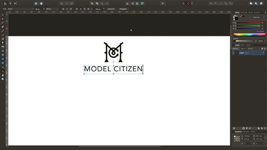
Over the next few steps, we're going to use the techniques you've already learned to mock up a page around your logo. Create a new design, same size or larger than before (ours is 3840 x 7400px) and we've unchecked 'Transparent background'. Once open, ensure Snapping is enabled, choosing the UI preset again. Next click the 'Place Image Tool' button, select your logo SVG, and drag it out at the middle top of the page. Ours is roughly 260px square, but it'll look perfect at any size!
Step 13

Choose whether to start with guidelines or content first (and guidelines afterwards), to kickstart your layout. Our guides define a repeating area that includes a background rectangle, one large and three small images, product information, and button regions. You can drag these guides on to the page from the rulers.
Step 14
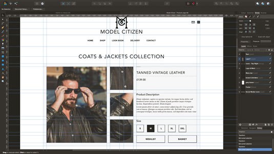
Time for some layout tips! To quickly centre-align, right-click an object and choose Alignment > Align Centre. Or add Alignment (and Distribution) controls to your upper toolbar using drag and drop – edit the toolbar using View > Customise Toolbar… to achieve this. Add text using the tool at the left, either scalable 'Art Text' or traditional 'Frame Text'. Use Hex colours by changing the Colour panel's menu to 'Sliders' and the model drop-down to 'RGB Hex'.
Step 15
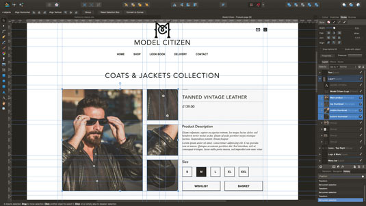
Once you're happy with your page mockup, it's time to select some elements to export. To select multiple product images, cmd+click each one in the Layers panel or Shift-click each one in the design. Now switch to the Export persona using the button in the top-left. In the Layers panel, click 'Create Slices'. You can adjust slices to be any size in any position.
Step 16
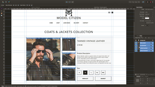
In the Slices panel, uncheck everything apart from your selected images. Choose whether to export at 1x size, 2x, 3x (or all three). Look up to the settings in 'Export Options'. We're outputting JPGs at High Quality, using a Lanczos3 resampler and happily ignoring ICC settings (but they're there if you need them!). Now click 'Export Selected' at the bottom of the Slices panel, pick a folder, and click Export.
You're done!
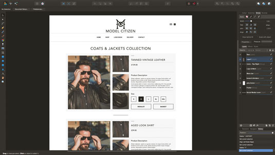
That's it! You've seen some creation tools, pixel-perfect shape manipulation, layout assistants, exporting as SVG, creating export areas from design elements, and exporting optimised graphics. There are plenty of ways to make Affinity Designer fit your unique workflow – start using it in your own way to see what fits!
This article was originally published in issue 269 of net magazine.
Related articles:
- Top new features in Affinity Designer 1.4
- Download free textures: high resolution and ready to use now
- The best photo apps for iPhone, iPad and Android

Thank you for reading 5 articles this month* Join now for unlimited access
Enjoy your first month for just £1 / $1 / €1
*Read 5 free articles per month without a subscription

Join now for unlimited access
Try first month for just £1 / $1 / €1
