Bing gets a new logo
Microsoft gives its search engine a bold new identity. What do you think of its new look?
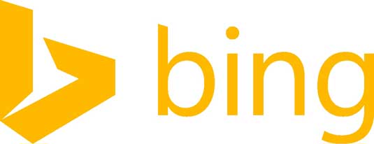
September's been a milestone month for search engine branding. First Yahoo launched its new logo to a storm of controversy. Then Google appeared to be testing a new 'flat' logo. And now Microsoft has thrown its hat into the redesign ring with this striking new logo design for Bing.
The new logo (above) ditches the trademark blue of the old design (below) for golden orange - the exact hue, in fact, that Microsoft uses in one quarter of its own flag-like logo.
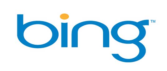
Cast in a customised version of Microsoft's Segoe font, the new Bing logo is being released to coincide with a new colour palette and an overhaul of Bing's functionality, which has a new responsive design and Smart Search feature aimed at making the search engine faster and better able to meet users' needs.
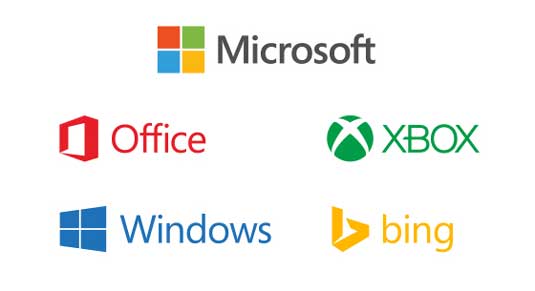
It's also been designed to fit in better with the identities of other Microsoft brands, the company says.
Typography
In this blog post, Microsoft gives more detail about the typography of the logo. While it's retained the lowercase 'b' "to provide a slightly less obtrusive stance", the descender on the 'g' has been slightly modified to curve upward "in a friendlier manner" and the cut on the top of the 'b' mirrors the angle on the cut of the 't' in the Microsoft logo.
The kerning pairs of the 'i' and the 'n' are exactly the same as the 'i' and the 'n' in the Windows wordmark, while the symbol, a stylized 'b', "evokes a sense of movement, direction and energy".
Development
Unlike Yahoo's new logo which was controversially created in a single weekend, Microsoft says of the new Bing logo: "A new visual identity doesn’t just happen overnight.
Get the Creative Bloq Newsletter
Daily design news, reviews, how-tos and more, as picked by the editors.
"We spent months looking at ways to update the look of Bing to represent what the product offers today, while achieving visual parity with Microsoft's over-arching new look for the company. We worked with product, graphic and user experience designers to create a look that matches and grows with the product.

"With principles and frameworks in hand, we looked at the art. We revisited the current logo and diagnosed what wasn't working. We looked at the new Microsoft identity and we did hundreds of studies to look at motion, font, color, size and form.
"We built out mock ads, localized product examples for China and fictitious billboards to see what was working. From simple evolutions to ridiculous explorations, we learned something in each one.
"In the end, our new logo was created to be simple, real and direct."
Like this? Read these!
- Download the best free fonts
- Free graffiti font selection
- Illustrator tutorials: amazing ideas to try today!
What do you think of the new logo? Let us know in the comments box below!

Thank you for reading 5 articles this month* Join now for unlimited access
Enjoy your first month for just £1 / $1 / €1
*Read 5 free articles per month without a subscription

Join now for unlimited access
Try first month for just £1 / $1 / €1

The Creative Bloq team is made up of a group of art and design enthusiasts, and has changed and evolved since Creative Bloq began back in 2012. The current website team consists of eight full-time members of staff: Editor Georgia Coggan, Deputy Editor Rosie Hilder, Ecommerce Editor Beren Neale, Senior News Editor Daniel Piper, Editor, Digital Art and 3D Ian Dean, Tech Reviews Editor Erlingur Einarsson, Ecommerce Writer Beth Nicholls and Staff Writer Natalie Fear, as well as a roster of freelancers from around the world. The ImagineFX magazine team also pitch in, ensuring that content from leading digital art publication ImagineFX is represented on Creative Bloq.
