The biggest new logo designs of July 2013
We take a look back at this month's biggest logo designs, including Hooters, Penguin, and MailChimp.
As creatives we constantly strive to reinterpret the world in new and visually exciting ways. Yet we can also be conservative and often have a knee-jerk reaction to something new.
So on the day a new logo design is launched for a familiar brand, the first reactions are usually negative. Once some time has passed and the new design has been seen in action, though, it can be a different story. Here we take a look back at the month's biggest redesigns: with a bit of fresh perspective, what do you think of them now?
01. Penguin
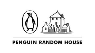
Newly created books giant Penguin Random House describes itself as "the world’s first truly global trade book publisher", employing more than 10,000 people across almost 250 imprints and publishing houses that collectively publish more than 15,000 new titles annually. And here's its new logo, which is already in use on its website and press releases.
It's a tricky task to combine two classic logo designs into something that keeps the essence of both while presenting something new. Whether or not you feel this does the job, bear in mind it's not a long-term solution - the company tweeted: "Logo is temporary so stay tuned" from its @PenguinRH_News account.
02. MailChimp
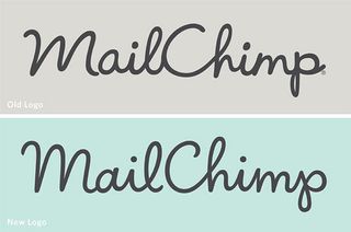
Jessica Hische has many fans amongst lovers of typography and the leading designer was recently asked to tackle a logo redesign for popular email newsletter platform MailChimp.
"They didn’t want to do a massive overhaul," Hische explains, "they just wanted to give their current mark a facelift."
Hische lightened the weight of the logo overall and improved the vector drawing, with the letterforms revised for legibility, especially at small sizes. The end result is a more refined, refreshed look whilst still portraying MailChimp's playful ethos.
Whilst the changes may not be so obvious to those who aren't typography junkies, the annotated images below show exactly how things have been tightened up and improved.
03. Glasgow Airport
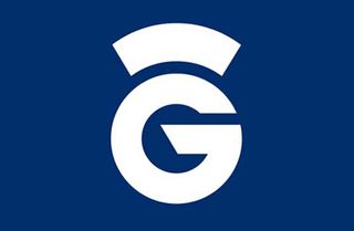
The largest city in Scotland, and the third largest in the UK, Glasgow will have the eyes of the world on it next July and August when it hosts the 2014 Commonwealth Games. And in anticipation of a rush of visitors to the city, Glasgow Airport has undergone a rebranding exercise as part of a £17 million investment including a new logo.
The typographic logo is said to resemble a thistle, the national flower of Scotland, and is set against a blue background, bringing to mind the colour of the Scottish flag. It will be teamed with a tagline: "Proud to serve Scotland".
The new branding, by Paisley-based agency Designline, will implemented across a wide variety of material including the website, a branded app, digital communications, corporate stationery, ambient media, promotional material and a Glasgow Airport mascot.
04. YouSendIt/Hightail
YouSendIt is one of the most widely used file sending services but with more and more competition rolling out every month, the company needs to be at the top of its game. That's why they've decided to do a complete branding overhaul - giving themselves a new name and logo.
Hightail will be offering exactly the same services, with the change aiming to excel over "a landscape of Boxes, Syncs and Shares alongside an audaciously elegant look that contrasts with the endless dreary blues of the cloud space", according to a blog post written by CEO Brad Garlinghouse.
With Carlinghouse teasing that there's more to come, we look forward to see what Hightail have to offer in the next few months.
05. Hooters
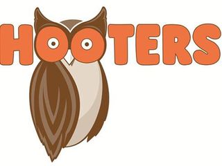
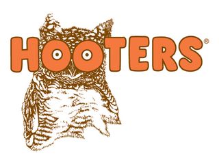
Hooters is one of the US's top brands and is an American institution. Much like the concept itself, the company's logo (below) served for 30 years as an example of a design that shouldn't work, but does. In July, though, Hooters decided the time had come to update it.
Atlanta design firm Sky Design has given the logo a more modern streamlined look (above), although the essential details remain, including the cartoon typography, the owl and the double-entendre use of the bird's eyes. Over the next few months the logo will be rolled out across the brand, appearing on waitress uniforms, menus and, eventually signage.
Like this? Read these!
- The best Photoshop plugins
- Our favourite web fonts - and they don't cost a penny
- Illustrator tutorials: amazing ideas to try today!
- Great examples of doodle art
What do you make of this month's biggest logo designs? Let us know in the comments box below!

Thank you for reading 5 articles this month* Join now for unlimited access
Enjoy your first month for just £1 / $1 / €1
*Read 5 free articles per month without a subscription

Join now for unlimited access
Try first month for just £1 / $1 / €1
Get the Creative Bloq Newsletter
Daily design news, reviews, how-tos and more, as picked by the editors.
The Creative Bloq team is made up of a group of design fans, and has changed and evolved since Creative Bloq began back in 2012. The current website team consists of eight full-time members of staff: Editor Georgia Coggan, Deputy Editor Rosie Hilder, Ecommerce Editor Beren Neale, Senior News Editor Daniel Piper, Editor, Digital Art and 3D Ian Dean, Tech Reviews Editor Erlingur Einarsson, Ecommerce Writer Beth Nicholls and Staff Writer Natalie Fear, as well as a roster of freelancers from around the world. The ImagineFX magazine team also pitch in, ensuring that content from leading digital art publication ImagineFX is represented on Creative Bloq.
