The biggest logo designs of November 2013
We take a look back at this month's biggest new logo designs, including new identities for Marvel, Philips, and more.
As creatives we constantly strive to reinterpret the world in new and visually exciting ways. Yet we can also be conservative and often have a knee-jerk reaction to something new.
So on the day a new logo design is launched for a familiar brand, the first reactions are usually negative. Once some time has passed and the new design has been seen in action, though, it can be a different story. Here we take a look back at the month's biggest new designs and redesigns: with a bit of fresh perspective, what do you think of them now?
01. Philips

Leading Dutch technology company Philips unveiled this new logo and identity across the entire brand in November. Based on the strapline 'innovation and people', the new shield logo harks back to the company's original logo design back in 1934. But this new look shield has curvier aspects to it, with thicker and softer lines throughout.
However, Philips have stated that they will continue to use their previous blue wordmark (above), as it aims to 'remains true to its legacy, rooted in its early years at the beginning of the 20th century'. The new logo will appear on all their upcoming promotional material.

02. Mesosphere
Here, we witness an evolution of a brand with a logo that mimics the transformation of its company as it goes along. Designer Brett Wickens was responsible for the iconic Sopranos logo for HBO - summing up the show's aesthetic in just a few letters. He now works as the partner and identity design specialist at Ammunition, where his expertise have been snapped up by San Francisco startup company Mesosphere to create a morphing brand identity.
Instead of a static image, the logo is an animated network of curvy nodes that shift and evolve over time. That network is amonogrammed 'M' that has been birthed in code, with the team building an app in the open source platform Processing that allowed them to tweak a few variables to suit their taste and the brand as a whole.
03. Marvel
If you've seen the movie Thor 2: The Dark World, you may have noticed something a little different at the beginning of the movie title designs. That difference is a change in the iconic Marvel logo - and the company has released the short video above to introduce it properly.
Get the Creative Bloq Newsletter
Daily design news, reviews, how-tos and more, as picked by the editors.
"We designed the very first Marvel logo for the first Spider-Man film," producer Kevin Feige explains on Marvel.com. "We've used that logo for 11 years, and with 'Thor: The Dark World', it felt like a good time to update it because this is the very first film that only has the Marvel logo in front of it." The design of the logo, which will appear in future Marvel movies, as well as the TV show Agents of S.H.I.E.L.D., has been beefed up, he added.

04. Wellington, New Zealand

This is the new logo design for New Zealand's capital, designed as part of the Destination Wellington project, which aims to promote the city as a place to do business.
Masterminded by Wellington City Council, with the help of paint company Resene, the rebranding exercise involved the creation of specific brand colours - Absolutely Yellow and Positively Black - as distinct from the black and gold of the Wellington rugby team.
This is being described as a way for residents to own the brand, by letting them use the paints in their own homes and businesses.

05. 50 Best Logos Ever

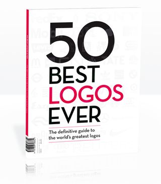
Okay, this is not a logo design from November - but a whole book of the best ones ever which was released this month! The 50 Best Logos Ever is a definitive guide to the greatest identity work ever created. Even if you only have a passing interest in graphic design, it’s fascinating to see what the BP logo looked like in 1930, or to chat about how the Coca-Cola identity has evolved (or not) over the past 125 years.
Over 180 premium pages, the book dissects the world's greatest examples of logo design, showing their origins, their evolutions and interviewing the designers behind them - including Rob Janoff (Apple) and Lindon Leader (FedEx). It all adds up to a fascinating reference book on the best known marks ever created.
Pick up the book at all good newsagents today or order it online. Or if you prefer, you can download a digital edition directly to your iPad from the Computer Arts app on iTunes.
Like this? Read these!
- How to build an app: try these great tutorials
- Free graphic design software available to you right now!
- Create a perfect mood board with these pro tips
What do you think of the logos unveiled in November? Let us know in the comments box below!

Thank you for reading 5 articles this month* Join now for unlimited access
Enjoy your first month for just £1 / $1 / €1
*Read 5 free articles per month without a subscription

Join now for unlimited access
Try first month for just £1 / $1 / €1
The Creative Bloq team is made up of a group of design fans, and has changed and evolved since Creative Bloq began back in 2012. The current website team consists of eight full-time members of staff: Editor Georgia Coggan, Deputy Editor Rosie Hilder, Ecommerce Editor Beren Neale, Senior News Editor Daniel Piper, Editor, Digital Art and 3D Ian Dean, Tech Reviews Editor Erlingur Einarsson and Ecommerce Writer Beth Nicholls and Staff Writer Natalie Fear, as well as a roster of freelancers from around the world. The 3D World and ImagineFX magazine teams also pitch in, ensuring that content from 3D World and ImagineFX is represented on Creative Bloq.
