5 tips for creating an event logo
Joff and Ollie, who branded the UK pavilion at Milan's World Expo 2015, share their advice on designing a logo for an event.

When it comes to events, there are a number of specific things you need to bear in mind regarding branding and logo design.
Most brands build their reputation over a long period of time, but event branding is different as there is always a short period of time between initial awareness, promotion and the event going live.
Here are our 5 tips for creating a strong logo and brand for an event...
01. Know your audience
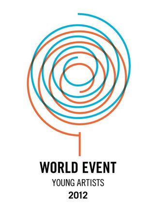
Your target audience needs to be able to relate to the logo immediately. Colours, forms and typography has to be on trend with the audience you’re addressing. It has to appeal to their imagination and inspire. If they don't get it straight away, you probably won't get a second chance, as before you know it, the event will be over.
02. Make it practical and easy
The short timescale of events means you will need to produce a lot of different material with little time to do it. You need a great looking logo that you can put on anything easily and quickly. It has to be practical and easy to implement in both print, web and the environment that is hosting the event.
03. Make it usable on social media
Social media is the number one method for promoting and hearing about events. If it doesn't work as a Twitter icon or on a mobile phone it doesn't work at all!
If the logo looks great on social media, people are more likely to retweet or share it as they will want to be associated with it.
04. Integrate dates and year
By including a date or year in the logo, it tells people it’s an event and gives them a sense of urgency to check it out. A year indicates it’s an annual event too, which gives it a level of importance and a 'not be missed' quality.
05. Make it fun and inspiring
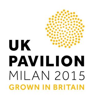
People go to events for lots of different reasons, but most of the time it’s because they want to have fun, learn something new and get inspired. The public or professionals will need to break their routine or travel to an event, often at great expense. If the logo doesn't look fun or inspiring, people won't feel compelled to go.
Words: Joff and Ollie Studio
Joff and Ollie Studio is a British design team whose recent work includes the branding for the UK pavilion at Milan's World Expo 2015, the Twin Tone Lampshade and Nottingham Castle’s successful branding bid presentation.
Liked this? Try these...

Thank you for reading 5 articles this month* Join now for unlimited access
Enjoy your first month for just £1 / $1 / €1
*Read 5 free articles per month without a subscription

Join now for unlimited access
Try first month for just £1 / $1 / €1
Get the Creative Bloq Newsletter
Daily design news, reviews, how-tos and more, as picked by the editors.
The Creative Bloq team is made up of a group of design fans, and has changed and evolved since Creative Bloq began back in 2012. The current website team consists of eight full-time members of staff: Editor Georgia Coggan, Deputy Editor Rosie Hilder, Ecommerce Editor Beren Neale, Senior News Editor Daniel Piper, Editor, Digital Art and 3D Ian Dean, Tech Reviews Editor Erlingur Einarsson and Ecommerce Writer Beth Nicholls and Staff Writer Natalie Fear, as well as a roster of freelancers from around the world. The 3D World and ImagineFX magazine teams also pitch in, ensuring that content from 3D World and ImagineFX is represented on Creative Bloq.
