5 of the most effective fantasy logos of all time
With Jurassic World – and its iconic logo – hitting the big screen, we pick out the greatest logos from the worlds of fantasy and sci-fi.
Jurassic World is out today, and, just as the sight of enormous CG dinosaurs rampaging across the screen never gets old, neither does the iconic Jurassic Park logo. It's been tweaked and revamped since the original movie was released, but it's still essentially the same piece of logo design that adorned movie posters back in 1993.
Discover six tips for using grids in logo design
Truly great fantasy and sci-fi logos are hard to come by; more often than not they're straightforward typographic treatments of the title, but there are a few that really stand out and capture the essence of a film or TV show. Here, then, are five of the best; be sure to tell us what we've missed in the comments.
01. Jurassic World
The logo for Jurassic World is, of course, a continuation of the Jurassic Park logo. Originally designed by Sandy Collora, it was based on Chip Kidd's cover illustration for Michael Crichton's novel: a simple but striking silhouette of a Tyrannosaurus Rex skeleton.
Let's gloss over the fact that T. Rex actually lived in the late Cretaceous period rather than the Jurassic. Collora set the T. Rex within a vivid red circle, added the JURASSIC PARK text in Neuland Inline and set the whole logo within a distinctive yellow outline.
It's been adapted for subsequent Jurassic Park movies; the biggest change was for the Jurassic Park 3 logo, in which the T. Rex was replaced by a Spinosaurus; however it's back for Jurassic World, in this striking monochrome bas-relief.
02. Star Wars
The Star Wars logo as we know it took a long time to come about; if you look at the original movie poster it features a logo that bears very little resemblance to the one we're all familiar with.
Get the Creative Bloq Newsletter
Daily design news, reviews, how-tos and more, as picked by the editors.
In fact the logo went through a number of iterations before art director Suzi Rice came up with the first version of the logo as seen in the film's opening title crawl; briefed by George Lucas to create something that looked "very fascist", she designed it using a modified version of Helvetica Black.
Effects artist Joe Johnston then adjusted it to make the final version, widening the lettering and redesigning the W of Wars, which looked more like an inverted M in Rice's logo.
03. Doctor Who
Just like the Doctor himself, the Doctor Who logo has been through many regenerations over the show's 50-year history. And just as Tom Baker is considered by many to be the best Doctor, the logo used for the majority of his tenure on the show is similarly definitive.
Created by BBC graphic designer Bernard Lodge, who also designed Doctor Who's previous three logos, the 'Diamond' logo was introduced in 1973 for Jon Pertwee's last season as the Doctor, as an integral part of a new title sequence that used a slit-scan technique to generate an amazing time tunnel effect full of swirling colours.
It won Lodge the RTS Television Award for Best Graphics in 1974, and the reworked version of the sequence featuring Tom Baker remained on the show until 1980.
04. Ghostbusters
Normally a logo for film or television is one of the last things to be designed, but in the case of Ghostbusters things worked the other way around.
The logo itself was specified in Dan Aykroyd's script as a ghost trapped within a 'No' symbol, and as it had to appear on-screen, on the Ghostbusters' uniforms, on the side of the Ectomobile and on a sign outside their headquarters, it had to be designed before the movie went into production.
Executive producer Michael C. Gross, who also worked as an artist and designer, was tasked with logo design, and the logo itself was quickly drawn by artist Brent Boates. The 'No' symbol itself is the wrong way round in the film; however for European posters the logo was reversed.
05. Batman
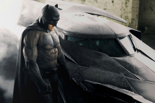
In book one of Frank Miller's The Dark Knight Returns, Batman gets shot in the chest, revealing a layer of armour beneath his bat-symbol. "Why do you think I wear a symbol on my chest," he explains, "Can't armour my head."
The Dark Knight's logo has been through innumerable changes since it first appeared in 1938, starting off with various adjustments to the distinctive bat symbol, then revamped in 1964 with the addition of a bright yellow oval that remained in place for years, albeit with the odd tweak along the way.
In The Dark Knight Returns, Batman switches from the oval symbol back to a simpler, more heavyweight logo, a no-nonsense bat-shaped slab of black, and it's this version that's being used for the upcoming Batman v Superman: Dawn of Justice.
Words: Jim McCauley
Jim McCauley is a writer, editor and occasional podcaster, and is available for space parties.
Like this? Read these:
- You'll love these wonderfully hypnotic animated GIFs
- What colour is your favourite music?
- Free Photoshop brushes every creative must have

Thank you for reading 5 articles this month* Join now for unlimited access
Enjoy your first month for just £1 / $1 / €1
*Read 5 free articles per month without a subscription

Join now for unlimited access
Try first month for just £1 / $1 / €1

The Creative Bloq team is made up of a group of art and design enthusiasts, and has changed and evolved since Creative Bloq began back in 2012. The current website team consists of eight full-time members of staff: Editor Georgia Coggan, Deputy Editor Rosie Hilder, Ecommerce Editor Beren Neale, Senior News Editor Daniel Piper, Editor, Digital Art and 3D Ian Dean, Tech Reviews Editor Erlingur Einarsson, Ecommerce Writer Beth Nicholls and Staff Writer Natalie Fear, as well as a roster of freelancers from around the world. The ImagineFX magazine team also pitch in, ensuring that content from leading digital art publication ImagineFX is represented on Creative Bloq.
