Logo design nightmares: part one
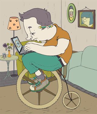
Branding projects can be a creative thrill, or an infuriating nightmare. This week, four anonymous professionals share their cautionary tales of woe. Nightmare #1? Reinventing the wheel
A new logo or branding commission always seems like an exciting prospect. Until the 17th round of amends, that is. Some clients simply can’t decide what they want, or can’t resist demanding changes purely for the sake of it.
Over the following week, four creatives (who’ve stayed anonymous to protect those involved) recall nightmare branding projects, detailing exactly what went wrong.
Experiences like the ones described here are all too common. But while you can’t stop clients from meddling or ignoring the design expertise for which they supposedly hired you, you can learn from their experiences: anticipate these tricky situations and take certain measures to keep them contained.
These stories show that quality, not quantity, is key when it comes to communication. Be clear and precise in your conversations with clients, and define your limits and boundaries. So, when a client’s demands cross the line from reasonable to ridiculous, you’ll know when it’s time to say stop.
You may not be able to prevent these awkward situations, but you can prepare yourself with certain techniques for dealing with them. Read on for nightmare #1: reinventing the wheel...
Words: Anne Wollenberg
Illustration: Camelia Dobrin, as seen in Computer Arts Projects 148.

Nightmare #1: reinventing the wheel
Anonymous designer, New York
Get the Creative Bloq Newsletter
Daily design news, reviews, how-tos and more, as picked by the editors.
“I was designing a logo for a client, combining a wheel with the name of the company. I had asked for a brief and showed them three initial design concepts. They clearly identified the one they liked and we began moving in that direction. The client was very specific, so I was really pleased because, of course, the more specific the brief and feedback, the easier it is to make sure you stay on the right track. I was thrilled, because they seemed like the perfect client.
We had agreed to have three additional rounds of design. The first two rounds went extremely smoothly: the client just wanted to tweak the colours a bit, and they loved the font. They asked for the icon to be made a little bit larger – then we’d be there. It seemed like the project was almost complete.
At this point, however, they then decided that they didn’t like the look of the wheel I had been using. First, they asked for it to have six spokes instead of five. I was happy to do this because it was what the client wanted – it was no big deal. But then they seemed to go from loving the whole thing to getting more and more nitpicky, following up this request with a whole lot more. For example, they decided that the spokes needed to be wider at the top than at the bottom, and they also complained that the tyre didn’t look as if it had been blown-up enough.
Meanwhile, as all this was going on, the client was arguing that these didn’t count as rounds of design because the basic concept was already in place, and we were just making minor adjustments. In their view, they hadn’t exceeded the pre-agreed limit.
I told the client I would do the work they wanted, but that I would charge on an hourly basis because it was outside the scope of the project. We were only able to finish it because, when it got to round eight or nine, I told them that enough was enough: they could have one last round of changes, and it was fine if they wanted someone else to work on the project after that. I’m really not sure if it would ever have been signed off by them otherwise."
What to do: our advice
There’s a limit to how much you can communicate in the beginning: while you need to be clear, you don’t want to scare off the client by over-articulating yourself. Be realistic: some projects will be more straightforward than others, but know when it’s time to say stop.
Don't miss:
Logo design nightmare #2: brand-clour chameleon
Logo design nightmare #3: with friends like these...
Logo design nightmare #4: total payment drought
Have you experienced a logo design nightmare? Let us know below...

Thank you for reading 5 articles this month* Join now for unlimited access
Enjoy your first month for just £1 / $1 / €1
*Read 5 free articles per month without a subscription

Join now for unlimited access
Try first month for just £1 / $1 / €1
The Creative Bloq team is made up of a group of design fans, and has changed and evolved since Creative Bloq began back in 2012. The current website team consists of eight full-time members of staff: Editor Georgia Coggan, Deputy Editor Rosie Hilder, Ecommerce Editor Beren Neale, Senior News Editor Daniel Piper, Editor, Digital Art and 3D Ian Dean, Tech Reviews Editor Erlingur Einarsson, Ecommerce Writer Beth Nicholls and Staff Writer Natalie Fear, as well as a roster of freelancers from around the world. The ImagineFX magazine team also pitch in, ensuring that content from leading digital art publication ImagineFX is represented on Creative Bloq.
