JavaScript tricks make educational site feel more real
We love this website, which lets students peek inside an animated ear. So we talked to designer Bryan James to find out how it was put together.

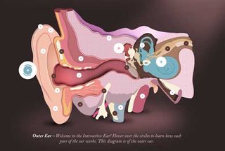
Ever wanted to journey inside someone's ear? Us neither, but this interactive educational website's great use of CSS and JavaScript makes it a weirdly engaging experience.
The Interactive Ear was created by Leeds-based agency Epiphany Solutions for its client Amplifon, which specialises in hearing aids, tests and solutions for the hard of hearing, and is targeted at both primary and secondary school level education.

The website showcases the three major parts of the ear's complex systems, encapsulated within a smoothly transitioning interface which enables the user to find out where sound goes, what happens and how it travels to the brain.
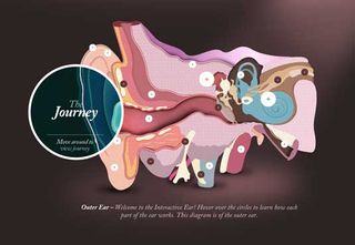
Clicking on the pulsating + symbol brings up a magnifying glass-style device (entitled 'The Journey') that enables you to have a sneaky peek inside. We love the naturalistic feel to the animation, so we asked designer Bryan James to tell us more about how it was created.

"We use JavaScript to place classes on an HTML element upon a particular action such as hover, which then applies a different style using CSS animations," says James.
"In older browsers without the support, you still get a swift experience which works, but we get the absolute best for the people who have modern browsers. With the power of modern technology, we were able to make the ear itself 'feel' more real with a rollover effect which draws separate 'pieces' in to where the user is browsing.

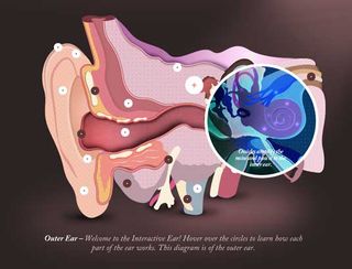
"We knew how we'd create the magnifying glass area from a previous project which also involved masking content inside a circle. The issue we had was that if you have numerous elements inside a CSS border-radius circle, the elements within still show as though they are contained within a square, so the image absolutely had to be what we used – an animated GIF.
"Applying an 'X-ray' visual to it allowed us to get away with the normal GIF issues of strange pixelation on none-straight edged or photographic images. The GIF is actually of the whole ear, so is large - using JavaScript, when a user moves 100 pixels right, the image then moves 100 pixels left (and similarly vertically) within the circle, which gives the effect of an X-ray."
Liked this? Read these!
- Brilliant Wordpress tutorial selection
- Our favourite web fonts - and they don't cost a penny
- Discover what's next for Augmented Reality
Have you seen a great educational website? Let us know about it in the comments below!

Thank you for reading 5 articles this month* Join now for unlimited access
Enjoy your first month for just £1 / $1 / €1
*Read 5 free articles per month without a subscription

Join now for unlimited access
Try first month for just £1 / $1 / €1
Get the Creative Bloq Newsletter
Daily design news, reviews, how-tos and more, as picked by the editors.
The Creative Bloq team is made up of a group of design fans, and has changed and evolved since Creative Bloq began back in 2012. The current website team consists of eight full-time members of staff: Editor Georgia Coggan, Deputy Editor Rosie Hilder, Ecommerce Editor Beren Neale, Senior News Editor Daniel Piper, Editor, Digital Art and 3D Ian Dean, Tech Reviews Editor Erlingur Einarsson and Ecommerce Writer Beth Nicholls and Staff Writer Natalie Fear, as well as a roster of freelancers from around the world. The 3D World and ImagineFX magazine teams also pitch in, ensuring that content from 3D World and ImagineFX is represented on Creative Bloq.
