Create interactive JavaScript video effects
Matt Campbell shows how JavaScript and a few image layers can create video-quality animations you can enhance with interactive elements.
Modern web users have embraced video, but developers often find video integration problematic owing to cross-device/platform limitations (most mobile browsers do not support autoplay for inline video) and fewer opportunities to infuse playback with user interactivity. With some fairly simple methods, you can replicate video-like effects without needing to transcode large files or fight autoplay restrictions on mobile devices.
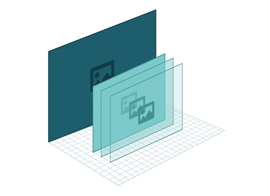
This guide will step through some simple techniques to create dynamic lighting effects by progressively adjusting the opacity of three image layers. The resulting effect will look as smooth as video – check out the demo. We'll also show some ways to enhance these animations with a few fun opportunities for user interactions.
Image set-up
First you'll need to create three images of the same object/scene with different lighting configurations. The first image should show the initial state of the effect, the second will be the middle transition, and the third one will be the final state.

Stacking the images
This boils down to the following code-level process:
- Set up a <div> container element that has position:relative style.
- Add each <img> inside the container with position: absolute.
The absolute positioning will enable the images to stack on top of each other while the container's relative style prevents the images from escaping to the top of the page.
The HTML and CSS code should look something like this:
<!doctype html>
    <html>
      <head>
      <style>
        #container { position: relative; }
        #container img { position: absolute; }
      </style>
      <body>
        <div id="container">
          <img src="path/to/image1.jpg"/>
          <img src="path/to/image2.jpg"/>
          <img src="path/to/image3.jpg"/>
        </div>
        <script>
          // we will be putting more code here
        </script>
      </body>
    </html>
Tracking the images in code
We need a very basic structure in the code to track and fade the images. This structure can also keep track of the animation's progress. It looks like this:
Get the Creative Bloq Newsletter
Daily design news, reviews, how-tos and more, as picked by the editors.
function Shader(images) {
      this.images = images;
    }
The constructor here just accepts a NodeList of images we will be tracking. Using the handy querySelectorAll function to get the images from the DOM, we can construct our object like so:
var container = document.getElementById('container');
    var shader = new Shader(container.querySelectorAll('img'));
Opacity changes
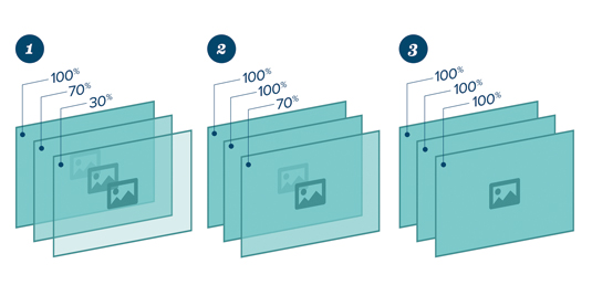
The lighting effect is achieved by showing the image on the bottom of the stack first, unmodified. In fact the bottom image is never faded at all – it is just what the user sees first.
As the animation progresses, we gradually fade in the images from bottom to top, so the user will see the middle image fade in first, followed by the top image a few moments later.
We can do this by tracking the progress of the animation from 0 to 1 (0% to 100%, if you like). Based on that progress variable we can fade the top images appropriately so that the middle image finishes its fade-in before the final image:
function clamp(value, min, max) {
      return Math.max(min, Math.min(max, value));
    }
    Shader.prototype.update = function (progress) {
      this.images[1].style.opacity = clamp(progress - 0.33, 0, 0.33) / 0.33;
      this.images[2].style.opacity = clamp(progress - 0.66, 0, 0.33) / 0.33;
    };
The clamp function here simply keeps progress within the bounds of 0 and 0.33 (the max it will be divided by). This is necessary because before the animation is at 66% progress, the final image would calculate progress - 0.66 as a negative number (for instance, -0.66) – it's better to just keep it at 0 in that case, since that image is not supposed to be fading yet. This will delay the fading of that image until the animation progress is beyond 66% (the only time progress - 0.66 would be positive).
In the update function, the first opacity line instructs the middle image to fade in between 33% and 66% of the animation. The final image starts fading at 66% and finishes at 99% (basically the end).
Tweening
Now that our animation is able to react to a progress variable, it's time to animate that variable. Applying the current time to a sine wave is an easy way to do this, providing a natural bounce from 0 to 1.
/* Define the animation loop */
    function animate() {
        /* Get sine for current time */
        var angle = Math.sin(Date.now() * 0.002);
        /* Normalize sine to 0 through 1 */
        var progress = (1 + angle) * 0.5;
        /* Ask animation to update the fades */
        shader.update(progress);
        /* Repeat! */
        requestAnimationFrame(animate);
    }
    /* Begin animation */
    animate();
First we get the current time in milliseconds using Date.now() . Multiplying it by 0.002 will slow down the 'bounce' of the sine wave.
Our animation expects a range of 0 to 1. Since sine waves are in the -1 to 1 range, we have to normalise the range using (1 + angle) * 0.5.
Next, we pass the resulting progress variable to our animation to update the fades of the images.

Finally we use requestAnimationFrame to call a function the next time the browser paints the window – this is usually synced to your monitor’s refresh rate. If your browser doesn't support this, it is possible to use setTimeout instead:
setTimeout(animate, 16); // 16ms = ~60fpsAnimating other properties
Animating the opacity is already an interesting effect, but you can animate any CSS property in the same way. One cool addition is to add a background image that moves along with the progress variable. This would create a 'parallax' effect, adding even more depth to the scene (here's an example).
First we need to update the CSS to put a background image in the container:
#container {
        position: relative;
        width:800px;
        height:800px;
        overflow:hidden;
        background: url(images/background.png);
    }
Since the background image will be scrolling, it must be wider than the image container. The CSS code forces the container to stay 800x800 in size and overflow:hidden hides the part of the background image that falls outside that container.
In the code, we're tracking the container DOM object already. We will now be animating the backgroundPosition style in order to move the background image.
In the previous animate() function, we can update this property directly after the shader.update(progress) call:
function animate() {
        var angle = Math.sin(Date.now() * 0.002);
        var progress = (1 + angle) * 0.5;
        shader.update(progress);

        /* Move the background image */
        container.style.backgroundPosition = -50 + progress * 50 + 'px 0';

        requestAnimationFrame(animate);
    }
As the animation progresses, this will move the background 50 pixels.
Adding interactivity
Since the animation reacts to the value of the progress variable, we can choose to adjust that variable based on any input instead of just bouncing it with a sine formula. One cool and easy input you should try using is the headtrackr library, which seamlessly adds headtracking to a web page.
By tying the animation progress to the position of the user's face, we can create the illusion that the user is 'looking around' the object. We'll capture the value of the user's face from the webcam and adjust the light shading to mimic a real-world interaction – check out a demo.
First, download the js file and reference it in your <head> tag:
<script src=”include/headtrackr.js”></script>This will expose a global htracker object, which we'll use later.
The headtrackr library needs both a <video> and a <canvas> element to work its magic. These are actually invisible, and we can just add them beneath the container div:
<canvas id="inputCanvas" width="320" height="240" style="display:none"></canvas>
    <video id="inputVideo" autoplay loop style="display:none"></video>
Now we'll be able to listen for a headtrackingEvent event. The headtrackr library fires this event any time it has an updated position for the user's head. That event will tell us the x (horizontal) position of the user's head, which we will simplify to the 0.1 range and pass on to the animation. This would replace the animate() function we were using before.
/* Initialize headtrackr with the input video/canvas */
    var videoInput = document.getElementById('inputVideo');
    var canvasInput = document.getElementById('inputCanvas');
    var htracker = new headtrackr.Tracker();
    htracker.init(videoInput, canvasInput);

    /* Listen for when the user's head moves */
    document.addEventListener('headtrackingEvent', function (e) {
        /* Restrict value range to -10 .. 10 and divide to -1 .. 1 */
        var headX = Math.max(-10, Math.min(10, e.x)) * 0.1;

        /* Convert range from -1 .. 1 to 0 .. 1 */
        var progress = (1 + headX) * 0.5;

        /* Update the animation */
        shader.update(progress);
    });

    /* Tell headtrackr we're ready for the events */
htracker.start();
Now after headtrackr finds your head, you should be able to move around in order to change the light shading animation. Laptop users can actually move the laptop instead of their head, making it appear more like a gyroscope-powered effect.
Conclusion
They say necessity is the mother of invention. But in this case we didn't need a new shiny library or browser update to solve a problem, just a few pre-existing, dependable techniques.
The code involved is neither new nor complex, although hopefully you will agree that the end result is pretty neat. It's always fun to apply things you already know to newer challenges, and it's especially cool to mix newer web technology (headtracking) with old.
Words: Matt Campbell
Matt Campbell is an expert in HTML5, JavaScript and LAMP. This article originally appeared in net magazine issue 256.

Thank you for reading 5 articles this month* Join now for unlimited access
Enjoy your first month for just £1 / $1 / €1
*Read 5 free articles per month without a subscription

Join now for unlimited access
Try first month for just £1 / $1 / €1

The Creative Bloq team is made up of a group of art and design enthusiasts, and has changed and evolved since Creative Bloq began back in 2012. The current website team consists of eight full-time members of staff: Editor Georgia Coggan, Deputy Editor Rosie Hilder, Ecommerce Editor Beren Neale, Senior News Editor Daniel Piper, Editor, Digital Art and 3D Ian Dean, Tech Reviews Editor Erlingur Einarsson, Ecommerce Writer Beth Nicholls and Staff Writer Natalie Fear, as well as a roster of freelancers from around the world. The ImagineFX magazine team also pitch in, ensuring that content from leading digital art publication ImagineFX is represented on Creative Bloq.
