Building an immersive environment with CSS and JavaScript
Technologist Benjamin Bojko and art director Dan Mall, on behalf of digital agency Big Spaceship, give us an exclusive look behind the creation of Activatedrinks.com and explain how they pulled off the loading process and added depth and fluid parallax motion to the particles effect on the site
ACTIVATE engaged Big Spaceship as digital agency of record to oversee digital strategy and production, including the brand's social and mobile marketing. The redesign of Activatedrinks.com and establishing their Facebook presence emerged as the primary initiatives in re-setting their online presence for this growing brand. When the Big Spaceship team began brainstorms towards these goals we didn't have a lot of time to pull this off.
The team’s inspirations, evolved rapidly from a wide array of sources including Ben the Bodyguard and Atlantis World’s Fair. Through our refining process, assessment of business goals and with a desire to create an engaging and fun departure, we decided on a simple one-page site framework where each section of the site is revealed sequentially.
ACTIVATE stores their vitamins inside the cap, until the moment you need them, for maximum potency. We wanted the website to deliver the same experience a consumer would have when opening a fresh bottle of ACTIVATE from the viewpoint of the vitamin’s journey; starting from the unopened bottle until finally the site becomes a home for all of ACTIVATE’s content within a bottle.
Here's how we pulled it off…
Loading
On first glance, the product is idle. The vitamins are tucked away in the cap, separated from the water below. The consumer consciously initiates the activation through twisting the cap, which releases a stream of particles into the water, enriching it with vitamins.
We translated this physical process onto the screen by showing the same dramatic transition from idle to a rich and deep experience. To deliver on this idea, we split the site into two sections:
- Bottle Cap Activation
- Rich Content Experience
The first section allows the user to ‘twist’ an ACTIVATE bottle cap by scrolling the browser window, releasing the vitamins into the site to reveal the content in the second section.
Get the Creative Bloq Newsletter
Daily design news, reviews, how-tos and more, as picked by the editors.
As the second section heavily relies on big and bold graphics, we decided to preload crucial pieces of the site to ensure the transition between the two sections occurred seamlessly.
We also decided to preload all resources, including images, scripts, and style sheets that are hard-coded into the page. The actual preloading utilises JavaScript and jQuery to wait for the window load event to trigger. To ensure users wouldn’t have to wait too long for each single asset to load, we dynamically loaded the non-essential items on the fly using JavaScript.
To show the loading process, we decided to provide users with two versions: an animated Flash preloader and a static fallback image for users that don’t have Flash enabled on their device. While the page loads, the Flash preloader is initialised using SWFObject and starts playing in an endless loop as soon as it’s loaded.
When the window load event is triggered in JavaScript, we use ExternalInterface to tell the Flash preloader to end its loop animation and fade out.
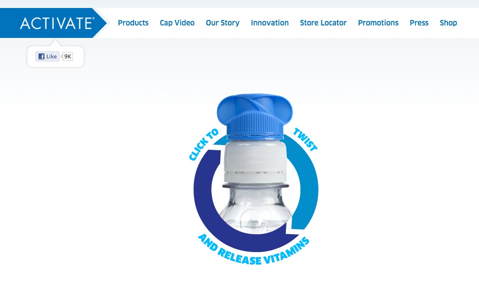
Twist to Activate
Once the site is loaded we start the twist animation logic. The animation consists of two main components:
- JavaScript logic to determine the twist progress
- Flash animation that displays the progress
The animation itself is a Flash file that plays a filmed sequence of a bottle cap being twisted open. Again, we use ExternalInterface to control the Flash animation from within JavaScript. In this way, Flash itself is only a representation of the data we process in JavaScript. If the user does not have Flash enabled we can fall back to a static image instead.
Since we are using the scroll position to control the animation, we need to ensure that the animation stays visible in the centre of the screen at all times. We achieve this by using CSS to set the position of the Flash animation’s HTML container element to fixed:
#intro-twist-wrapper { position: fixed; width: 100%; height: 100%; top: 0; left: 0;}To map the scroll position to the animation we need to define two scroll positions that map to the beginning and the end of the animation. We call these scrollMin and scrollMax. The difference between these two defines how far the user has to scroll to play through the entire twist animation. We call this value scrollDistance. Assuming our Flash animation consists of 100 frames, scrollMin would map to frame 1 and scrollMax would map to frame 100.
To achieve this mapping in real-time while the user scrolls we apply the following formula:
var scrollDistance = maxScroll - minScroll;// ...var animationProgress = (currentScroll - minScroll) / scrollDistance;This will give us a value from 0 to 1. If we multiply this value with the total amount of frames we have in our animation (again, let’s assume we have 100) we get the frame that would map to the current scroll position:
currentFrame = totalFrames * animationProgress;Particles: depth and parallax
A large part of the bottle metaphor we applied to the site experience is the particle effect that flows throughout all sections. In order to help tie the content together, we wanted the particles to form a single, vibrant stream from the bottle cap at the top to the very bottom of the page. To create the impression of being underwater, we also needed to add depth and fluid motion.
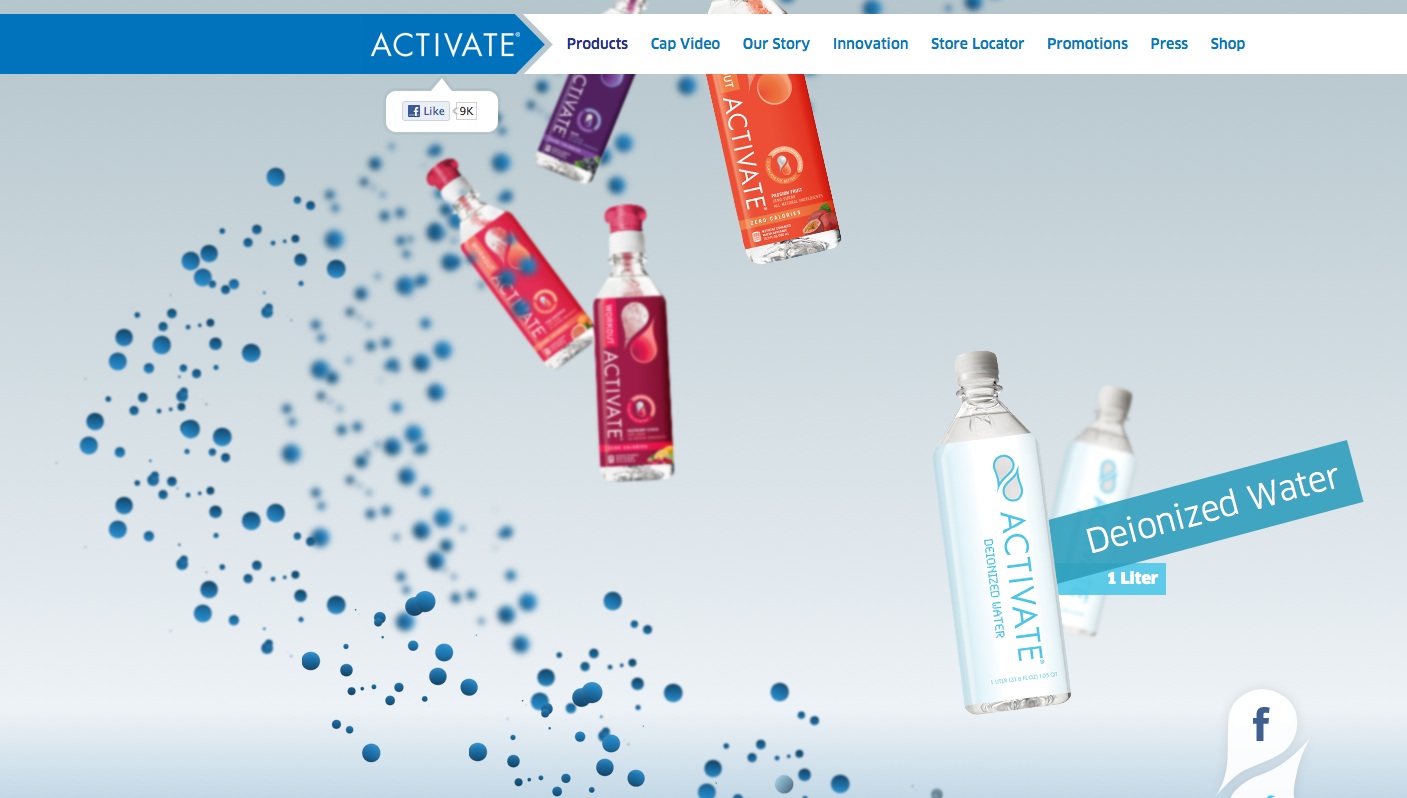
The following represent key challenges we faced and how we solved each of them:
Creating the Particle Stream
Making a stream of particles that goes from left to right on a page is a seemingly simple task; place a few absolutely positioned, transparent images on a sine curve throughout the site. The JavaScript for this would look something like:
for( var i=0; i<numParticles; i++ ){ var y = i * spacing; var x = radius * Math.sin( y ); $("#my-particle-id").css( "left", windowWidth/2 + x ); $("#my-particle-id").css( "top", y );}This is a good start that creates a stream from left to right, but we’re still missing a few things.
As is, we have very little control over how the particles are positioned relative to the content, which can create disturbing overlaps between text, images and decorative particles. To resolve this, we created a separate stream for each section. Every stream starts at the top-left corner of its section and flows in a single sine wave back to the bottom-left corner, seamlessly connecting with the next section.
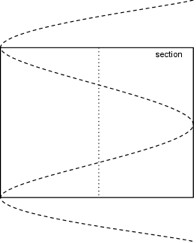
To achieve this, we simply calculated the x-position slightly differently:
var delta = 2*Math.PI * y / sectionHeight;var x = Math.sin( delta );Since all sections have a fair amount of spacing at the top and bottom of the actual content, the stream would now cross from left to right above the content, and back from right to left below the content, avoiding overlaps.
Rendering lots of particles
Having figured out how we wanted the flow of the stream to function, we needed to make sure the rendering of all of these particles remained smooth and responsive. It became clear from the start we couldn’t animate thousands of particles at once in HTML, so we had to pull a few tricks out of our sleeves.
The first and most obvious was instead of rendering each particle individually we created entire clusters of particles in one image that we could duplicate throughout the entire stream.
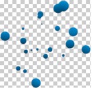
While this created a slightly repetitive pattern, it significantly reduced the amount of items the browser had to render. We used approximately 20 particles per cluster and 20 clusters per section. This gave us close to 400 particles per section to play with while the browser only had to render 20 total images.
However, having eight sections to contend with meant we would end up with 160 images that all needed to be animated. To avoid having to compute each of these images on each animation frame, we added a simple check. If a particle cluster is either above or below the visible browser window area, we skip its animation and set it to invisible. This allowed us to reduce the number of animated images further down page to about 20, for very tall browser windows.
Creating depth and motion
Now that we had particles flowing at a decent performance rate, it was time to put some life into them. Instead of just letting the particles flow from left to right we wanted them to actually wrap around the content in a spiral.
To make this happen, we introduced a z-coordinate to our loop using almost the same calculation for the x-coordinate, except that we instead used a cosine curve to start and end at 0 for each section transition.
Additionally we split the particles into three layers. Layers 1 and 2 are behind the content and layer 3 sits on top of it. Each layer has its own CSS class to let us control the z-index.
Summing up, these two solutions together let us display around 3,200 particles on the site while actually processing less than 20 images on each animation frame.
This is a total reduction to less than 1%.
var z = Math.cos( delta );if( z < -0.9 || z > 0.9 ){ particle.addClass("layer3");} else if( z < -0.4 || z > 0.4 ){ particle.addClass("layer2");} else { particle.addClass("layer1");}To give the particles even more depth and enforce the illusion of being under water, we also wanted to blur the particles in the background. Since there is no real blur filter in CSS (there is a proprietary Microsoft blur filter for IE: msdn.microsoft.com/en-us/library/ms532979(v=vs.85).aspx) we simply ended up creating a separate particle cluster for each layer, packing them all into one big sprite sheet.

The following is a simplified version of the CSS code we ended up with for the particles:
.particle { width: 204px; height: 192px; background: transparent url("../img/particles.png") no-repeat 0 0;}.particle.layer1 { background-position: -408px 0; z-index: 101; }.particle.layer2 { background-position: -204px 0; z-index: 102; }.particle.layer3 { background-position: 0 0; z-index: 103; }To recap, we had a large number of particles wrapping around the content both on the X and Z axes and the further they are behind the content, the more these are blurred. One big piece that’s missing is motion, which could be used to give the particles even more depth and a feeling of mass and buoyancy.
Since we decided there would only be vertical movement, we chose to go for a simple parallax effect for the particles. This basically meant two things:
- The further a particle is away from the middle of the window on the Y axis the more it gets pushed away from it.
- The higher the z-index of a particle, the more it gets pushed away, thus moving faster along the screen than particles with lower z-indices.
An easy way to achieve this with JavaScript and CSS is to wrap each particle image in its own container. The container is positioned absolutely on the site while the image itself is given a relative offset according to its z-index and its distance to the middle of the window.
Below is a very simple code example that shows the key properties that needed to be set to achieve this effect.
<!-- HTML --><div class="particle-wrapper"><img class="particle layerX” .../></div>/* CSS */.particle-wrapper { position: absolute; }.particle { position: relative; }// JSvar layerRepulsions = [ 0.3, 0.2, 0.1 ];for( … ){ var distanceToMiddle = parseFloat( $(particleWrapper).css("top") ) - windowMiddle; $(particle).css("top", distanceToMiddle * layerRepulsions[layerIndex] );}Now that we had the particles moving according to the layer they were on, we had already created a rich impression of depth and motion, but the particles reacted too quickly when the user scrolled, which made them look rigid.
To loosen up the animations, we wanted to give the impression the particles had their own mass and were actually floating in water. Instead of using the actual middle of the browser window, we calculated a separate value that is eased towards the new scroll position. We used this value for the parallax calculation so all particles would automatically be eased out.
The following is our adjusted example code:
var layerRepulsions = [ 0.3, 0.2, 0.1 ];for( … ){ var easedWindowMiddle += (easedWindowMiddle - windowMiddle) * 0.3; var distanceToMiddle = parseFloat( $(particleWrapper).css("top") ) - easedWindowMiddle; $(particle).css("top", distanceToMiddle * layerRepulsions[layerIndex] );}Unsolved problems
Being able to work on an engagement that lets you play around with new technology is extremely exciting and our team wanted to try out as many new features that CSS3 gave us, that would fit into the concept of the site. Naturally, working in unexplored territories sometimes leads into dead ends – and we certainly had a few of these.
In early phases, we were hoping to be able to use CSS3 transformations since this provides a lot of flexibility. To add diversity to the particles we tried applying a random rotation to each cluster. During development and implementation, it turned out that having several items rotated on the page at the same time decreased performance significantly so we had to reduce this, using rotation to key visuals like headlines and big bottle shots.
Reading about HTML5 we stumbled upon a few people suggesting the usage of CSS3 to leverage hardware acceleration on WebKit based browsers (www.html5rocks.com/en/tutorials/speed/html5/). It turned out that this resulted in more rendering issues (especially with Chrome 12+) than saving performance objectives, so we completely refrained from using this feature.
Bibliography
As always in our endeavours, we stand on the shoulders of giants. We leveraged a plethora of knowledge from other great thinkers and makers.
The following is a list of many of the resources we utilised to help us achieve our goals.
As a basis for our HTML code, we used Justin Windle’s Springboard template, which comes with an ANT task that compiles a release version of the site, minifying CSS with Yahoo’s YUI Compressor and compiling JavaScript with Closure all with one command.
To allow us to write more complex object oriented JavaScript code, we used Google’s Closure Tools to compile the project using strict type checking, class inheritance and heavy file-size and performance optimisations.
We also used jQuery in conjuction with the Google Closure Library to take advantage of its easy to use selectors and utility functions.
Other third party libraries we used:
- HTML5 Shiv: code.google.com/p/html5shiv/
- JS Signals: millermedeiros.github.com/js-signals/
- Modernizr: www.modernizr.com/
- Stats.js: github.com/mrdoob/stats.js
- SWFObject: code.google.com/p/swfobject/
- Underscore: documentcloud.github.com/underscore/
- jQuery 2d Transformation Plugin: github.com/heygrady/transform/wiki
- jQuery Address Plugin: www.asual.com/jquery/address/
- jQuery Easing Plugin: gsgd.co.uk/sandbox/jquery/easing/
- jQuery Form Plugin: jquery.malsup.com/form/
- jQuery ScrollTo Plugin: plugins.jquery.com/project/ScrollTo
About
Big Spaceship grows organisations by creating connected experiences, products and platforms.
This article is a product of the minds of two of Big Spaceship’s team members, representing design and technology disciplines:

Benjamin Bojko, technologist
Benjamin Bojko is an interactive coder from Germany. After studying and freelancing in Berlin, he went from intern to full-time at Big Spaceship. To Benjamin, programming is the grownup version of playing with LEGO and he thrives from bringing things to life with code.

Dan Mall, art director
Dan Mall is an award-winning interactive art director and designer. Before coming to Big Spaceship, Dan was the interactive director at Happy Cog in Philadelphia. Dan has a passion for playing matchmaker between unique art direction and intuitive interaction design. Outside of Big Spaceship, Dan regularly contributes to publications and gives presentations at conferences. His most recent endeavour has been in the classroom as a teacher of advertising, graphic design and Flash. Dan lives in Brooklyn with his wife, Emily and newly arrived daughter Siddalee.

Thank you for reading 5 articles this month* Join now for unlimited access
Enjoy your first month for just £1 / $1 / €1
*Read 5 free articles per month without a subscription

Join now for unlimited access
Try first month for just £1 / $1 / €1

The Creative Bloq team is made up of a group of art and design enthusiasts, and has changed and evolved since Creative Bloq began back in 2012. The current website team consists of eight full-time members of staff: Editor Georgia Coggan, Deputy Editor Rosie Hilder, Ecommerce Editor Beren Neale, Senior News Editor Daniel Piper, Editor, Digital Art and 3D Ian Dean, Tech Reviews Editor Erlingur Einarsson, Ecommerce Writer Beth Nicholls and Staff Writer Natalie Fear, as well as a roster of freelancers from around the world. The ImagineFX magazine team also pitch in, ensuring that content from leading digital art publication ImagineFX is represented on Creative Bloq.
