Build a responsive Javascript nav menu
As the industry explores RWD's patterns and challenges, we need to examine how we write the JavaScript behind them. Rob Tarr explains how to build off-canvas navigation.
Responsive web design (RWD) has had an enormous impact on how our industry develops websites and applications for different devices. Everywhere we look there are new techniques, tools, and thoughts on the subject. RWD provides us with the tools we need to create awesome experiences for the multitude of devices that our users have.
Ethan Marcotte's original article outlines the three core pieces of a responsive design: fluid grids, flexible images and media queries. While JavaScript isn't one of these foundations of RWD, it does allow developers to enhance interactions and create richer experiences for users. Many people (myself included) would argue that our content should be available to users without JavaScript enabled. This is where we tread a fine line between using JavaScript to make our websites more usable and hiding content behind a JS wall.
- Get the source files for this tutorial
If you spend any time writing JavaScript for RWD you're sure to come across the work of Scott Jehl of the Filament Group. It's fortunate for us that there are such people creating and sharing tools to help move responsive design forward.
Article continues belowLet's build something
I don't have a specific breakdown of how much time we spend on each section of our websites, but we generally devote more to the navigation (especially for large sites) than any other aspect. Ensuring we have the right content, making sure it's organised well, it's easy to get to, is accessible, and functions on all of the devices we can get our hands on, can be time-consuming, to say the least.

So, to make our lives easier, let's build some responsive navigation. A few goals for this navigation are:
- To work well on small and large screens.
- To work in Chrome, Safari, Firefox and IE (8+).
- To work with or without JavaScript.
The markup
If you're not using the files from the tutorial, now would be a great time to at least copy base.css. Since our focus here is on the JavaScript, we're not going to look much at the CSS. Go ahead and grab the index.html file from the tutorial files and let's get started.
In the footer?
Once you've looked at the HTML, you may be asking yourself: why is the nav in the footer? Good question. One of our goals was to make the navigation available to non-JavaScript users. For users on small screens without JS, we don't want the nav to eat up the screen when they visit the page. So in the header, we have a link to the navigation, which exists (expanded) in the footer.
Sign up to Creative Bloq's daily newsletter, which brings you the latest news and inspiration from the worlds of art, design and technology.

Smallest first
It's generally much easier to build responsive sites if you start with the smallest size and work up from there. At this point, you should have a navigation that works at a small size with JavaScript turned off, has a Show Nav link (that currently does nothing) at this size when JavaScript is enabled, and works with a simple hover at large sizes both with and without JavaScript.
Let's start adding some JavaScript to breathe a bit of life into the smallsize navigation. You'll need to add references to jQuery and the navigation JavaScript just before the closing body tag of index.html.
<script src="js/jquery.min.js"></script>
<script src="js/nav.js"></script>
We're going to start with the following in nav.js. This will create an object (window.NAV) to contain all of the code to control our navigation:
(function() {
  window.NAV = {
    $body: $("body"),
    $subMenus: $(".subMenu"),
    toggle: function(e) {
      e.preventDefault();
      NAV.$body.toggleClass("mainMenu-is-open");
    },
    bindEvents: function() {
      $(".js-togglesOffCanvas").on("click", NAV.toggle);
    },
    init: function() {
      NAV.bindEvents();
    }
  }
})();
NAV.init();
The init method above contains all of the necessary setup. Here it's calling NAV.bindEvents, which is using jQuery to bind a click event to anything with a class of js-togglesOffCanvas, to call the NAV.toggle method.
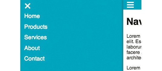
NAV.toggle is going to stop the default event from firing (so we don't follow links we don't want) and use jQuery to toggle the mainMenu-is-open class on the body. This will set up the CSS rules to move the .mainNav div (currently positioned off the left side of the screen) into view using CSS transforms. Using translate3d forces hardware acceleration in WebKit. So, we can detect what is available using Modernizr and use translate3d (if available) for smoother animations.

Since our event is bound to the class js-togglesOffCanvas, you'll need to add that class to the show link in the header:
<a href="#navigation" class="showNav js-togglesOffCanvas">Show Nav</a>You should now have a navigation that slides in from the left side at a small size when you click the Show Nav link. But wait – we don't have a way to close the navigation now that we've opened it. Let's fix that.
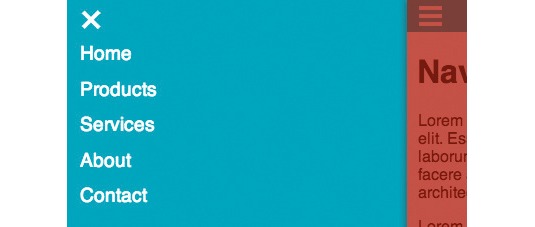
I'd like to have a button at the top left in the same place the open link was before we slid it right. I'd also like to be able to click anything to the right of the navigation to trigger a close. Instead of trying to add an event listener to everything on the right-hand side, let's drop in an overlay div and listen for clicks on it. Create a JS variable to store the markup and add to our NAV object:
window.NAV = {
$clickOverlay: $("<div class=’clickOverlay js-togglesOffCanvas’></div>"),
…
We'll then add a line to the init method to add this div to the DOM. This way we're only adding this if we have JS and the off-canvas nav might be activated.
init: function() {
  NAV.$clickOverlay.appendTo("body");
  NAV.bindEvents();
}
If you want to see that div, add a class of visible: as this element is invisible this can be helpful for testing. Now's a good time to add the close button to the nav itself. Add a <button> just inside of <div class="mainNav">:
<button class="js-togglesOffCanvas closeOffCanvas">
<span class="visuallyHidden">Close Menu</a>
</button>
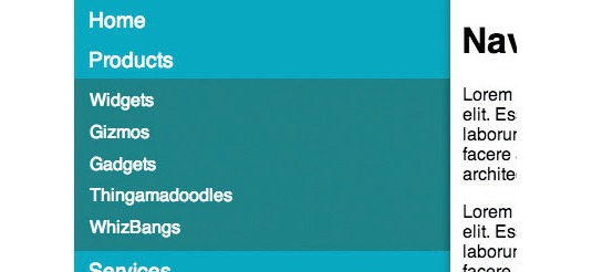
Now we can close our navigation - a relief - though we can't get to the second-level links in this off-canvas state. We can do something about this via a couple of changes to our nav.js file. First, add this method to the NAV object:
toggleSubNav: function(e) {
  e.preventDefault();
  $(this).siblings("ul").stop().slideToggle("fast");
},
Next, add a click handler for .js-togglesSubMenu to NAV.bindEvents.
bindEvents: function() {
  $(".js-togglesOffCanvas").on("click", NAV.toggle);
  $(".mainNav").on("click", ".js-togglesSubMenu", NAV.toggleSubNav);
},
Add the js-togglesSubMenu class to any link that should open a submenu <ul> in index.html.
<li><a href="#" class="js-togglesSubMenu">Products</a>This navigation is really coming together now, but if you mess around you can find a few issues. The first shows up when the off-canvas nav is open and a media query change causes the layout to switch to the non-off-canvas layout. Everything looks broken: the body element still has a class of mainMenu-is-open applied. Also, if you open then close a submenu, the hover effect on it at the larger size won't work - a problem if the breakpoint at which that switch happens lies between portrait and landscape modes of a handheld device.

Currently, browsers don't fire events when media queries change state. But newer browsers do have access to determining whether a specific media query is applied through the matchMedia API. For this case, I'll use a wrapper, mediaCheck, which I wrote around the matchMedia API. It lets us set up functions to execute when a media query becomes, or stops being, active. To do so we add a reference to mediaCheck in index.html just before nav.js:
<script src="js/mediaCheck.js"></script>Next, we will need to add the code to tell mediaCheck what media queries to watch and also what to do when they change. Add these lines at the end of init function().
mediaCheck({
  media: "(min-width: 35em)",
  entry: function() {
    NAV.clear();
  }
});
Now add the NAV.clear method. Remove the mainMenu-is-open class from the body, resetting elements moved to make way for the nav back to their right places, and removing inline styles the jQuery animations added to elements:
window.NAV = {
  $subMenus: $(".subMenu"),
  clear: function() {
    NAV.$body.removeClass("mainMenu-is-open");
    NAV.$subMenus.removeAttr("style");
  }
…
Now, whenever the browser width becomes greater than or equal to 35ems the mainMenu-is-open class and the inline styles from jQuery will be removed.

Another issue that exists is that the transitions that create the off-canvas sliding animation are still applied when the nav switches between contexts. This results in a fairly ugly shift between media queries. We can build upon the fix for the first issue by adding the following method to window.NAV:
toggleAnimations: function() {
  if ( APP.getState() === "small" ) {
    NAV.$body.addClass("enableAnimations");
  } else {
    NAV.$body.removeClass("enableAnimations");
  }
},
Modify the mediaCheck call in the init method like so:
mediaCheck({
  media: "(min-width: 30em)",
  entry: function() {
    NAV.clear();
    NAV.toggleAnimations();
  },
  exit: function() {
    NAV.toggleAnimations();
  }
});
And finally, modify line 80 of base.css to be:
.enableAnimations .mainNav, .enableAnimations .mainContent,
.enableAnimations .masthead, .enableAnimations .clickOverlay {
Now the transitions are tied to the enableAnimations class being present, and that class is only applied at the small size.
You'll notice the third issue if you try to click on the products menu at the larger size. Viewing the second-level nav at this size should be handled by the hover. The click handler we applied to deal with the smaller size is still firing.

This is a bit trickier. I originally developed a solution, but with the help of Adam Simpson have made big improvements. Look at app.js in the tutorial files and you'll see a method definition for APP.getState, which injects an element with an ID of sizeTest into the page. This element picks up styles from the CSS, which it uses to get an idea of what size the browser is relative to the defined media queries. Add the app.js reference to index.html:
<script src="js/app.js"></script>In the CSS you'll find the following declarations (this is a bit of a hack):
#sizeTest {
  font-size: 10px;
}
@media (min-width: 30em) {
  #sizeTest {
  font-size: 30px;
}
}
APP.getState checks the font-size of this element to return a string (which you can define): either small or large. We've tried other approaches, but this has the best cross-browser/device support. This can then be used to control the logic flow of our JavaScript. NAV.toggleSubNav becomes:
toggleSubNav: function(e) {
  e.preventDefault();
  if ( APP.getState() === "small" ) {
    $(this).siblings("ul").stop().slideToggle("fast");
  }
}
Now the JavaScript toggle will only happen at the small sizes.
Conclusion
At this point you should have pretty solid navigation that will work almost anywhere. If want to delve further, I'd recommend following Scott Jehl, Brad Frost and Sparkbox: we've only scratched the surface of what we can do to enhance our responsive websites using JavaScript.
Words: Rob Tarr
This article by Rob Tarr originally appeared in net magazine issue 245.

The Creative Bloq team is made up of a group of art and design enthusiasts, and has changed and evolved since Creative Bloq began back in 2012. The current website team consists of eight full-time members of staff: Editor Georgia Coggan, Deputy Editor Rosie Hilder, Ecommerce Editor Beren Neale, Senior News Editor Daniel Piper, Editor, Digital Art and 3D Ian Dean, Tech Reviews Editor Erlingur Einarsson, Ecommerce Writer Beth Nicholls and Staff Writer Natalie Fear, as well as a roster of freelancers from around the world. The ImagineFX magazine team also pitch in, ensuring that content from leading digital art publication ImagineFX is represented on Creative Bloq.
