What Apple got right (and wrong) with iOS 7's icon design
A minimal masterpiece or a gaudy mess? Designers speak out about Apple's new icon design language.
OS X set Apple on a design course that slammed into a wall in September 2013. Until then, Apple had favoured textures and a kind of virtual reality for its icons. On the Mac, All My Files became so detailed you could zoom in on its wooden drawer and see lines from Think Different written on the paper sheets stacked within.
On mobile, iOS dutifully followed along, reportedly due to the fascination and fondness Steve Jobs and Scott Forstall held for textures and realism, to the point you could pick the icons up and examine them if only they weren't trapped behind a layer of glass.
With both figures gone from Apple, and human interface design now squarely under the command of minimalism advocate Jony Ive, it should have come as no surprise iOS 7 introduced major changes.
A new philosophy
Perhaps it was the radical nature of the departure that caught people off guard. Tim Cook talked about a "stunning new interface," and Jony Ive spoke of the "profound and enduring beauty in simplicity, in clarity, in efficiency".
Of iOS 7's design in general, he argued true simplicity was "derived from so much more than just the absence of clutter and ornamentation," and was "about bringing order to complexity".
Still, no-one was quite prepared for what was revealed: a distinct lack of interface chrome, Helvetica sprayed everywhere, and vibrant icons that favoured simple geometric shapes.
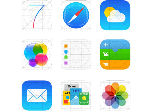
For the iOS icons, Ive revealed his team had created an underlying grid system that was intended to achieve a "much more harmonious relationship between individual elements" and incorporated a "whole new palette of colours". The aim was to create something that was "instantly familiar".
Get the Creative Bloq Newsletter
Daily design news, reviews, how-tos and more, as picked by the editors.
Almost immediately, the backlash from the design community was ferocious, with accusations the new icons were childish and lurid. There were also complaints about the retention of skeuomorphic elements; and when news broke that Apple's marketing department had influenced the icons' direction, some designers seemed set to march on Cupertino (although in the event placated themselves by posting angry nuggets of 140-character bile on Twitter).
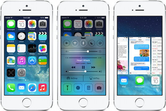
With the benefit of hindsight, icon designers today appear split. Jon Hicks says he finds the new icons "either bland or gaudy, but mostly an inconsistent mess". In general, he thinks the result looks "very immature and unfinished compared to other platforms like Windows 8".
Sebastiaan de With, doubleTwist CCO, agrees: "Apple's icon design, for which it was an industry leader in the past, has been significantly degraded with the change of management at the company. The poor proportions, legibility and overall lack of consistent styling has left many design professionals utterly puzzled at the final versions."
By contrast, Soft Façade creative director Dmitry Tsozik has mellowed to the icons: "At first, I was disappointed, but after watching the WWDC 2013 sessions and learning the iOS 7 philosophy, I can see what Apple is trying to do - it's more about minimalism, precision and the '70s than flat design trends."
A platform for experimentation
Iconfactory co-founder Gedeon Maheux offers a different take: "Apple designed these icons to be the home screen 'baseline' for how apps can look - and using that measurement they work". He reckons that in not pushing the boundaries and in being quite similar in style and appearance, Apple's iOS 7 icons benefit third-party developers, because they can "experiment with the design of their apps and find ways to make them familiar and yet still stand out."
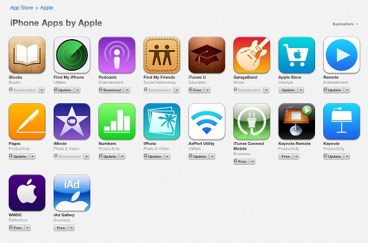
In terms of general approach, Maheux is also positive about Apple's direction. Although he believes certain icons - notably Settings and Safari - are too fiddly and busy, he lauds the use of negative space, with typography that has room to breathe, and also the use of colour: "The entire experience is bright and fresh, a colour companion to the expressive animations seen throughout iOS. And the icons in being pared down communicate what they are at heart. Stripped of fancy textures and edge treatments, they have nowhere to hide".
Tsozik is similarly enthusiastic about the minimal approach: "Apple's system is one where you ask whether an element will add to the metaphor, rather than asking yourself what cool effects your graphics software has." And Bjango director and lead designer Marc Edwards thinks Apple has "created more harmony with its icons, through the grid system and unified colour palette".
He's an especially big fan of the grid: "That should serve third-party icons well, giving designers a bit of direction and a means to ensure icon metrics match Apple's creations". Edwards adds some official templates "would be nice", (although notes Mike Swanson's mask "is close enough" in the meantime); Tsosik would like to see some better style guidelines, because Apple is "on to something new and great here, but designers around the globe didn't get the idea".
Sweating the details
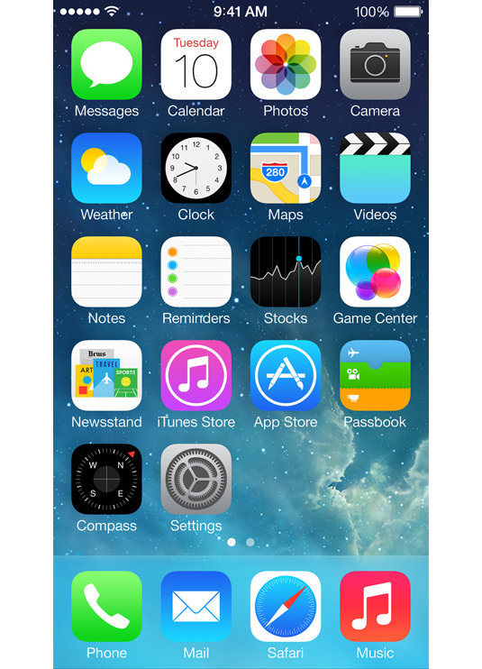
When iOS 7 was revealed at WWDC 2013, Ive made one particular claim designers think Apple fell short on: "We've considered the tiniest details". Tsozik notes that the Camera icon changes throughout the operating system, and that the visual language feels incomplete: "It's like Apple didn't create proper icon guidelines and didn't spend enough time working on each icon."
Hicks also reckons the styles vary too wildly for what Apple was trying to achieve: "There's fine detail in Safari and Clocks, and then the almost blank-looking Notes and Reminders. Then Game Center stands out as completely ill-fitting with the rest of the set, as well as being a very poor metaphor. It suggests small children's parties, not gaming!"
When asked about the downsides to the icons, Maheux appears less concerned with consistency issues; instead, he considers that - even as a fan of minimalism - perhaps they are too simple for Apple, and that the company should iterate: "There's room for additional shading and shadows without going overboard, and this would help give the icons a certain visual richness that they currently lack."
Edwards has similar thoughts: "I like the simplicity of the new iWork iOS icons, for example, but I prefer the latest OS X refresh. There's value in using realistic lighting and materials, where appropriate."
Designing in absolutes
According to de With, part of the problem is Apple designing in absolutes: "Previously, iOS heavily pushed shadows, highlights and textures, and now the icons almost entirely forego them. But visual rhythm requires some degree of subtle depth - removing these tools from designers hasn't increased the quality of Apple's icons."
Hicks adds Apple's desire to radically simplify things has also had the knock-on effect of making icons elsewhere in the interface less usable: "I find the iOS 7 'outline' style too light - it takes longer to process than a solid icon. Also, their stark simplicity, along with the use of Helvetica, just looks utterly bland and lacking in character."
Hicks reckons the icons "will change with the next release of iOS, or at least be iterated on," and he's not alone. "Will the iOS 7 icons adapt and improve over time? Of that I have no doubt," says Maheux. "Apple never stays in one place for long, and I expect both the icons and UI will evolve."
Still, Edwards thinks naysayers shouldn't hold their breath just yet: "App icons are typically updated in conjunction with major releases, and so I doubt we'll see much change at all until iOS 8. So love them or hate them, they're here to stay for a while."
Words: Craig Grannell
Liked this? Read these!
- Discover the best iPhone apps for designers
- Check out these stunning iOS icons
- How to build an app: try these great tutorials
What's your take on iOS 7's icons? Tell us in the comments!

Thank you for reading 5 articles this month* Join now for unlimited access
Enjoy your first month for just £1 / $1 / €1
*Read 5 free articles per month without a subscription

Join now for unlimited access
Try first month for just £1 / $1 / €1

The Creative Bloq team is made up of a group of art and design enthusiasts, and has changed and evolved since Creative Bloq began back in 2012. The current website team consists of eight full-time members of staff: Editor Georgia Coggan, Deputy Editor Rosie Hilder, Ecommerce Editor Beren Neale, Senior News Editor Daniel Piper, Editor, Digital Art and 3D Ian Dean, Tech Reviews Editor Erlingur Einarsson, Ecommerce Writer Beth Nicholls and Staff Writer Natalie Fear, as well as a roster of freelancers from around the world. The ImagineFX magazine team also pitch in, ensuring that content from leading digital art publication ImagineFX is represented on Creative Bloq.
