Our Verdict
A superb wireframe design tool for creating page layout ideas, with flexible export options, too. Sold!
For
- Wealth of customisation options
- You can save settings for reuse
- Encourages grid-based design
- Great for wireframing
Against
- Can't change options once set
- Not ideal for finished layouts
Why you can trust Creative Bloq
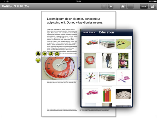
The old complaint that the iPad is 'only good for consuming content' is thoroughly debunked now. As if to help usher it out the back door and bury it completely, Quark - maker of veteran desktop publishing software QuarkXPress - has released DesignPad, a layout creation tool that's part-sketchbook, part-wireframe design tool, and part-layout starter kit. It's a curious tool, but once you start playing with it you'll start to see its value.
Ready-made layouts
Tap the Start a New Design button to begin. You’re presented with a selection of ready-made layout types; brochure, business card, classified ad, display ad, fact sheet, and so on.
Pick one, and then fine-tune it with the Size controls (US Letter, A4, or custom sizes) and then the Layout options.
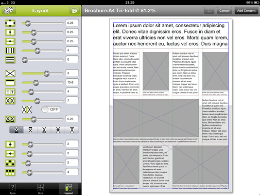
This provides a wealth of tools for adjusting the layout structure, in terms of its columns and rows, number of content boxes (picture and text), headline box size, background image box, captions for pictures, and so on.
Random options
If you’re looking for ideas here, in a rush or not feeling the creative flow, simply tap the dice icon and you’ll get a random set of options dialled in for all but a few core attributes.
Another 'roll' of the dice sees fresh random settings replacing the previous set; so you can keep tapping until you see a design or something you like. Then, from here, you can fine-tune these settings by hand. You can save these for reuse if you like - which is very handy considering how many variables there are.
Tap a box to tag it (headline, subhead, copy, caption, logo, photo, and so on), or jump straight to the Add Content stage.
Take your time
At this point, it's worth noting that you can't go back to play with these options later. That's not a big deal, but it does mean you should nail down these things first.
In other words, although it's great that it's very easy to create designs quickly, it's probably worth taking your time in the early stages to ensure you get it right first time, to avoid annoyances later on.
Grid-based design
It's great to see how DesignPad encourages solid grid-based design. This doesn't mean things are inflexible; although it's true that this isn't as free-form a layout tool as the blank page you get in regular DTP software, the layouts are still highly configurable.

Picture and text boxes that are generated as part of the initial layout specification process will automatically follow changes to the grid. Press and hold on any grid gutter and you can drag it around; the grid itself and all the existing boxes will change shape to follow this.
You can add new text and picture boxes to customise the design further, but they don’t follow changes in the grid structure. They also can't be shuffled behind existing content, so make sure you plan accordingly.
Text and pictures
This stage is also where text and picture content and the fills and outlines of objects are set. Tapping an item brings up a set of icons for customising the appearance and contents.
Picture boxes can be filled using content from your own iPad photo library or from a ready-made stock image library.
Unlike your own pics, stock shots are bundled into the layout output option - but more on that in a second.
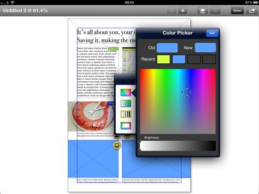
Text boxes are pre-filled with lorem ipsum placeholder content, and sliders and scrolling font lists give control over font size, face, inset, alignment, and colour. The typefaces available are the regular iPad set, so choose the nearest to your final plans and be ready to adjust later.
Output your designs
Which brings us to output: you can email a rendered PNG graphic of your layout, which is great for a quick demo to a client or colleague.
You can tweet it if you prefer, but what makes this more interesting is that you can also email a link to a regular QuarkXPress document that's generated from your DesignPad efforts.
Wireframe-style
This app isn't meant for making finished layouts ready for repro, but you can knock together a wireframe-style page layout with pictures and text in minutes, email yourself the QuarkXPress version, then fine-tune it in Quark's professional desktop publishing software.
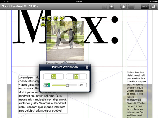
For a designer with an iPad, this is rather stunning. And did we mention that it's free? Who ever said the iPad was only for content consumption? Not us - and not Quark, either.
- You'll find this review, and many more, in Tap! Magazine issue 22.
Now read:
- 40 best iPad apps for designers
- 10 best apps for art on the iPad
Key info
- Price: Free
- Works with: iPad
- Version: 1.0
- App size: 2.2MB
- Developer: Quark Inc.
- Age rating: 4+

Thank you for reading 5 articles this month* Join now for unlimited access
Enjoy your first month for just £1 / $1 / €1
*Read 5 free articles per month without a subscription

Join now for unlimited access
Try first month for just £1 / $1 / €1
out of 10
A superb wireframe design tool for creating page layout ideas, with flexible export options, too. Sold!

The Creative Bloq team is made up of a group of art and design enthusiasts, and has changed and evolved since Creative Bloq began back in 2012. The current website team consists of eight full-time members of staff: Editor Georgia Coggan, Deputy Editor Rosie Hilder, Ecommerce Editor Beren Neale, Senior News Editor Daniel Piper, Editor, Digital Art and 3D Ian Dean, Tech Reviews Editor Erlingur Einarsson, Ecommerce Writer Beth Nicholls and Staff Writer Natalie Fear, as well as a roster of freelancers from around the world. The ImagineFX magazine team also pitch in, ensuring that content from leading digital art publication ImagineFX is represented on Creative Bloq.
