Our Verdict
On balance, we like it – it’s free, so we encourage you to download it and see if it’s right for you and your work.
For
- Restrictiveness leads to simpler presentations
- Easy to use
- Free
Against
- Restrictiveness might be annoying
Why you can trust Creative Bloq
Most of us have had that sinking feeling when someone fires up a PowerPoint presentation; "I'll just start with a bit of background," they say, clicking to a slide that has 17 bullet points and a piece of stock art of a pumpkin in a top hat or something. (If you don't recognise this feeling, you're either very lucky, or we're sorry to be the ones to break it to you; you're that guy.)
There's a reason 'death by PowerPoint' is a phrase that's recognised by many in business, the creative industries, education, and more; too often, presentations are a crutch for the speaker, and they overload each slide with far too much detail and, in the very worst cases, they commit the cardinal sin: they then proceed to read each bullet point aloud.
We can only assume you don't want to gain enemies in the workplace or school, and so that's why we feel that Haiku Deck could be the answer to producing presentations that, quite simply, aren't an information overload and duller than a wet weekend in Hull.
Layout choices
Each slide in its presentations can have either a plain background or a full-screen photo, plus an optional big heading and sub-heading.
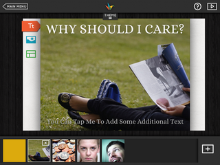
The only control you have over layout is a handful of different positions for the two bits of text.
No bullet points. No charts. No choice of awful transitions. Geography students everywhere will surely rejoice at the confirmation of this; it can be tough to digest all that data.
New focus
If this sounds like a terrible idea, then consider how different a presentation you have to sit through would be if its presenter used Haiku Deck rather than PowerPoint - or even Keynote.
He or she would be forced to use the slideshow as a background, as a visual aid to strongly underline a very few key points, rather than as a kind of animated brochure or manifesto they're just going to read from.
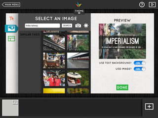
It moves the focus of the whole presentation from the slideshow to the speaker - and you can argue that this is a good thing. If all people are doing is reading what's already on screen, it begs the issue of is there any point of someone reading this out?
Free to try
Ultimately, this approach just might not work for the kind of presentations you have to give, and that’s fine, too. But since the app is free, it’s worth downloading and experimenting with.
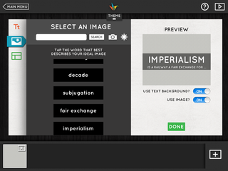
It might just be that in forcing yourself to create a simpler, more direct presentation, you'll hone and clarify your message, and even if there's a culture in your company or school for giving big, detailed, classically PowerPoint presentations, trying Haiku's picture-and-text approach might well help your voice be heard above the babble. (Or it might get you fired; we take no responsibility for that...)
Five themes
The app's not entirely locked down, either. There are five different themes included, plus 11 others available as In-App Purchases for $1.99 (£1.49) each, or $14.99 (£10.49) for the whole pack.
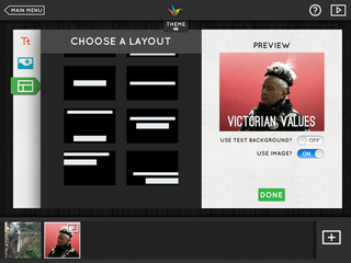
Each theme changes the font used on the presentation (and all are interesting custom faces), and applies a filter to any photo you add so the whole presentation hangs together. You can choose to switch the filter off (though only for a whole presentation, not for each slide), but you can’t change the font.
Building a presentation
The actual art of building a presentation is, unsurprisingly, easy. Create a new deck, pick a theme, and get started. You can import images from your iPad’s library, or - and this is the clever part - search the web for Creative Commons-licensed images and pop them straight in along with the relevant attribution metadata. Even slicker, if you first type your slide title and then go to add an image, it will try to pick out the relevant keywords and pull in relevant images.

Once you're done, you can share your presentation over services such as Twitter and Facebook; by emailing an uneditable PowerPoint file to someone; or, of course, by presenting directly from the iPad.
Liberating or restrictive?
Whether you find Haiku Deck liberating or restrictive is down to both your personality and the nature of the work you do - Apple's own Keynote remains the daddy on iOS.
But if you take an honest look at your presentations and realise they are extremely difficult for the audience to digest and you'd like to go for a direct, simple approach, then give Haiku Deck a try. We did, and we were pleasantly surprised at our results.
Key info
Price: Free
Universal: No
Version: 1.3.1
App size: 39.9MB
Developer: Giant Thinkwell
Age rating: 12+
You'll find this review, and many more, in Tap! Magazine issue 23.
Liked this? Read these!
- 40 best iPad apps for designers
- The 20 best iPhone apps for designers
- Mobile website design: 20 pro tips

Thank you for reading 5 articles this month* Join now for unlimited access
Enjoy your first month for just £1 / $1 / €1
*Read 5 free articles per month without a subscription

Join now for unlimited access
Try first month for just £1 / $1 / €1
out of 10
On balance, we like it – it’s free, so we encourage you to download it and see if it’s right for you and your work.
The Creative Bloq team is made up of a group of design fans, and has changed and evolved since Creative Bloq began back in 2012. The current website team consists of eight full-time members of staff: Editor Georgia Coggan, Deputy Editor Rosie Hilder, Ecommerce Editor Beren Neale, Senior News Editor Daniel Piper, Editor, Digital Art and 3D Ian Dean, Tech Reviews Editor Erlingur Einarsson and Ecommerce Writer Beth Nicholls and Staff Writer Natalie Fear, as well as a roster of freelancers from around the world. The 3D World and ImagineFX magazine teams also pitch in, ensuring that content from 3D World and ImagineFX is represented on Creative Bloq.
